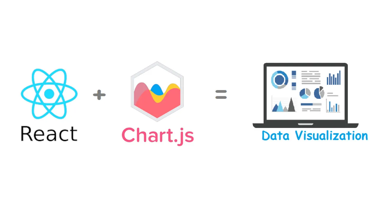
Thanks to Analytics Vidhya that published my previous article “Data Visualization with React & ECharts” in which I have covered the importance of data visualization and how we visualize the data in React.js using ECharts. Now this time we do the same data visualization plots but with other JavaScript library that is Chart.js. This article helps you to plot & understand some basic visualization of the dummy data with React and Chart.js.
**React **is an open-source JavaScript library, maintained by Facebook for building user interfaces or UI components.
Chart.js is a free open-source JavaScript library for data visualization, which supports 8 chart types: bar, line, area, pie, bubble, radar, polar, and scatter.
Pre-requisites
Before starting, make sure you have installed the node.js, otherwise you can installed from official site of Node.js
Setting up
Lets create the React project by using the npm package. Open the command prompt/terminal and run the following command:
npx create-react-app visualization
Once your command executed successfully then test if the web server is running fine :
- for this first, change directory to project folder
cd visualization
- and run
npm start
The following page will be shown on the browser, which means you web development server working fine.

Now next we need to install and add Chart.jsin the project by execute the following commands:
npm install --save react-chartjs-2 chart.js
Usage
import { Doughnut } from 'react-chartjs-2';

<Doughnut data={...} />
Bar Chart
Add a new file in src folder named ‘Bar.js’ and insert the below code:
import React from 'react';
import {Bar} from 'react-chartjs-2';

const data = {
  labels: ['January', 'February', 'March', 'April', 'May', 'June', 'July'],
  datasets: [
    {
      label: 'My First dataset',
      backgroundColor: 'rgba(255,99,132,0.2)',
      borderColor: 'rgba(255,99,132,1)',
      borderWidth: 1,
      hoverBackgroundColor: 'rgba(255,99,132,0.4)',
      hoverBorderColor: 'rgba(255,99,132,1)',
      data: [65, 59, 80, 81, 56, 55, 40]
    }
  ]
};
function App() {
  return (
    <div>
        <h2>Bar Example (custom size)</h2>
        <Bar
          data={data}
          width={100}
          height={50}
          options={{
            maintainAspectRatio: false
          }}
        />
    </div>
  );
}
export default App;
Open the App.js file in src folder and replace the default code with the below code:
import React from 'react';
import './App.css';
import Bar from './Bar';

function App() {
  return (
    <div className="App">
      <Bar />
    </div>
  );
}
export default App;
Note: By default react application is run by index.js file which import the App.js file. So the above code snap actually create the separate JavaScript code for Bar.js and then we import this in App.js.
Again run the npm start command then it will show the below line graph on browser.

Bar chart using Chart.js
Doughnut Chart
For doughnut chart, you can again add a new file in src folder named ‘Doughnut.js’ and insert the below code:
import React from 'react';
import {Doughnut} from 'react-chartjs-2';

const data = {
  labels: [
    'Red',
    'Green',
    'Yellow'
  ],
  datasets: [{
    data: [300, 50, 100],
    backgroundColor: [
    '#FF6384',
    '#36A2EB',
    '#FFCE56'
    ],
    hoverBackgroundColor: [
    '#FF6384',
    '#36A2EB',
    '#FFCE56'
    ]
  }]
};
function App() {
  return (
    <div>
        <h2>Doughnut Example</h2>
        <Doughnut data={data} />
    </div>
  );
}
export default App;
Open the App.js file in src folder and replace the default code with the below code:
import React from 'react';
import './App.css';
import Doughnut from './Doughnut';

function App() {
  return (
    <div className="App">
      <Doughnut />
    </div>
  );
}
export default App;
#data-visualization #react #javascript #chart #developer