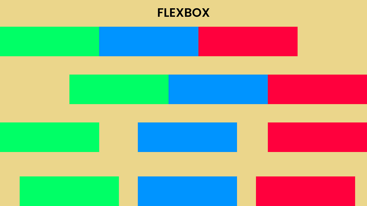
The Flexible Box Module, or Flexbox, is a one-dimensional layout model that helps us deal with space distribution in a very efficient way. Since it is one dimensional, it deals with layout one dimension at a time, i.e either a row or a column. In this article you will see all the useful properties of Flexbox that you can use in your stylesheet to make better designs.
Two axes
Flexbox has two axes: the Main axis and the Cross axis.
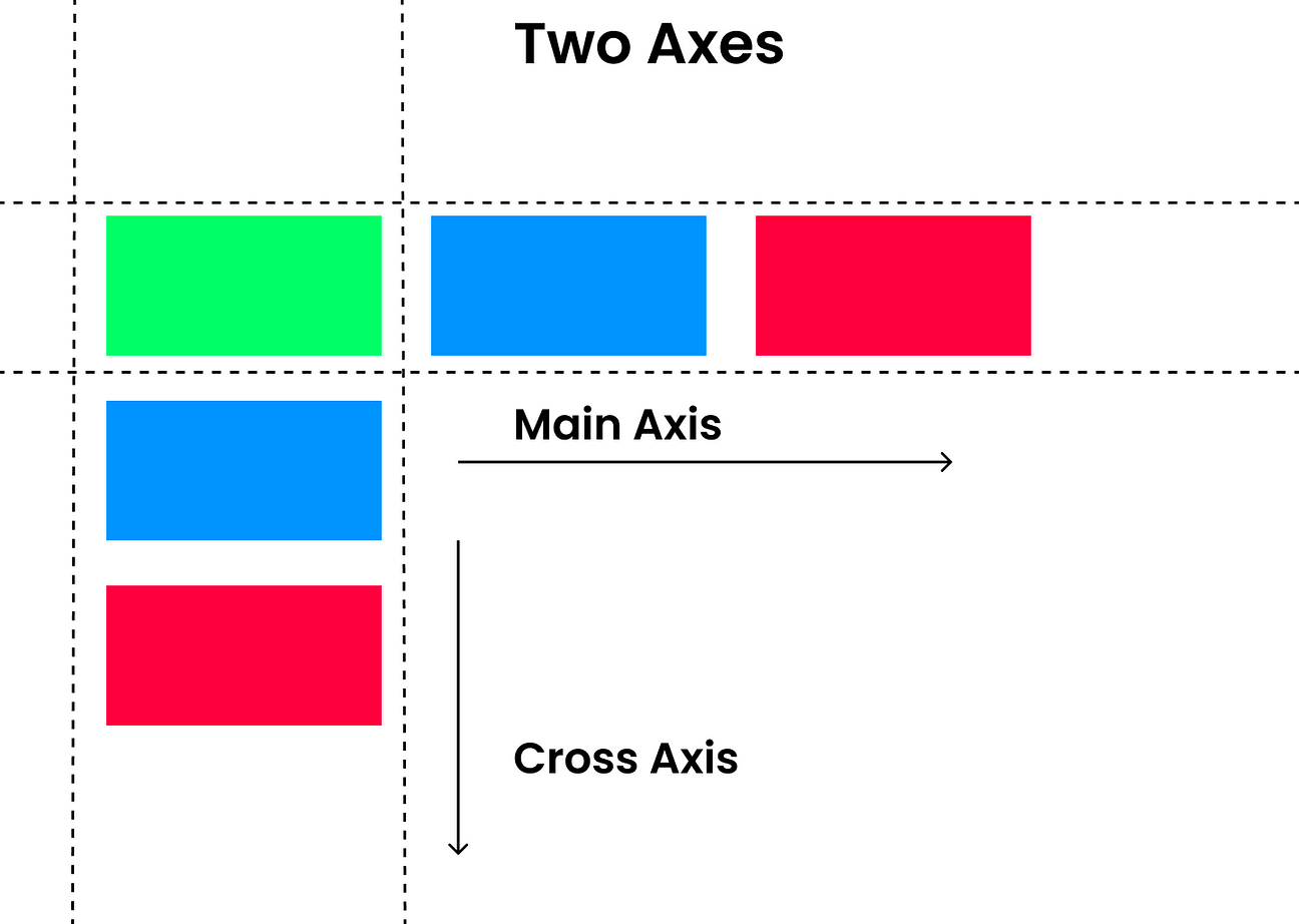
Main Axis and Cross Axis
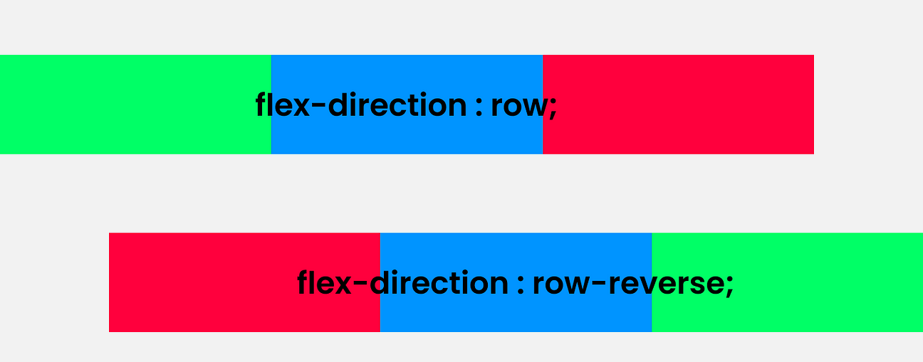
The main axis is the default. Flexbox has two properties for the main axis, **row **and **row-reverse. **The row property is the default behaviour, running from the left of the screen to all the way to right. **Row-reverse **reverses the whole row, so the last element would be treated as the first element in reverse order.
Main Axis
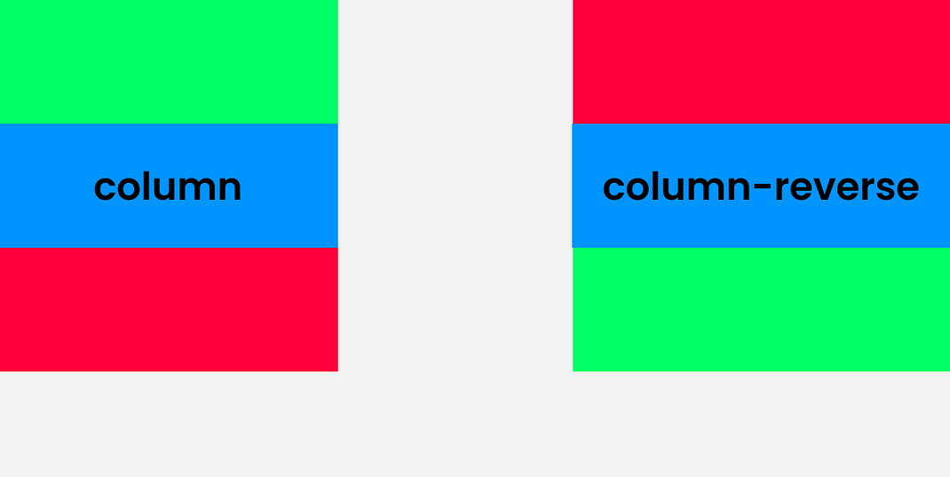
The cross axis runs perpendicular to the main axis. Basically, in cross axis the main axis changes direction and runs from top to bottom. We can change the direction by using the property “flex-direction,” so all you have to do is set the parent element as flex and use the flex-direction and set the direction **column **or column-reverse.
Cross Axis
_NOTE: _If the main axis is set to row or row-reverse, then the cross axis runs along the columns. If the the main axis is set to column or column-reverse, then the cross axis runs along the rows.
#flexbox #css3 #programming #front-end-development #css