How hard could it be to create a style guide for your website, app, or any other project? And, what if you want to build it with React and styled-components? So, will you accept this challenge? Great! This tutorial will take you through the whole process and show you how you, too, can build a great style guide from scratch! Now, let’s start and have some fun!
How to Build a Great Style Guide with React & styled-components part 2.
How to Build a Great Style Guide with React & styled-components part 3.
Project setup
Let’s start with the first step. This step is about putting together the dependencies we will need to develop our style guide. We will need to install four of them-react, react-dom, react-scripts and styled-components. react, react-dom probably need no explanation. react-scripts is a bundle of scripts and configuration used and provided by Create React App project.
We will use these scripts and configs to make our work faster an easier. We will not have to deal with any bundler such as Webpack or Parcel. This all will be taken care of by react-scripts. Finally, we will use styled-components to take care about styling. We will not work with any CSS or Sass files. All styling will be done in JavaScript.
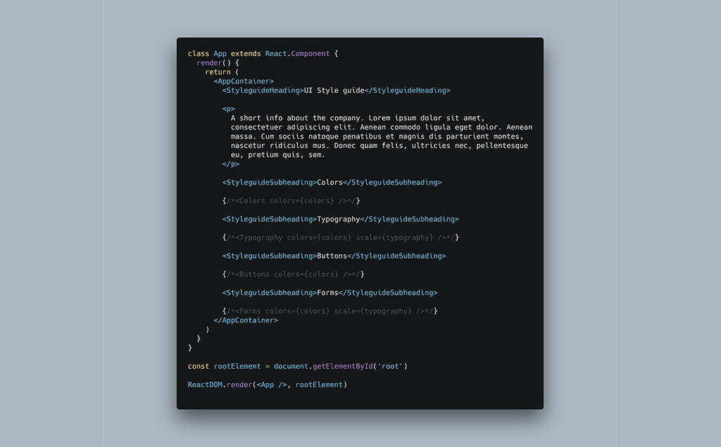
If this is the first time you will be using styled-components, you may want to take a look at its documentation. Then, you can also go through two tutorials focused on this library. First is A Simple Introduction to Styled-components. Second is Styled-Components – Mastering the Fundamentals Through Practice. This will help you understand how styled-components works.
Next, we will create scripts to run the style guide on dev server and also to build it when we are done. As I mentioned, we will use scripts from Create React App project. Now, the only thing we need to do is to “wire” together specific scripts with npm scripts. We will create four scripts-start, build, test and eject. However, today, we will only use the first two. And, that is all. This is how our package.json looks like.
Note: you will need either npm or yarn package managers installed on your computer in order to install dependencies and work on this style guide. Npm is distributed with node. You can get the installer for your system on nodejs website. If you prefer yarn, that is actually really much better option, you can download the installer here.
// package.json

{
  "name": "ui-style-guide",
  "version": "1.0.0",
  "description": "",
  "keywords": [
    "design",
    "react",
    "reactjs",
    "styled-components",
    "style guide",
    "web design"
  ],
  "main": "src/index.js",
  "dependencies": {
    "react": "16.4.2",
    "react-dom": "16.4.2",
    "react-scripts": "1.1.4",
    "styled-components": "3.4.5"
  },
  "devDependencies": {},
  "scripts": {
    "start": "react-scripts start",
    "build": "react-scripts build",
    "test": "react-scripts test --env=jsdom",
    "eject": "react-scripts eject"
  }
}
#react #styled-components #javascript #design development