You might think that raw data is more accurate than smoothed data. But in the case of the Covid-19 pandemic, smoothed data reduces reporting anomalies and is a more accurate representation of timing than the raw data is. But only if the smoothing is done correctly.
Wrong Way #1: Not Using Smoothed Data to Expose Trends
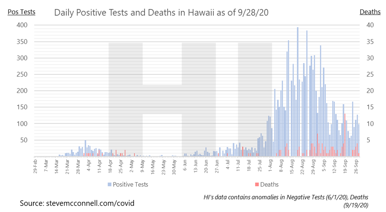
Raw state-level data is noisy, and it’s difficult to see trends in raw data. The example below shows the current raw data report from Hawaii. The light blue lines represent positive tests, and the red lines represent deaths.
Are tests going up or down? It’s virtually impossible to tell from this depiction of the data.
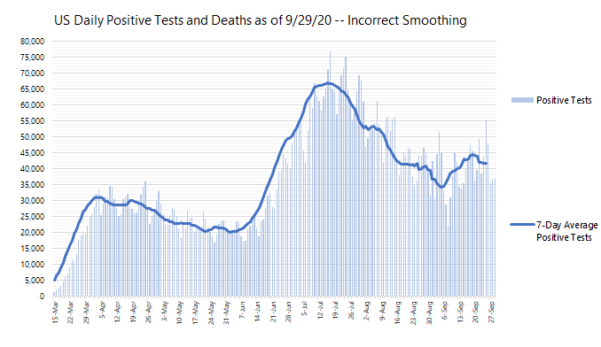
In contrast, what does the figure below tell you about whether positive tests are currently up or down? Visually, it’s clear that positive tests have been flat to slightly increasing for about a week.
#covid-19-data #data-analysis #data #data-science #covid19