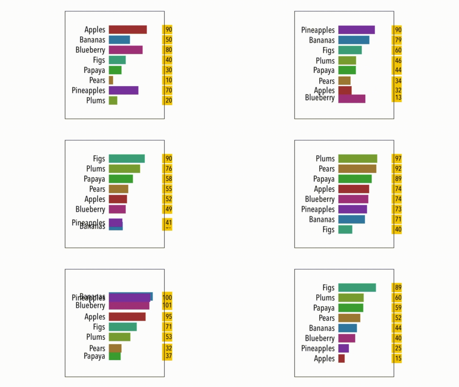
This is the third article in a series I’m putting together on building charts in SwiftUI 2.0. The bar chart your looking at, the Barron’s of bar charts, is an animated, autocoloured, value-shifting, visual-sorting one — a chart that I consider to be the one of the ultimate challenges in the bar charting domain: the bar chart race. These charts are all the rage right now.
So what’s it doing? Well, it’s simply a sorted bar chart, a dynamic one that’s constantly changing and visually resorting in the process.
How did I do it? The code in question — the _Barron bar chart, _lets call it — uses a struct with four values in it. The first is the text label, the second is the value to be sorted by, the third indicates its place in the overall chart, and lastly, we have the colour of the bar. The colour starts out as clear and is set on the first run, as it initially draws the chart.
I’m using a timer to add a delay to each bar as I draw it. Having built the view, I then use a second timer to cycle through the process of sorting, feeding in new values and resorting. The code with the cases initially just sorts the bars, then updates the values against them, and then resorts them again — cycling over the last two cases, never ending.
The layout of the whole thing is a ZStack; the position field within the data struct dictates an offset to be added. The offset obviously indicates where the bar appears within the overall chart. And there you have it. I included a good deal more code than you need, so you have something to play with. Read “Linking Animations Together to Build Bar Charts in SwiftUI” and “Animating Your Bar Chart With Combine Messages” to find out more about how the rest of the code works.
#programming #mobile #swiftui #swift #ios
