How to Align Elements with CSS Auto Margins
Learn how to use CSS auto margins to align elements horizontally and vertically, with ease. This step-by-step guide includes images to illustrate the key concepts.
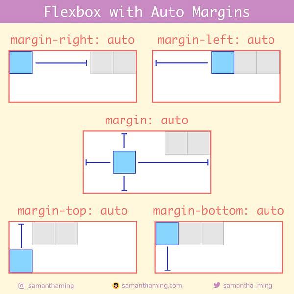
Another way to align Flexbox child elements is to use auto margins. Although this isn't a Flexbox property, it's still important to be aware of it because it has a very interesting relationship with Flexbox.
Flexbox: Aligning with Auto Margins
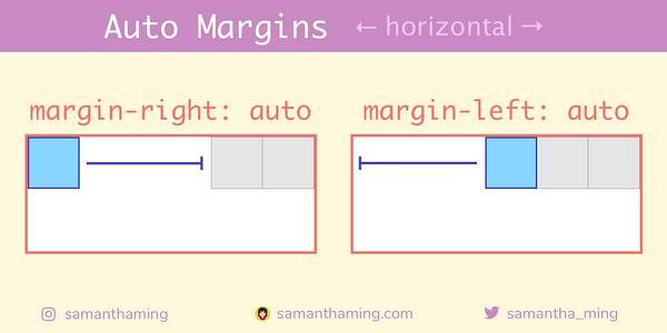
You learned that align-self gives you control of the child item in the cross axis. Your next question might be "is there something similar for the main axis", say a "justify-self" 🤔 Great question! Unfortunately, the answer is NO 😅. But we have an existing CSS property that we can use! And that's auto margins. We can use it to control the horizontal alignment of a specific element.
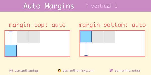
Actually, you can also use auto margins to control the vertical alignment of a specific element.
And if you apply all the margins (left, right, top, bottom) with the shorthand margins. You actually center that child in the horizontal and vertical direction!
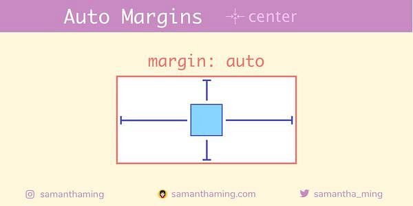
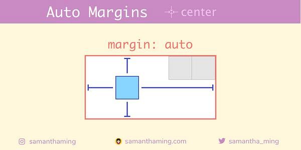
Note, if there are other child, it will center accordingly with them.
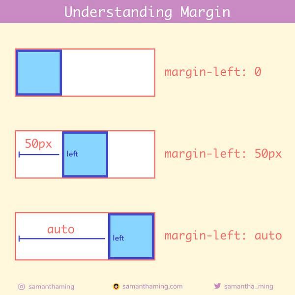
Understanding Margin
You might be a bit confused at this point. Why does margin-left:auto push things to the right or why does margin-right: auto push things to the left. It seems counter-intuitive. Don't worry, I was too 😅
Remember the basics of margin. It adds space to the element. So with margin-left:50px, it adds 50px worth of space to the left of the element. Which pushes the element to the right. With margin-left:auto, the auto calculates the entire available space and makes that the amount of space to the left of the element. Which pushes the element all the way to the right.
| margin | space | appearance |
|---|---|---|
margin-left | adds space to the left | pushes element to the right |
margin-right | adds space to the right | pushes element to the left |
margin-top | adds space to the top | pushes element to the bottom |
margin-bottom | adds space to the bottom | pushes element to the top |
margin | adds space all around | pushes element to the center |
Auto Margins Always Wins 🏆
If you use auto margins, it will reign supreme and your Flexbox alignment properties will have no effect 💪
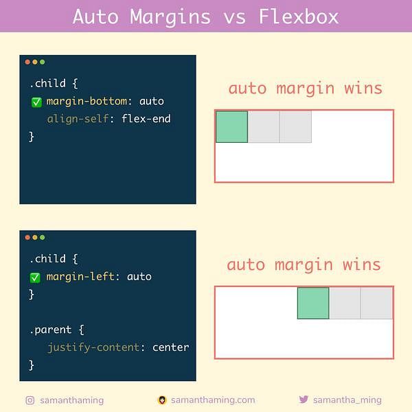
Why?
Note: If free space is distributed to auto margins, the alignment properties will have no effect in that dimension because the margins will have stolen all the free space left over after flexing.
In non dev terms, auto margins is that clueless friend who you kindly invited to stay at your house and then they think the entire house is theirs and takes over the entire space. No? You don't have that type of friend. Neither do I 😳 But I think you get the point 😂
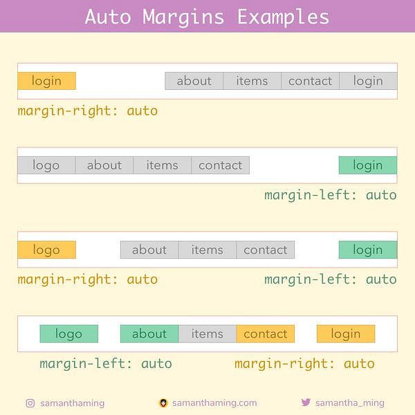
Auto Margins Examples
Here are some examples where auto margins really shine! It's great to layout your navbar in whatever style you prefer 🤩
Which should I use 🤔
I bet your head is spinning now as to use which and when to use what (the problem with choices am I right) 😅. Here's how I go about it:
- Always use Flexbox properties
- If not possible, use auto margins
Reasoning? I think Flexbox properties are more intuitive and read more explicit than "auto margins". Check it:
.child {
  align-self: flex-end;
}
vs
.child {
  margin-top: auto;
}
Even if you don't have any Flexbox knowledge. Just be reading this code, you can conclude that the child is aligning to the end. However, with margin-top: auto option, you're kinda spinning your head with what that exactly looks like. Of course, this is just my recommendation.
Source: https://www.samanthaming.com
#css
