Introduction
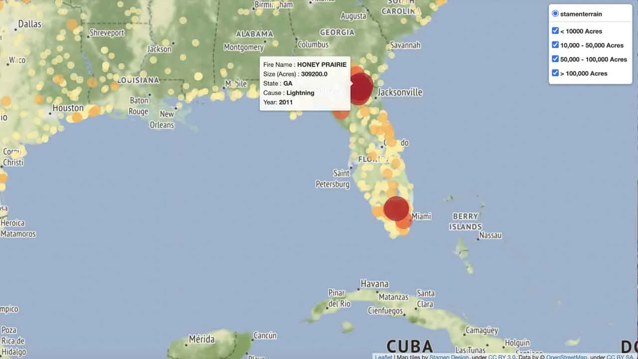
I’ve been very interested in wildfires recently, as 2020 was a record year for them here in Colorado. Loosely continuing on with the theme of my first article, I wanted to do a project on wildfires in the US. During my search for data, I found two awesome geospatial datasets to work with: a Kaggle dataset of points stored in a SQLite database containing records for 1.88 million wildfires from 1992 to 2015[1], and a United States Geological Survey (USGS) dataset of polygon data[2] of wildfires from 1878–2019, stored in a shapefile. In general, Kaggle, and US Government agencies are excellent data sources for projects. In this article, I’ll show you how to make an interactive map of this data using open source software (Folium) in Python.
For this project, you’ll need GeoPandas, Folium and Branca (you also need Pandas and Numpy, but I assume you have those installed already 😃). If you do not have these libraries, pip install them from a Python command prompt or Jupyter Notebook:
pip install geopandas

pip install folium
pip install branca
Part 1: Plotting points in Folium (Kaggle Dataset)
Here, I’ll run through how to plot up points in Folium from the Kaggle dataset. As the data is in a SQLite database, my workflow will be to read the table of interest from the database in to a Pandas dataframe, clean the data up a bit, and then plot the data in Folium for visual analysis.
#python #folium
