A good chart allows the reader to more easily understand data. The pie chart often fails this most simple test.
Indeed, Edward Tufte a statistician, artist, and Professor Emeritus at Yale University, has said that the only worse design than a pie chart is several of them and considered a simple table to be better in most cases [1].
Let’s take a look at an example. The pie chart below represents the rainfall each month for a year.
Rainfall over 12 months
Which is the rainiest month? March, right? Then November, or is it December? Which is the bigger segment, April or May? What happened to June? And how many centimetres of rain is it anyway?
Am I guilty of misrepresenting the poor old pie chart? It could be drawn better. It could have labels, for example, to show the actual amount of rain each month.
But isn’t this better:
Rainfall over 12 months
A simple column chart: months along the bottom and number of centimetres on the y axis. Not as colorful, admittedly, but you can easily see the values for each month and the relative rainfall in each part of the year.
The problem for the pie chart is that we are much better at noticing the difference in the lengths of bars than we are at seeing the difference in segments of a circle. It is simply much easier to interpret the data in a bar chart than a pie chart.
There is one thing that the pie chart is reasonably good at, though. If you have a small number of values which are fairly distinct, the pie chart can show the differences quite well.
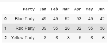
Here is a completely fictitious set of polling figures for three political parties over 6 months.
And here is a pie chart that represents the January data. It is not a bad representation, you can clearly see the differences between them but without labels showing the actual figures, you can only guess at the percentage of voters that would vote for each party.
Below is a column graph that charts the same data. It is equally clear but has the advantage that the bars are alongside each other, so you can more easily see the differences between them. It also has the advantage of a clear scale so you can approximate the actual numbers of people who intend to vote for each party.
#pie-charts #data-representation #statistics #data-visualization #data-science #data analysisa