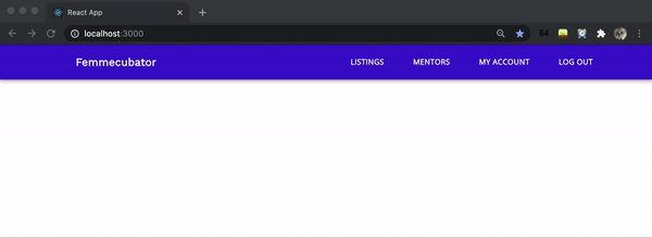
Hi! Previously, we learned how to build a basic Header component using Material UI and React to achieve the static result below:

Image credit: Author
In this tutorial, let’s turn this static desktop version into a mobile view when the user resizes their screen. Responsive design is important, as you would not want to rob your users of a good experience when navigating your web app on their mobile device. If you haven’t done so already, check out my previous tutorial to build out a basic desktop header before proceeding!
By the end of this tutorial, we will achieve the following:
GIF credit: Author
Let’s get started! FYI: You can access the source code on GitHub to follow along.
#programming #reactjs #javascript #react

14.95 GEEK