In this tutorial, we’re going to create a model to predict House prices🏡 based on various factors across different markets.
Problem Statement
The goal of this statistical analysis is to help us understand the relationship between house features and how these variables are used to predict house price.
Objective
- Predict the house price
- Using two different models in terms of minimizing the difference between predicted and actual rating
Data used: Kaggle-kc_house Dataset
GitHub: you can find my source code here
Step 1: Exploratory Data Analysis (EDA)
First, Let’s import the data and have a look to see what kind of data we are dealing with:
#import required libraries
import pandas as pd
import numpy as np
import seaborn as sns
import matplotlib.pyplot as plt
#import Data
Data = pd.read_csv('kc_house_data.csv')
Data.head(5).T
#get some information about our Data-Set
Data.info()
Data.describe().transpose()
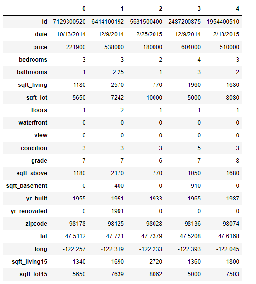
5 records of our dataset
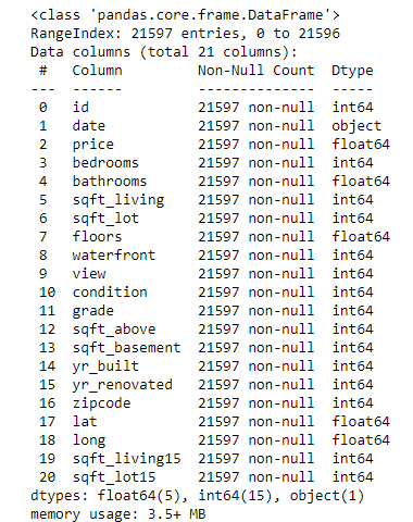
Information about the dataset, what kind of data types are your variables
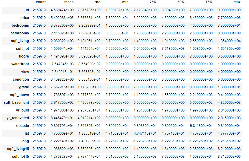
Statistical summary of your dataset
Our features are:
✔️**Date:**_ Date house was sold_
✔️**Price:**_ Price is prediction target_
✔️**_Bedrooms: _**Number of Bedrooms/House
✔️**Bathrooms:**_ Number of bathrooms/House_
✔️**Sqft_Living:**_ square footage of the home_
✔️**Sqft_Lot:**_ square footage of the lot_
✔️**Floors:**_ Total floors (levels) in house_
✔️**Waterfront:**_ House which has a view to a waterfront_
✔️**View:**_ Has been viewed_
✔️**Condition:**_ How good the condition is ( Overall )_
✔️**Grade:**_ grade given to the housing unit, based on King County grading system_
✔️**Sqft_Above:**_ square footage of house apart from basement_
✔️**Sqft_Basement:**_ square footage of the basement_
✔️**Yr_Built:**_ Built Year_
✔️**Yr_Renovated:**_ Year when house was renovated_
✔️**Zipcode:**_ Zip_
✔️**Lat:**_ Latitude coordinate_
✔️**_Long: _**Longitude coordinate
✔️**Sqft_Living15:**_ Living room area in 2015(implies — some renovations)_
✔️**Sqft_Lot15:**_ lotSize area in 2015(implies — some renovations)_
Let’s plot couple of features to get a better feel of the data
#visualizing house prices
fig = plt.figure(figsize=(10,7))
fig.add_subplot(2,1,1)
sns.distplot(Data['price'])
fig.add_subplot(2,1,2)
sns.boxplot(Data['price'])
plt.tight_layout()
#visualizing square footage of (home,lot,above and basement)
fig = plt.figure(figsize=(16,5))
fig.add_subplot(2,2,1)
sns.scatterplot(Data['sqft_above'], Data['price'])
fig.add_subplot(2,2,2)
sns.scatterplot(Data['sqft_lot'],Data['price'])
fig.add_subplot(2,2,3)
sns.scatterplot(Data['sqft_living'],Data['price'])
fig.add_subplot(2,2,4)
sns.scatterplot(Data['sqft_basement'],Data['price'])
#visualizing bedrooms,bathrooms,floors,grade
fig = plt.figure(figsize=(15,7))
fig.add_subplot(2,2,1)
sns.countplot(Data['bedrooms'])
fig.add_subplot(2,2,2)
sns.countplot(Data['floors'])
fig.add_subplot(2,2,3)
sns.countplot(Data['bathrooms'])
fig.add_subplot(2,2,4)
sns.countplot(Data['grade'])
plt.tight_layout()
With distribution plot of price, we can visualize that most of the prices are between 0 and around 1M with few outliers close to 8 million (fancy houses😉). It would make sense to drop those outliers in our analysis.
#linear-regression #machine-learning #python #house-price-prediction #deep-learning #deep learning