No one enjoys filling out a form. But there are ways we can build forms that are more interactive, promote engagement, and are less burdensome for the user. In this Vue Mastery article, we’re going to build an interactive and distraction-free form using advanced concepts of the Vue.js framework and other supporting libraries for form validation and animations.
Before we start, take a look at the demo (and here’s the GitHub repo).
When we talk about dynamic forms, what do we mean exactly? What kind of requirements might we need to consider as a developer and what kind of requests might we receive from a client or manager?
You — as a developer — would come up with the dynamic requirements as below:
Dynamic Form Requirements
- Entire form is controlled by a single .JSON configuration file
- Form uses reusable Vue components for its fields
- Form validates each field based on validation rules defined in form configuration
- Form stores validated data in Vuex store for further processing
Additionally, you might also get the kind of requirements below, from your client:
Interaction Requirements
- User interacts with only one form field at a time
- Submit button stays hidden initially and also when validation fails
- First form field appears on initial page-load
- Completed field disappears and new field appears
- All form fields are accessible via previous-n-next navigation
- Reactive progress bar shows form progression
Now that we understand the requirements for our own form, let’s explore how we’d start building it.
Planning is everything. In programming, planning goes in parallel with proof of concept (POC). POC helps validate our plan. With that in mind, let’s start planning Vue components with the very first requirement of form configuration.
In essence, this entire form is controlled by a .JSON configuration.
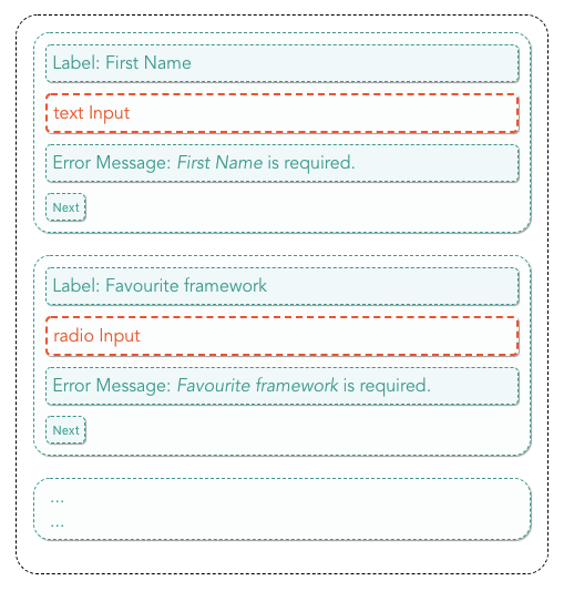
We’ll start with a basic form with a label, input field and error message. Below is a minimalist structure for a single form field object.
// config/formConfig.json
[
  {
    "type": "text",
    "label": "First Name",
    "name": "firstName",
  },
  ...
]
We’ll develop this object structure progressively throughout the article.
Now that we have a basic JSON structure ready, we can start planning which one or more of the component composition strategies we can combine to build our dynamic form. Vue.js provides plenty of options ranging from render functions, to a provide/inject pattern, mixins, dynamic components and slots.
Here, we’ll kick things off with Dynamic Components and see what follows naturally.
Dynamic Component
Imagine all of the input fields as Vue components. We find the matching component based on field-type and use <component> to render fields as defined in the form configuration.
The building block components for different types of input fields would look something like below. Each component will have its own set of methods, data and props as required.
<InputBox>renders text field,<Checkbox>renders checkboxes,<RadioButton>renders radio buttons, and so on…
Each component above will accept user input and emit the user input back to the parent component. The emitted value will be stored into a local object variable, which we can call formData.
We can simply:
- register building block components in
components: {}key, - loop through the form configuration,
- render each field using
<component>via the:isattribute and - add
v-modelto store the emitted value in a local variable :formData
<template v-for="(field, key) in formFields">
          <Component
            v-model="formData[field.name]"
            :is="field.type === text ? InputBox : ''"
            :type="field.type"
          />
</template>
Since the form configuration and Vue components are separate objects, we must find the corresponding component for each fields — before we can provide them in :is above.
We can either,
- Perform
v-if/v-elseto find & assign matching component, or - Write switch statements to assign the relevant Vue component, or
- Better yet, use
objectmap to assign the matching component for each field.
In the third option above, we can even prepare an entire field object using the ... spread operator to amend the component key into a plain field object. 💡
This option would save us lot of ifs-n-elses as well.
Object Map
See object map in action in the CodePen below. It’s created for only one field object. In our project, we’ll map through an array of objects.
After modification, field.component👇 alone should work — without any conditional statement.
<template v-for="(field, key) in formFields">
          <Component
            v-model="formData[field.name]"
            :is="field.component"
            :type="field.type"
          />
</template>
Slots
Slots are perfect for distributing/injecting content into child components and organizing the content into manageable chunks. Such as: <label> for field-label and <div>or <span> for field-error. We can define two Vue components with slots, <field-label> and <field-error>. We can manage an individual state of the child component to animate or show/hide the error message.
We have <field-label> , <field-error> and <component :is=""> so far.
Let’s create yet another slotified Vue component -<field-group>-to accommodate <field-label> , <field-error> and <component :is=""> .
<field-group> groups each field nicely with its respective children. One of the form requirements is to display only one field at a time. With this grouping, we can simply show and hide <field-group> from the view-port.
Here’s a static CodePen to understand the concept we have come up with so far.
Understanding form parts to derive common and custom Vue components
We can see a generic template emerging at this stage. All we need here is a wrapper component to enclose all fields in a form element.
Let’s call this wrapper component <form-template>. In the diagram below, boxes with a dashed border indicate reusable components.
Let’s take a moment and list all of the responsibilities the <form-template> component should have. Such as:
- importing form configuration
- importing building block Vue components for each field type
- preparing all field objects and
- rendering the form
The list above doesn’t include all the methods, data & computed properties that are required to interact with the form yet.
So, how about delegating the data-preparation task over to a separate component? That component’s only job will be to prepare and provide data to <form-template> because it won’t have any markup.
In Vue.js, we have a special way of writing these kinds of components where templates are not necessary, but you still need to provide the functionality. They are also one of the most powerful 💪 features of Vue.js, called Functional Components.
Functional Components
Before we get to a functional component, we need to take a quick primer on Render Functions. The render function provides the full programmatic power of JavaScript.
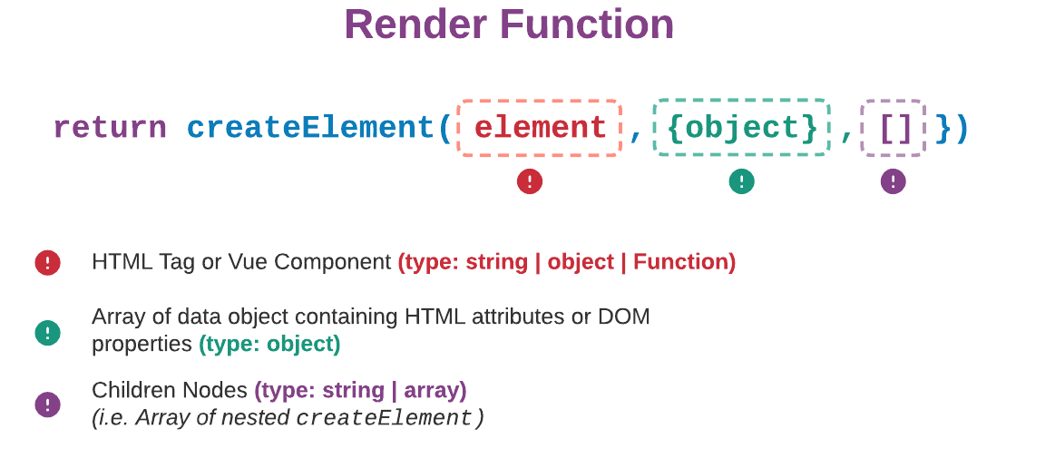
This diagram reads something like…
createElementtells Vue what kind of element it should create and what sort of attributes and children nodes it should have.
Example
createElement should create a <button> tag with,
id= 'submit'- onClick event handler,
this.activateand class= 'active'
The above requirement would translate into a render function as shown below. The green section is the data object, which is reactive in nature. This is similar to v-bindin regular Vue components.
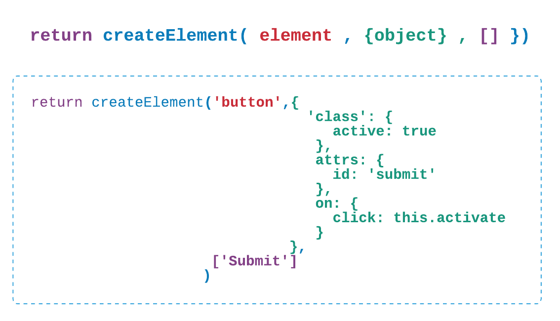
The reactivity of this data object is the key difference in a functional component. Functional components are stateless because they don’t manage any state, which is exactly what we want! We want this wrapper component to process some data and feed it to the child node.
In a functional component, the syntax remains the same, with an addition of one property.
Functional Component = Render function +
_functional: true_property
Verbalised requirement for this wrapper (form config provider) component — ‘createElement should create <form-template> element with form-config-data sent as props’.
// components/formConfigProvider.vue
<script>
import FormTemplate from "./FormTemplate.vue"
import formConfig from "../config/formConfig.json"
export default {
  functional: true,
  render(createElement) {
    let fieldObjects = ... ... ...
    return createElement(FormTemplate, {
      props: {
        formFields: fieldObjects
      }
    })
  }
}
</script>
Important: props as an attribute will only work when the element to be created is a Vue component. props won’t work on HTML tags.
Functional components won’t have access to
_this_context as seen in a regular render function. On the contrary, they have their own render context. We’ll use this render context in the Transition section later.
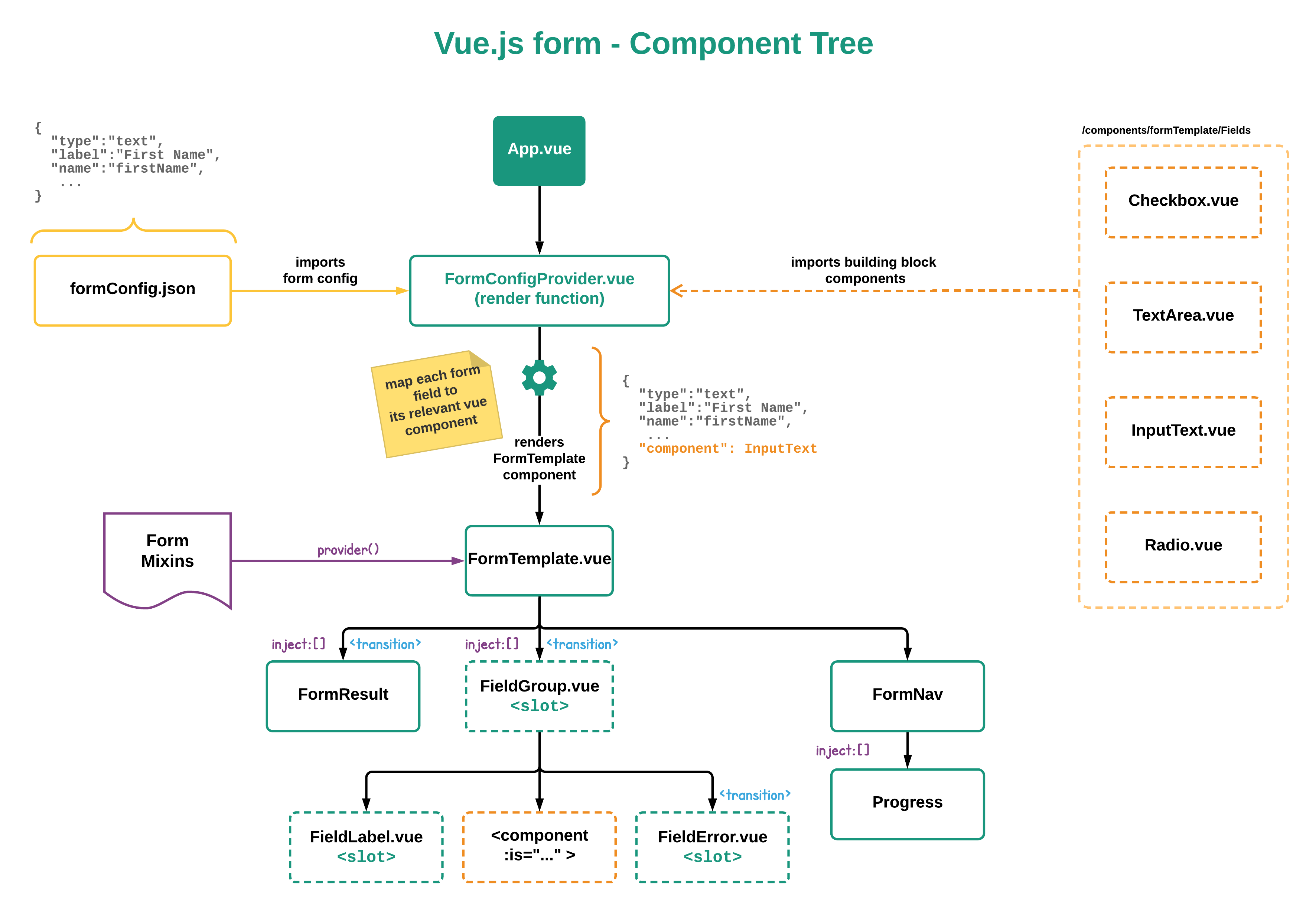
We’ll pause here for a bit to add other foreseeable components for form result, navigation and progress bar.
As seen in the diagram below, mixins are added to the <form-template>. Mixin, in combination with the provide & inject pair, brings this form to life. And that’s exactly what is coming up in the next section.
Below is a complete component tree structure as planned until this point.
Mixins
Although mixins promote reusability, we simply want to delegate methods and computed properties to keep <form-template> component easy to manage. Eventually mixins will get mixed with <form-template> anyways.
In Dynamic Component section, we planned to store user input in formData. Along with formData, we have helper variables:
formLength— controls progress bar and navigationactiveField— shows only one field on screenisComplete— tracks form completionisNext— tracks changes in transition direction (used later in Transition section)isValid— indicates whether an activeField is valid
Provide and Inject
provide & inject come in a pair and they must be used as a pair as well.
data() on Vue instance is reactive by nature. And data provided using provide are not reactive by default. But any reactive data provided as an object becomes observable. Object is the keyword here.
Therefore, we store above five variables into the formState object, and then introduce them via dependency injection in child components.
Step 1 — Declare reactive data object
// mixins/formMixin.js
data () {
  return {
   formState: {
     activeField: 0,
     isNext: true,
     formLength: this.formFields.length,
     success: false,
     isValid: false
    }
  }
}
Step 2 — provide from parent
// components/FormTemplate.vue
provide() {
 return {
  formState: this.formState
 }
}
Step 3 — inject in children
//components/formTemplates/formField/
inject: [“formState”]
Any child of <form-template> — no matter how deeply nested — can access formState.
provide & inject enables splitting logic from presentation by allowing observable data to travel discreetly within the component hierarchy — without polluting the parent with multitudes of props, v-ifs and elses.
Other methods and computed properties are added into mixins as well.
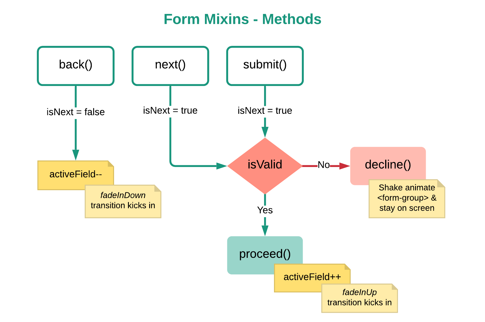
Methods overview in form mixin
isValid is derived from computed property. next and submit methods are similar in nature, while back method only decreases activeField index given it is greater than 0.
After back, next and submit methods are called, isNext is set to true/false to make sure the transition is directed in the accurate direction.
📌 You can view complete formMixin on GitHub.
Vuex
In Vuex store, the state variables need to match with fields defined in the form configuration. We can create the variable one by one, manually in store state. But instead we’ll use form configuration to generate an empty state automatically.
// store/form/lead.js
const state = {
  formData: {}
}
// Use form config to populate empty variables
import formConfig from "../../config/formConfig.json"
formConfig.forEach(field => {
  state.formData[field.name] = ""
})
Above code would generate an empty state variable of object {} type.
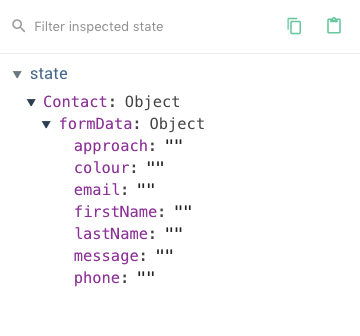
Now every time the user enters any input values, we call a mutation that sends value and key for the field.
// components/FormTemplate.vue
@input= "updateField(
         {key: field.name, value: formData[field.name]}
)"
And updateField mutation will set the value against the correct key in the formData state object.
// store/form/eoi.js
const mutations = {
  updateField(state, payload) {
    state.formData[payload.key] = payload.value
  }
}
This is a single mutation that works for all fields, saving us from a long list of mutations if written for each individual field. And this ties up pretty well with the dynamic component we wrote to render any type of input field. That’s pretty much it for the Vuex.
📌 You can view lead.js store module on GitHub.
More about the form configuration
Form configuration also indicates different options needed by different types of fields. Such as placeholder for text & text-area, selection options for checkbox & radio button, etc.
// config/formConfig.json
// form configuration object with placeholder
   {
    "type": "text",
    ...
    "options": {
      "attrs": {
        "placeholder": "Please enter your given name"
      }
    },
    ...
  },
  {
    "type": "radio",
    ...
    "options": {
      "choices": ["float", "dive", "dip"]
   },
Since not all fields have the same attributes, we need to conditionally bind relevant attributes to the input field. And once again, the ... spread operator will help expand the attributes ( “attrs” ) object. And then we v-bind it in the dynamic <component>.
// form-template.vue
<component :is="InputBox"
           v-bind="{ ...field.options.attrs }"
/>
Unlike placeholder, checkbox and radio buttons have an array of choices for users to make a selection from.
We’ll use conditional binding in combination with double exclamation (!!) to cast the choices values as true or false. Meaning, if choices option is not found, then it won’t be rendered at all. This will make the dynamic Vue component behave consistently for all fields.
// form-template.vue
<component :is="InputBox"
  :options="!!field.options.choices? field.options.choices: false"
/>
📌 You can view complete formConfig on Github.
Validate fields with Vee-Validate
This is one of those details that will change as many times as the client changes their mind. So, it makes sense for validation rules to be within form configuration. We’ll use Vee-Validate library to validate form fields.
// config/formConfig.json
  {
    "type": "text",
    ...
    "validation": "required"
  },
Once we have defined validation rules for each of the fields in form configuration, we will use v-validate directive to invoke them.
<component v-validate="field.validation"
       :data-vv-as="field.label"
       name="field" type="text" />
We’d add :data-vv-as attribute to pretty-up the field name when an error message is shown.
VeeValidate injects a mixin that adds its own computed property called fields, so we must be careful not to name any other computed property or data variable with this name. This fields property is an object that contains state flags for each field in question.
For example, if we want to find whether the field firstName is valid, we can check it by passing the field names as a key into fields.
return this.fields['firstName']
The return statement above returns an object similar to below. I have highlighted some of the flags that you may end up using a lot.
{
  "untouched": true,
  "touched": false,
  "dirty": false,
  "pristine": true,
  "valid": false,
  "invalid": true,
  "validated": false,
  "pending": false,
  "required": true,
  "changed": false
}
These flags are reactive objects. As soon as the user interacts with the field, we can easily check whether that field is valid.
return this.fields['firstName'].valid
// returns true/false
How we retrieve the field name for each field looks a little different in our case. Instead of hard-coding it, we’ll make sure the field name is reactive to activeField and is then fed into the return statement above using a computed property.
Of course, we have all the field names available in the form configuration.
return this.formFields[this.formState.activeField].name
Once we have the acceptable status of an activeField, we can easily move it around the viewport. It all comes down to: What do we want to happen on a screen when the field changes its status?
Based on the interaction requirements:
- slide attempted && valid field upwards
- wiggle field if user input is invalid
- wiggle field if
Nextbutton is clicked with invalid input
Form validation can have a tremendous impact on improving user experience. Various flags of Vee-Validate gives us plenty of opportunities to provide contextual and animated responses using using Vue.js Transitions.
With that, we’ll move onto Vue.js transitions in the next and final section.
Transitions
<transition> or <transition-group> is a wrapper component provided by Vue.js. It basically surrounds any element you wish to conditionally render with animation.
<transition>: for a single element transition — We’ll use this for the error message and Ok button to show/hide usingv-if/v-else<transition-group>: for a multiple elements transition — We use this to transition between each input field
The Vue.js transition component comes with six attributes to intervene in the transition lifecycle, such as:
- enter-class
- enter-active-class
- enter-to-class
- leave-class
- leave-active-class
- leave-to-class
This means we don’t have to reinvent the wheel here. We just have to…
Train our brain to think in terms of data while working with Vue.js transitions because transitions are data-driven.
Let’s think about the activeField and the isNext data property that we have in our app.
- activeField
activeField will help us render only one field at a time.
<div v-if="key === activeField"> ... </div>
Using <transition-group>, we’ll transition between the number of fields found in the form configuration by binding the field group to a dynamic property, activeField.
- isNext
<transition-group name="data-driven-transition"
            appear
            appear-active-class
            :enter-active-class="isNext ? ... : ..."
            :leave-active-class="isNext ? ... : ..."
>
...
</transition-group>
We’ll bind the isNext variable with entering and leaving attributes to change the direction of transition.
In addition, we’ll make use of an additional appear and appear-active-class attributes for the first form-field to appear on initial Render.
I have prepared a minimalist CodePen to demo this.
When transitions are written directly in <template>, they create too much markup. And we’re planning to use transition in three components.
Re-introducing functional components
To abstract away the markup and achieve re-usability, we’ll transform these transitions into functional components. Technically, they’re a function that does a specific thing based on parent component state, without having their own state.
Attributes of the transition component become props when rendered as a functional component.
All attributes of the transition component are treated as props in the functional component. And we can bind values to these attributes as well.
render(h, context) {
    var data = {
      props: {
        appear: true,
        appearActiveClass: "...",
        enterActiveClass:  "...",
        leaveActiveClass:  "...",
        name: "data-driven-transition",
        ...
      }
    }
    ...
  }
Markup required by transition component is now tucked away in the functional component as props.
But how do we provide **isNext** to the functional component?
We provide isNext as a prop from wherever this transition is wrapped.
<data-driven-transition :isNext="isNext">
And then consume isNext in the functional component as props.
  props: {
    isNext: {
      default: true
    }
  }
isNext is then accessed within the functional component via render context, which is the second argument.
export default {
 render(h, context) {
  console.log(context.props.isNext)
 }
}
📌 You can view complete functional components for data-driven-transition and type-based-transition on GitHub.
GSAP or Animate.css?
For a quick turnaround, I have used animate.css — which is CSS animation library. But transitions can be powered by a JavaScript animation library such as GSAP as well.
In that case, all attributes of the transition component will accept JavaScript hooks. And then, you write the GSAP script for each transition hook, such as enter and leave in the example below.
<transition
  v-on:enter="enter"
  v-on:leave="leave"
>
  <!-- ... -->
</transition>
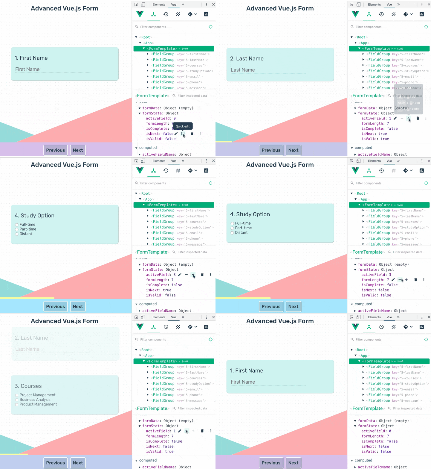
As you can see, it’s all about reactive data! And thinking in terms of data helps create systematic transitions. This 10-second GIF shows exactly how that looks like.
Conclusion
This kind of highly interactive form can be used in many contexts. You could use it as a contact form, a poll, quiz or questionnaire, lead generation, a survey, and so on. Because these forms require significant time commitment from our users, it’s critical to keep the form distraction-free and engaging at the same time. Clean form design can assist users towards completion of our forms. Since all form questions have been spread across multiple slides, the progress bar keeps users in check of their progress, making them feel like they’re making definite progress, and clueing them in to how much more they have left to complete.
We also implemented real-time validation to assure proper responses are received and at the same time allow the user to revisit previous responses in case they wish to change any of them. Validation still works the same when users re-attempt the question.
Frameworks like Vue.js make it possible and exciting to progressively add more features into a project like this over time, and the resulting interactive experience makes the boring process of gathering user-data more engaging and fun!
#vuejs #vue #javascript
