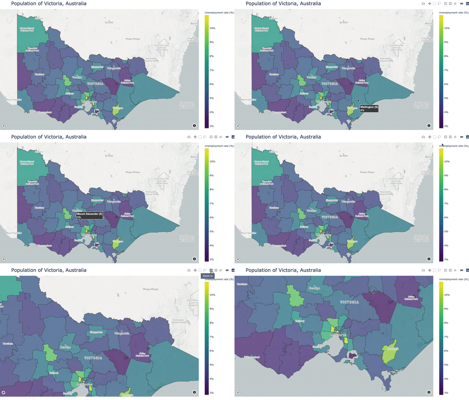
Plotly makes it really easy to display geospatial data in an interactive choropleth map, particularly if your data pertains to the US. Unfortunately, if the location of your data is outside of the US, and more granular than country-level, things get a bit murky. You might feel like the poor cousin when sifting through the depths of Stack Overflow and GitHub Issues to find clues to achieving your mapping goals. I’m here to say I’ve been there, I feel your pain, and there is a solution. Let’s jump in!
Step 1: Get some data to plot
For this tutorial, I’m going to display unemployment data from Victoria, Australia. I got my data from the Australian Bureau of Statistics Stat portal. This portal allows you to select the geospatial granularity of your data. I selected to download “Census 2016, G43 Labour force status by age by sex (LGA)”, where LGA refers to Local Government Area, which is the spatial granularity of the data. Let’s load it in and reshape it a bit:
import geopandas as gpd
	import pandas as pd
	import numpy as np
	import matplotlib.pyplot as plt
	from mpl_toolkits.axes_grid1 import make_axes_locatable
	import plotly.graph_objects as go

	emp_df = pd.read_csv('./data/ABS_C16_G43_LGA_26072020234812892.csv') #read in the data
	emp_df = emp_df[['LGA_2016', 'Labour force status', 'Region', 'Value']] #select only the columns we need
	emp_df['LGA_2016'] = emp_df['LGA_2016'].astype('str') # we will join on this axis, so both dataframes need this to be the same type
	emp_df = emp_df.pivot(index='LGA_2016', columns='Labour force status', values='Value').reset_index().rename_axis(None, axis=1) #pivot the dataframe to make the spatial location the index
	emp_df['percent_unemployed'] = emp_df['Total Unemployed']/(emp_df['Total Unemployed']+emp_df['Total Employed']) #calculate unemployment rate
	emp_df.head()
view raw
choropleth_example1.py hosted with ❤ by GitHub

The column “LGA_2016” is referring to the ID or code for each Local Government Area (LGA). By pivoting the data we’ve created one row, and therefore one unemployment rate, for each LGA. This is important since when we create our map we will need one value for each geospatial area we show.
Step 2: Get geometries corresponding to your data
The key to creating a Plotly choropleth with data outside of the US is to have a GeoJSON with geometries corresponding to your data. While sometimes you may already have a GeoJSON, it’s more likely you’ll have to create one, which is the case for me.
I’m using The Australian Bureau of Statistics again to access geometries of my data in ESRI Shapefile format, via this link (I downloaded “Local Government Areas ASGS Ed 2020 Digital Boundaries in ESRI Shapefile Format”). This format can be loaded in to Python using Geopandas, by pointing it at the ‘.shp’ file:
lga_gdf = gpd.read_file('./data/1270055003_lga_2020_aust_shp/LGA_2020_AUST.shp') #load the data using Geopandas
	lga_gdf = lga_gdf[lga_gdf['STE_NAME16']=='Victoria'] #Select the data for the state of Victoria
	lga_gdf['LGA_CODE20'] = lga_gdf['LGA_CODE20'].astype('str') # we will join on this axis, so both dataframes need this to be the same type
	lga_gdf.head()
view raw
choropleth_example2.py hosted with ❤ by GitHub

Now we can see that both the data frames have a column containing a code for each LGA, which is what we will be joining on. Each row also has a “geometry” value, which is the geospatial outline of the LGA.
**Side note: **For plotting of Australian data the ABS will be your best bet for acquiring a shape file. I’m not as well versed in data for other countries (please leave a comment if you know of websites providing geo data from your country), but if you’re stuck http://www.diva-gis.org/gdata contains shape files, free to download, for most countries.
#data-science #python #programming #data #data-visualization #data analysisa
