Creating layouts with normal flow, positioning, and floats is possible, but not very user-friendly for developers. That’s where flexbox comes in to help. With flexbox it’s possible to build much more complex layouts than by just using normal flow, positioning, and floats. Flexbox allows developers to manage tricky layouts such as vertical and horizontal alignment and gain precise control over spacing and sizing of layout elements.
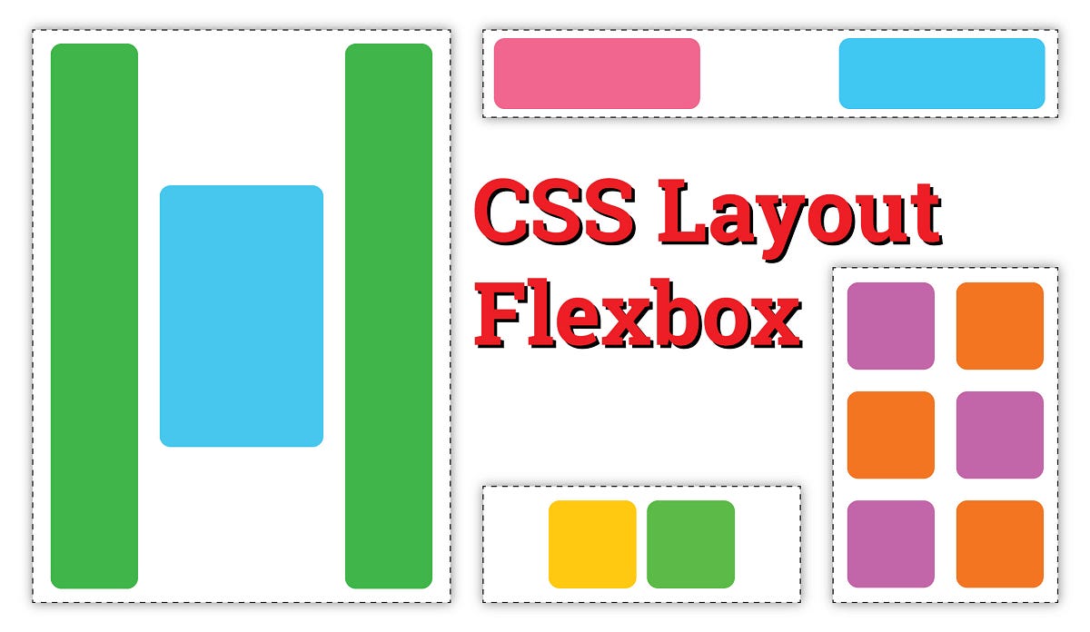
CSS Layout — Flexbox
The Flex Model
Flexbox is built upon use of several key concepts.
- Flex Container — has
display: flexapplied and is the parent element that encompasses all elements displayed with a flexbox layout. - Main Axis — runs in the direction that flex items are laid out and has a main start and main end for the start and end of the axis.
- Cross Axis — runs perpendicular to the main axis and has a cross start and cross end for the start and end of the axis.
- Flex Items — elements laid out inside the flex container are called flex items.
Implementation
To designate a flex container, the element uses the css entry display: flex.
The parent or flex container also specifies if the flex container will make use of a row or column layout. This is done using the flex-direction property.
Wrapping Flex Items
Flex items will display as a row or column and use up as much space as needed to fit all the items into the row. This works okay when there are few items, but causes problems when items begin to overflow their containers or stretch the page display beyond the browser maximum width. To handle this type of situation, there is a property called
flex-wrapthat will wrap content within a flex container that is to large for the height or width of the container.
#flexbox #css #layout