Exploring racial segregation with Schelling’s spatial proximity model
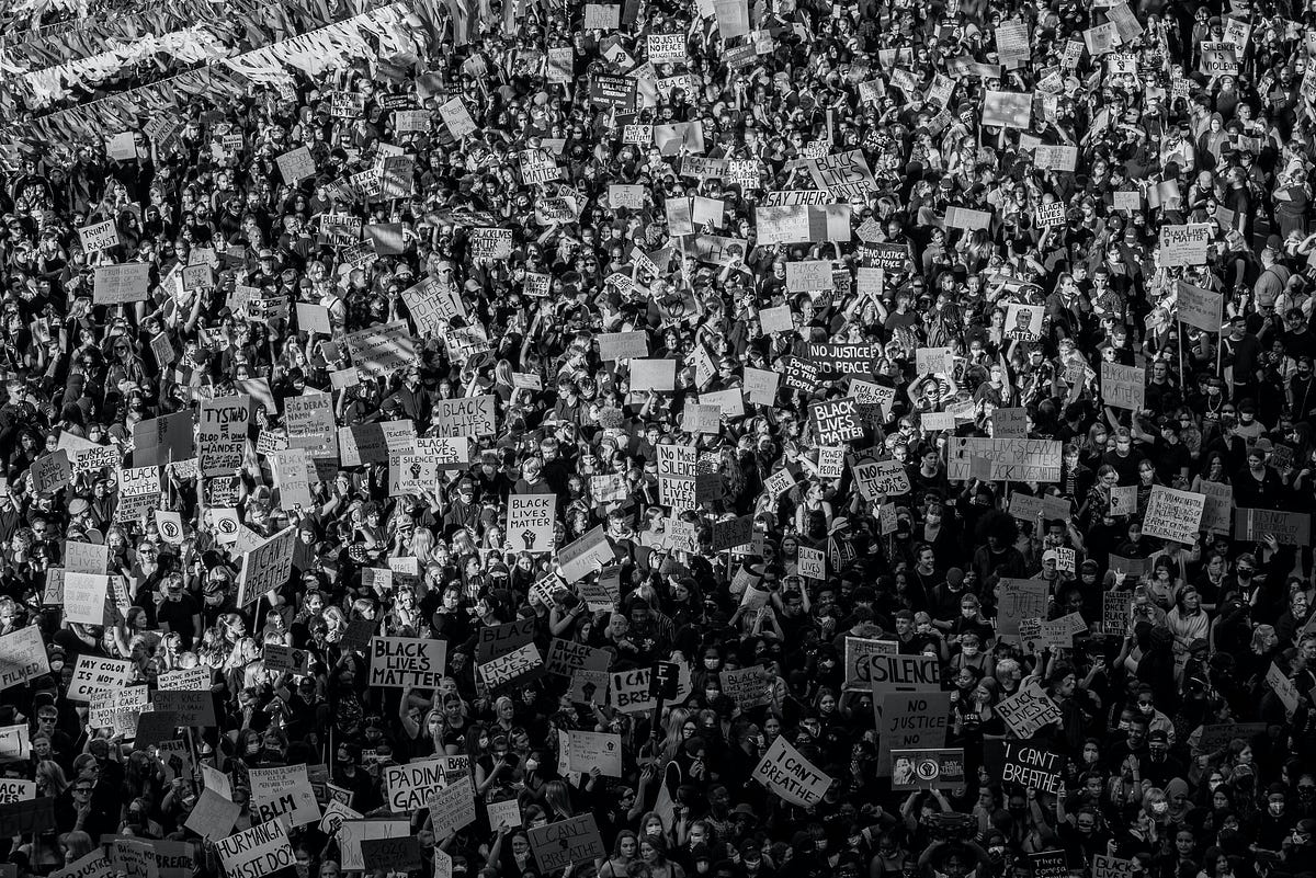
Even as the pandemic is sweeping around the world, the underlying tensions within the racial inequality and divide in US has bubbled over due to the killing of George Floyd. I have regularly read about the appalling things that black people in the US have to deal with, but the explosive reaction to the incident took me by surprise, even though on hindsight, it shouldn’t have.

Photo by Teemu Paananen on Unsplash
The tensions have been simmering for a long time. Despite being considered one of the more racially tolerant countries in the world, racial segregation has been very indicative of how deep the divide is.
In 2009, radical cartographer (I admit these 2 words don’t come easily together for me) Bill Rankin came up with a startling map that showed how racially segregated Chicago is.
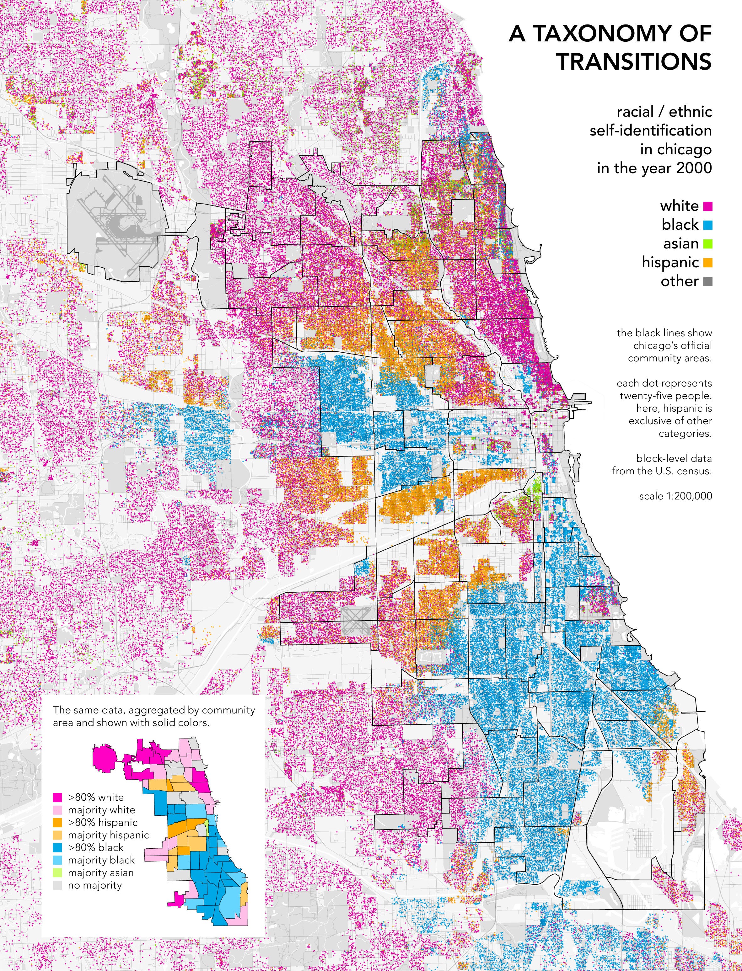
A taxonomy of transitions (credits: Bill Rankin http://www.radicalcartography.net/index.html?chicagodots)
His work amazed and subsequently inspired quite a few people. This include Eric Fisher who soon after came up with a photoset of many other US cities that showed Chicago wasn’t so unique after all.
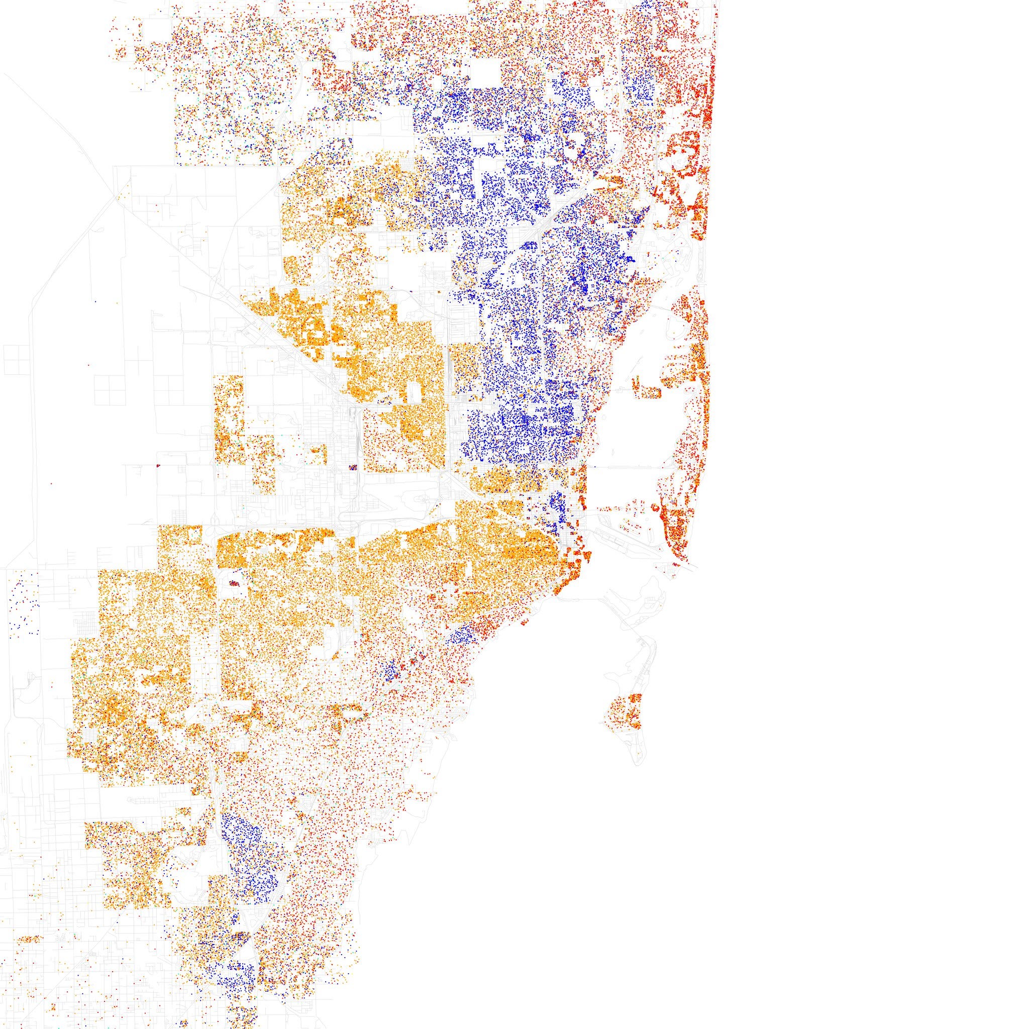
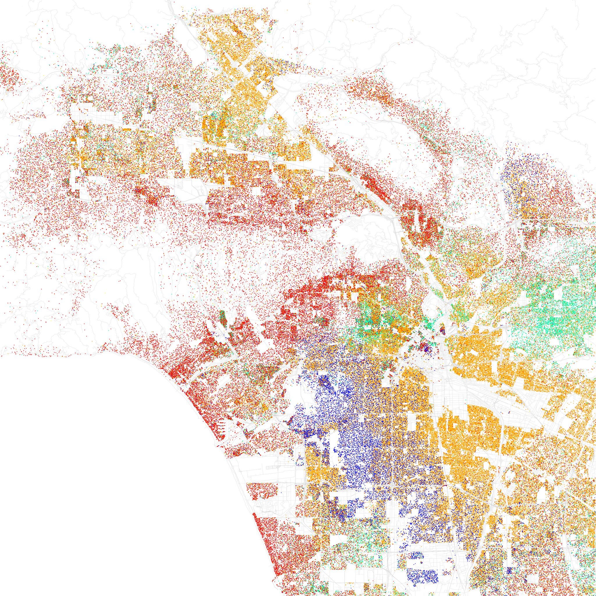
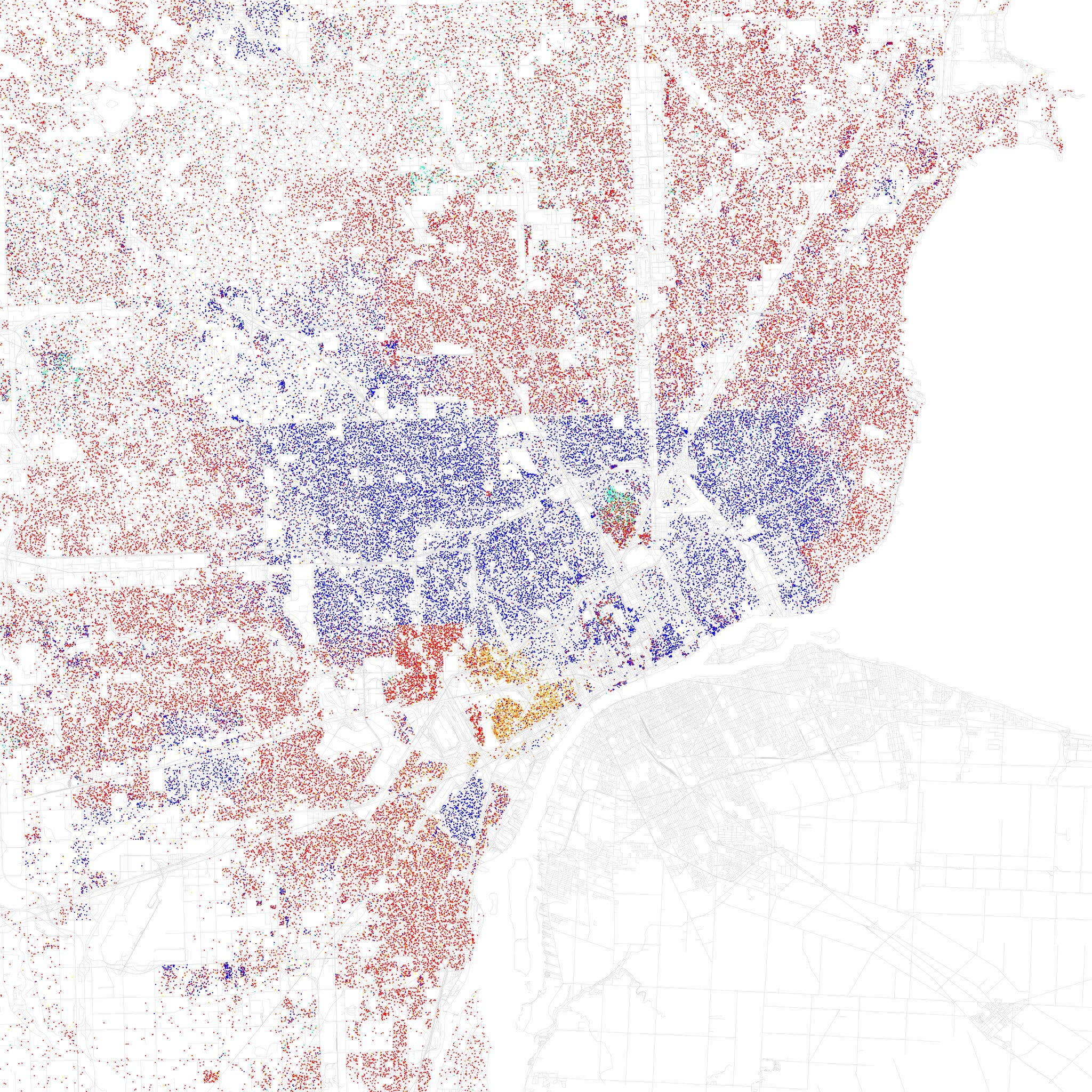
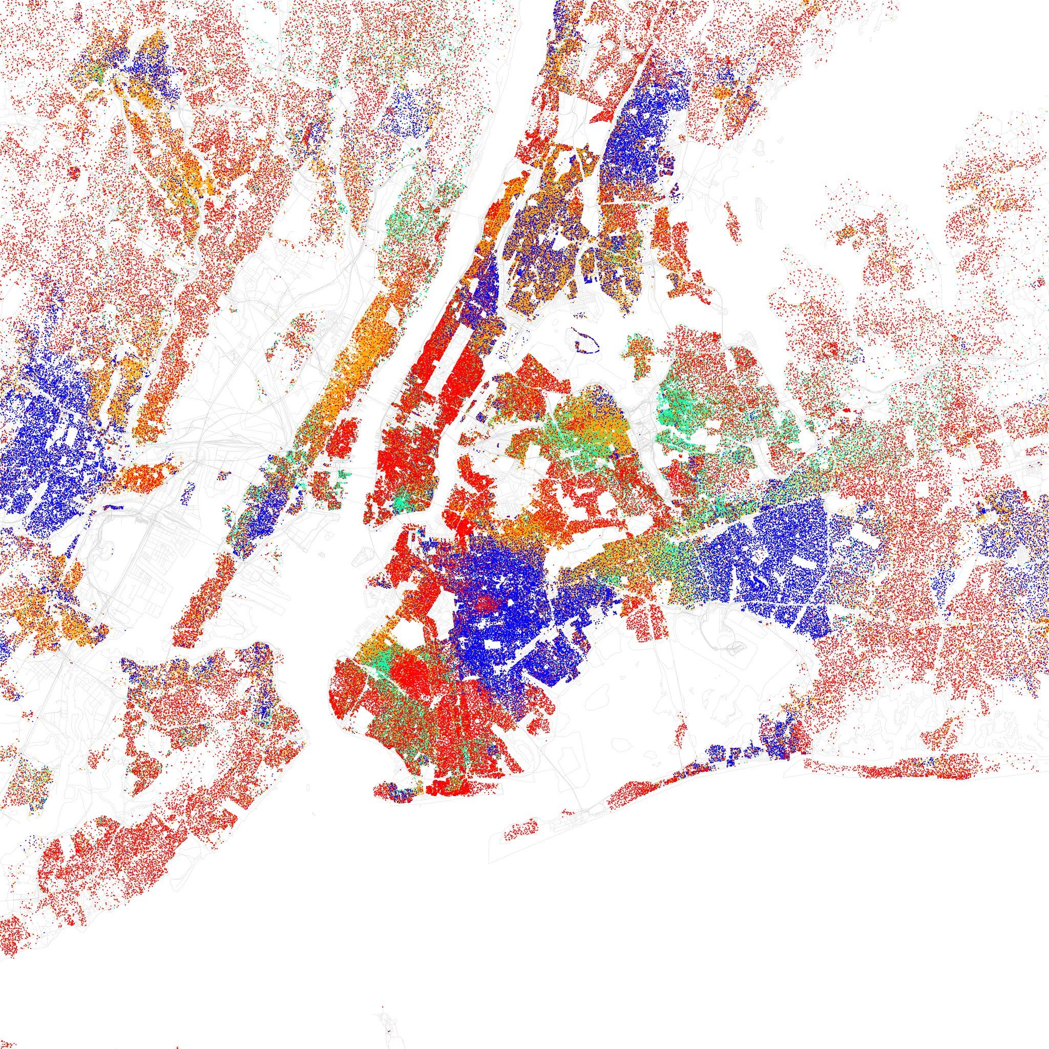
From top left to bottom right: Miami, Los Angeles, Detroit, New York (credits: Eric Fisher https://www.flickr.com/photos/walkingsf/sets/72157626354149574/with/5560490330/)
This has obviously been going on for some time and shouldn’t come as a surprise to anyone, though the visualization is quite startling. With such sharp segregation, it’s no wonder eventually something will blow up.
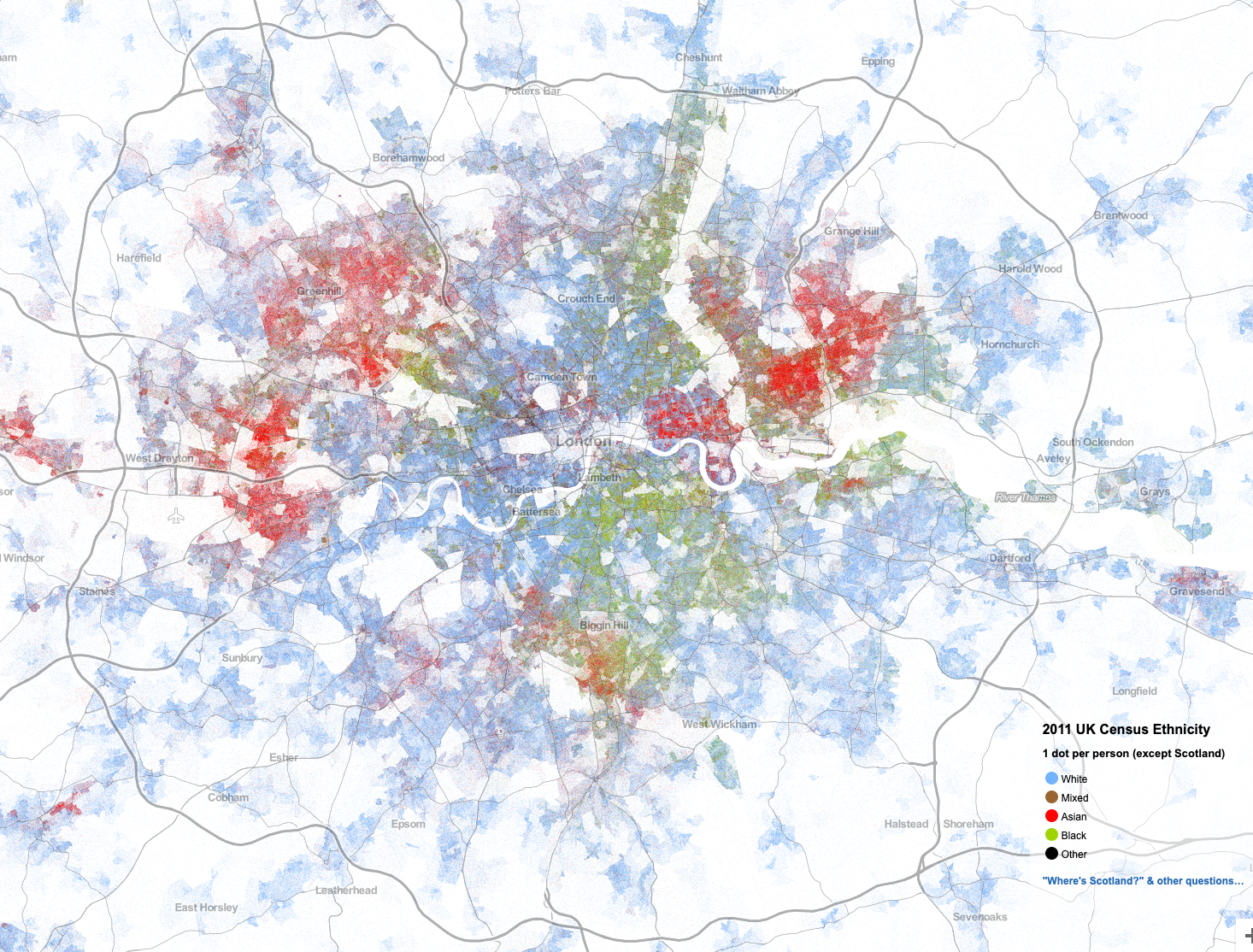
But is it only something in US? Actually no, this really isn’t unique to US after all, here’s a similar map done by Andrew Whitby for London (UK, except Scotland actually).
#go #blacklivesmatter #simulation #george-floyd #racial-segregation