Web sites, publications and news sources all have their own styles. Take a look at the financial data published by, say, the BBC or The NewYork Times. Or polling data on Nate Silver’s FiveThirtyEight web site. They each have a clear and consistent look.
We are going to look at how we can achieve something similar with our Pandas charts and plots. First, by using the built-in styles that are available to us and then by looking at how we can create our own customizations.
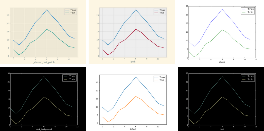
The default style renders a line graph like the image, below. It’s a clean looking image but there are several more built-in styles, if you prefer something different.
#python #pandas #programming #matplotlib #data-visualization
1.25 GEEK