Using data to inform decisions is essential to product management, or anything really. And thankfully, we aren’t short of it. Any online application generates an abundance of data and it’s up to us to collect it and then make sense of it.
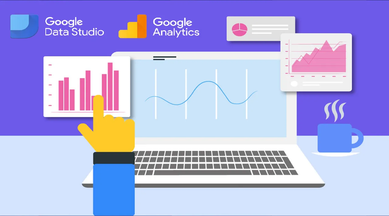
Google Data Studio helps us understand the meaning behind data, enabling us to build beautiful visualizations and dashboards that transform data into stories. If it wasn’t already, data literacy is as much a fundamental skill as learning to read or write. Or it certainly will be.
Nothing is more powerful than data democracy, where anyone in your organization can regularly make decisions informed with data. As part of enabling this, we need to be able to visualize data in a way that brings it to life and makes it more accessible. I’ve recently been learning how to do this and wanted to share some of the cool ways you can do this in Google Data Studio.
#google-data-studio #blending-data #dashboard #data-visualization #creating-visualizations #how-to-visualize-data #data-analysis #data-visualisation