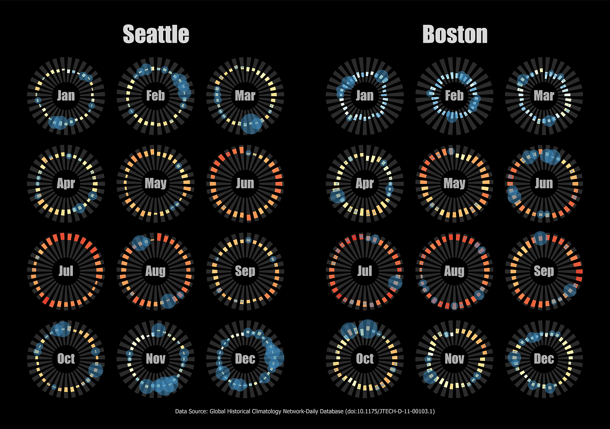
Data visualisation is an area where experimentation is rewarded. It is important to be able to rapidly prototype ideas when creating charts. It is easy to think up of impressive ways of building a graph to show a trend in a data set only to find out that, once created, it simply does not work as expected.
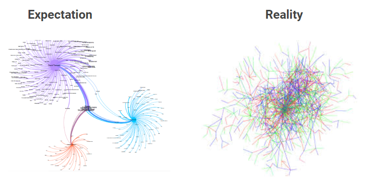
Even well thought out charts can turn into a mess when real data is added
Whilst open source tools such as Python and R have a large number of packages to support the creation of charts and graphs, iterating with code can be slow and introduces a steep learning curve. Given that visualisation of data is normally only a small part of a data scientist’s workflow, spending time understanding the specifics of a visualisation library can be painful.
Charticulator
The Charticulator platform not only enables charts to be created from data using a simple drag-and-drop interface, it enables full customisation of the elements within charts in the same way. The platform is open source (MIT license, source code here).
The way that all of the chart attributes can be built from data allows for almost anything to be created. When using the platform you can concentrate more on bringing your data to life than on the process of doing so.
#visualization #data-visualization #power-bi #data-science