Build a Custom React Carousel Component with Hooks
Learn how to build a custom React carousel component using Hooks. This tutorial will show you how to use Hooks to create a reusable and efficient carousel component that you can use in your own React projects.
One of the problems in web development today is the entangling of different layers. Not only do we face strong coupling to multiple dependencies, but we also wire logical code directly to some styling or presentation layer. The end result may still be easier to reuse than similar code some years ago, but it is definitely more difficult to reuse than it should be.
In this article, we look at implementing a carousel that tries to simplify the entanglement by using React Hooks.
Contents:
- Carousel implementations in React
- What are React Hooks?
- Understanding the essential state of a carousel
- Desired carousel behavior
- Implementation of the carousel state using React Hooks
use-carousel-hook
Carousel implementations in React
Looking at the situation for available carousel implementations in the React space can be daunting. There are quite a lot, and each one makes different promises. There are many that are quite old, while others are super popular, and some come with many dependencies. However, what they all have in common is that they are opinionated about presentation and styling.
In our case, we don’t want that. We already have a style in mind, and we want to reuse the same carousel with different styles — not only to choose, for example, different colors for some arrows, but in fact to choose whether we use arrows at all. Ideally, the whole usage of the component is up to the user. In the end, we decided to go for our own implementation using React Hooks.
What are React Hooks?
React Hooks have been introduced to simplify code reuse. One reason why the React team introduced Hooks is to get rid of class components, which require a higher degree of knowledge in JavaScript, plus introduce a higher risk of bugs. The core reason is the correct understanding of this in JavaScript, which is everything but intuitive for people coming from other languages.
In JavaScript, this is context-bound and not instance-bound. If, for example, a method is passed on as a callback, it loses its context. If the method is then called like a function, the context will be undefined. As such, in order to avoid this scenario, the this context has to be captured in the method. This can be done either by wrapping the method (() => f()), using a field with an arrow function instead (f = () => {}), or using a bound version of it using bind (f = f.bind(this)).
Another reason for introducing Hooks is the ability to reuse code that deals with the component’s state and lifecycle more easily. Previously, we had mixins for React class components, but they had quite a few problems and did more harm than good. The core issue here was that mixins still operated on the different lifecycle functions individually. They also just operated within the class components instance, meaning the probability that different mixins step on each other’s toes (e.g., by overwriting variables) was quite high.
By using React Hooks, we can separate complicated behavior from their representation quite easily. As a result, code may read like this:
const MyCarousel = ({ slideTime }) => {
  const carouselBehavior = useCarousel(slideTime);
  return <div className="my-carousel">...</div>;
};
Even though there is a variety of core Hooks, the most interesting ones are useState (creates or gets a state cell) and useEffect (gives us the ability to execute a side effect depending on some conditions). Once state gets complicated, useReducer may also be handy.
The flow (or lifecycle) of Hooks can be best summarized by the following diagram:
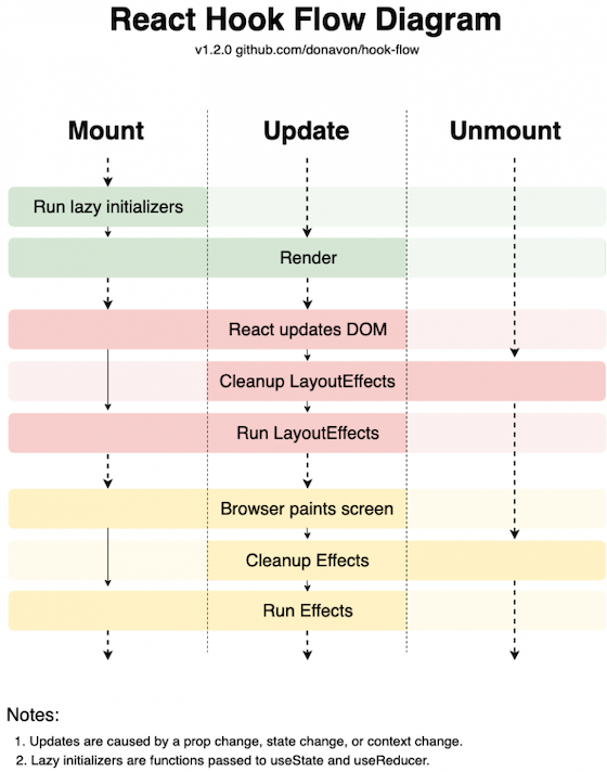
React Hooks are simple functions that work in conjunction with the React dispatcher. As such, they need to be called at rendering time (of the respective component), and they have to appear in the same order. One consequence is that React Hooks should never be inside a condition or loop. Also, they can only be used by functional components.
Understanding the essential state of a carousel
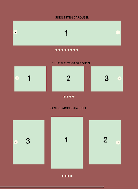
A carousel is a UI component that uses a single view to show multiple items. The items are shown in the view by rotation. Some carousels allow the rotation to be time-triggered; others allow user interaction with bullet points (free navigation) or arrows (forward or backward). On mobile, a popular pattern is swiping to go forward or backward:
The essential state of a carousel can thus be written as:
const [current, setCurrent] = React.useState(0);The result of calling the useState Hook with the initial value is a tuple (i.e., an array with a fixed number of items) containing the current value and a callback for changing the current value. Here, a tuple simplifies the custom naming for us.
If we want to bring in auto-rotation after a certain time (time, given in milliseconds), we could do:
React.useEffect(() => {
  const next = (current + 1) % slides.length;
  const id = setTimeout(() => setCurrent(next), time);
  return () => clearTimeout(id);
}, [current]);
The number of slides is determined by slides.length. Due to the modulo operation, we ensure that the current slide is always between 0 (inclusive) and the number of slides (exclusive).
Interestingly, we can use the second argument of useEffect to determine when the side effect has to be triggered. By setting an array to current, we tell React to dispose the previous effect (effectively calling clearTimeout), if any, and run it again.
Naturally, we therefore reset the clock on manual user interaction (going anywhere, e.g., forward) and otherwise have an effect similar to setInterval, but easier to control and much more compliant to the core ideas of React Hooks.
Desired carousel behavior
Because we already have two potential building blocks for our carousel — and, frankly, two building blocks that could be sufficient for a very simply carousel implementation — let’s look at what behavior we want to have.
Obviously, our carousel should be capable of auto-rotating. For this, we’ll need an effect such as the one introduced earlier. However, in addition, users should be capable of dragging the current slide forward or backward. This should all run smoothly, empowered by some CSS animation. When the user starts dragging, the auto-rotation should be reset.
To distinguish between the different modes, we introduce the following state variables, which are in many cases set jointly:
const initialCarouselState = {
  offset: 0,
  desired: 0,
  active: 0
};
The offset is relevant for managing the user’s current dragging efforts. Likewise, desired and active are necessary to indicate the currently active slide versus the slide to which we actually want to go. The two are different in case of an ongoing transition.
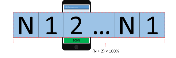
Our requirements with the dragging and smooth scrolling requires us not to have N slides (or “images”) in the rotation, but actually N + 2. What we require under the hood should look like this:

While we start at the usual first slide, we had to insert one slide beforehand (real index 0, referring to the last Nth slide). This pseudo-slide will be used when we swipe left or would go left. Note, however, that once we reach this slide, we will reset the offset to the real slide (without any transition).
Once we are “inside” the deck of slides, there is no problem with going either forward or backward:
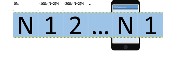
The same problem as on the first slide can also be seen on the last slide. In this case, it’s not the going backward (swiping to the right) that is problematic, but the going forward (swiping to the left). Again, our solution is to insert a pseudo-slide (real index N+1), this time referring to the first slide.
Keep in mind that while the visible container will be set to overflow: hidden, the inner container will expand beyond the screen. Thus, the width of this container will actually be (N + 2) * 100% with respect to the visible (carousel) container.
Nevertheless, the transitions inside the inner container refer to the width of the inner container. As such, while the width of the inner container may be, for example, 500% (for three slides), a translation from one slide to the other will always be less than 100 percent. Because the minimum number of slides is three (a single real slide with two pseudo-slides — referring to the same slide), the maximum size of the translation is 33 percent. For eight real slides (i.e., 10 slides in total), we get a shift between transitions of 10 percent.
Implementation of the carousel state using React Hooks
Because the state variables are used jointly, we should use the useReducer Hook. A possible implementation based on the carousel state as described earlier looks like:
function carouselReducer(state, action) {
  switch (action.type) {
    case "jump":
      return {
        ...state,
        desired: action.desired
      };
    case "next":
      return {
        ...state,
        desired: next(action.length, state.active)
      };
    case "prev":
      return {
        ...state,
        desired: previous(action.length, state.active)
      };
    case "done":
      return {
        ...state,
        offset: NaN,
        active: state.desired
      };
    case "drag":
      return {
        ...state,
        offset: action.offset
      };
    default:
      return state;
  }
}
Using carouselReducer is as simple as writing:
const [state, dispatch] = useReducer(carouselReducer, initialCarouselState);Introducing advanced touch gestures (swiping) can be done via a library (react-swipeable). This library already gives us a Hook:
const handlers = useSwipeable({
  onSwiping(e) {
    dispatch({
      type: "drag",
      offset: -e.deltaX
    });
  },
  onSwipedLeft(e) {
    const t = threshold(e.event.target);

    if (e.deltaX >= t) {
      dispatch({
        type: "next",
        length
      });
    } else {
      dispatch({
        type: "drag",
        offset: 0
      });
    }
  },
  onSwipedRight(e) {
    const t = threshold(e.event.target);

    if (-e.deltaX >= t) {
      dispatch({
        type: "prev",
        length
      });
    } else {
      dispatch({
        type: "drag",
        offset: 0
      });
    }
  },
  trackMouse: true,
  trackTouch: true
});
The returned value are the handlers that can be attached to any container for following the drag operation. The threshold can be set to any value. In this implementation, we set it to a third of the container’s width (obtained via e.event.target).
In other words, in the previous code, we distinguish between the following cases:
- A
dragoperation is currently ongoing, and we need to reflect the current progress in the state - A
dragoperation was finished successfully, and we need to go to the next or previous slide - A
dragoperation was finished without succeeding — now we should reset the offset
The whole state machinery is assisted by useEffect to get the timing right:
useEffect(() => {
  const id = setTimeout(() => dispatch({ type: "next", length }), interval);
  return () => clearTimeout(id);
}, [state.offset, state.active]);

useEffect(() => {
  const id = setTimeout(() => dispatch({ type: "done" }), transitionTime);
  return () => clearTimeout(id);
}, [state.desired]);
As noted earlier, the first useEffect is responsible for the auto-rotation. The only difference to the code presented earlier is the use of another dependency for triggering/disposing the rotation. Due to our requirements, we also introduced the offset. Thus, if a dragging operation is ongoing, we will not trigger the auto-rotation.
The second useEffect will be necessary to finally set the active state to the desired one. Because we use a CSS transition, we are not controlling the transition from JS. As such, a timeout with the same time needs to be present to help us.
For the transitions, we set the following constants:
const transitionTime = 400;
const elastic = `transform ${transitionTime}ms cubic-bezier(0.68, -0.55, 0.265, 1.55)`;
const smooth = `transform ${transitionTime}ms ease`;
The elastic transition is used to indicate a “bounce-back” when dragging the current slide was insufficient for moving forward or backward. The smooth transition is our preference when we are moving to another slide.
Finally, one use of the useCarousel Hook can look as follows:
export const Carousel = ({ slides, interval = 5000 }) => {
  const length = slides.length;
  const [active, setActive, handlers, style] = useCarousel(length, interval);

  return (
    length > 0 && (
      <div className="carousel">
        <ol className="carousel-indicators">
          {slides.map((_, index) => (
            <li
              onClick={() => setActive(index)}
              key={index}
              className={`${active === index ? "active" : ""}`}
            />
          ))}
        </ol>
        <div className="carousel-content" {...handlers} style={style}>
          <div className="carousel-item">{slides[slides.length - 1]}</div>
          {slides.map((slide, index) => (
            <div className="carousel-item" key={index}>
              {slide}
            </div>
          ))}
          <div className="carousel-item">{slides[0]}</div>
        </div>
      </div>
    )
  );
};
Note that we introduced the two duplicates as described in the behavior section; the first carousel item (referring to the last slide) and the last carousel item (referring to the first slide) are there to enable continuous dragging, yielding a periodic experience (as expected by a carousel, i.e., a round object with a certain periodicity).
The exact style — such as where the indicators are, or whether we use indicators at all — is fully determined by us. The presentation is also decoupled from the behavior logic. We only receive the style that manages or determines the transition display logic. Likewise, we received handlers to be attached where we see the point of interaction.
use-carousel-hook
The main purpose of this article was to implement a highly configurable, unopinionated, and reusable carousel component that gave the users all the powers to build their own carousel. By the time of this update, a new hook had been published which has all that and is easy to integrate and use. In this section, we will quickly see how to use this hook: use-carousel-hook.
use-carousel-hook is a new React hook used to create configurable sliding carousels. Just like our own hook above, the style is fully determined by the user, and it also returns functions to integrate into your slider to give full flexibility and control over the carousel you create.
These are the functions:
import { useCarousel } from 'use-carousel-hook';
const { ref, previous, next, setCurrent, reset } = useCarousel();
The ref is to be attached to the carousel container containing the carousel elements. The previous and next are for navigating to the previous or next element in the carousel. You can also set amount to decrease/increase; the default is 1. setCurrent is used to jump to a particular element and can be helpful when you want to show multiple elements at once. And of course, reset is to go back to the beginning of the carousel.
The code below shows the functions in action:
      return (
        <div>
            <button onClick={() => previous()}>Previous</button>
            <button onClick={() => previous(2)}>Go back 2 items</button>
            <button onClick={() => next()}>Next</button>
            <button onClick={() => next(2)}>Go forward 2 items</button>
            <button onClick={() => reset()}>Reset</button>
            <button onClick={() => setCurrent(2)}>Set index to 2</button>
            <ul ref={ref} className="carousel__list">
                <li className="carousel__item">
                  <img src='https://picsum.photos/200' alt=''/>
                </li>
                <li className="carousel__item">
                  <img src='https://picsum.photos/201' alt=''/>
                </li>
                <li className="carousel__item">
                  <img src='https://picsum.photos/202' alt=''/>
                </li>
                <li className="carousel__item">
                  <img src='https://picsum.photos/203' alt=''/>
                </li>
            </ul>
        </div>
    );
And a little styling:
.carousel__list {
  display: flex;
  list-style: none;
  padding: 0;
  padding: 1rem 0 0;
  overflow: hidden;
  position: relative;
  width: 75vw;
  margin: 0 auto;
  max-width: 50rem;
}

.carousel__item {
  flex: 0 0 auto;
  width: 100%;
  padding: 0;
  margin: 0;
}
As you can see, this library is very similar to what we implemented and lets the user handle how the carousel looks while providing the core functionalities of a carousel. This is the CodeSandbox for a closer look.
Conclusion
Using React Hooks, we can come one step closer to reusable pieces of software. In the given example, we constructed a fairly complicated UI component that is capable of being reused in many forms. The full code is available at GitHub.
Maybe the useLayoutEffect would have been even better. I am not fully sure yet, but my first tests indicate that useEffect is good enough. What are your thoughts and preferences? Where do you see Hooks shine? I would love to hear what you think in the comments!
Source: https://blog.logrocket.com
#react #reactjs #reacthooks