Exploratory data analysis’ is an attitude, a state of flexibility, a willingness to look for those things that we believe are not there, as well as those we believe to be there.
Introduction
These words are believed to belong to a prominent American mathematician — John Tukey. He played a key role in the development of statistics due to his contributing dozens of brilliant ideas related to the ways of **collecting **and **analyzing **data. On top of that, he first introduced the ‘Exploratory data analysis’ (EDA) term.
Let’s take a look at the meaning that is hidden behind this term.
What is EDA
The **Exploratory Data Analysis **(EDA) is a set of approaches which includes univariate, bivariate and multivariate visualization techniques, dimensionality reduction, cluster analysis.
The *main goal *of EDA is to get a full understanding of the data and draw attention to its most important features in order to prepare it for applying more advanced analysis techniques and feeding into machine learningalgorithms. Besides, it helps to generate hypotheses about data, detect its anomalies and reveal the structure.
You should never neglect data exploration — skipping this significant stage of any data science or machine learning project may lead to generating inaccurate models or wrong data analysis results.
During exploring, you should look at your data from as many angles as possible since the devil is always in the details.
What EDA techniques are used
The g*raphical techniques *are the most natural for the human mind, therefore, plotting shouldn’t be underestimated. These techniques usually include depicting the data using box and whisker plots, histograms, lag plots, standard deviation plots, Pareto charts, scatter plots, bar and pie charts, violin plots, correlation matrices, and more.
Motivation
The goal of this tutorial is to share my experience of exploring and visualizing the data before starting a predictive analytics project. I hope to inspire you to get insights into data as well as Tukey encouraged statisticians to pay more attention to this approach.
Step 1. Define your objectives
Before starting a new data visualization project, it’s crucial to understand your long-term goals.
Today we’ll be working with the Medical Appointment No Shows dataset that contains information about the patients’ appointments.
Each patient’s record is characterized by the following features:
- PatientID — a unique identifier of a patient
- AppointmentID — a unique identifier of an appointment
- Gender
- ScheduledDay — a day when an appointment is planned to occur.
- AppointmentDay — a real date of an appointment
- Age — a patient’s age.
- Neighborhood — a neighborhood of each patient
- Scholarship — Does the patient receive a scholarship?
- Hypertension — Does the patient have hypertension?
- Diabetes
- Alcoholism
- Handicap
- SMS_received — Has the patient received an SMS reminder?
- No_show — Has the patient decided not to show up?
We aim to understand **why **people who receive treatment instructions do not show up at the next appointment time. In other words, what are the contributing factors for missing appointments?
But this is the long-term goal. Before digging deeper, we should try answering the following questions:
- What is the ratio of people who miss appointments to those who don’t?
- Who don’t show up more often — men or women?
- What is the most popular month/day/hour for not showing up?
- What is the age distribution of patients?
This list is not complete — you can extend it with additional questions that come to your mind during the analysis.
Prepare your workspace
In this tutorial, we’ll try visualizing data in Python. I assume you know how to work with basic Python libraries. Let’s import the ones we’ll need for working with the data:
We’ll use Plotly as a primary charting library. It’s an open-source Python package that extends the functionality of d3.js and stack.gl and offers sophisticated charts which can meet the requirements of any project. Being high-level, Plotly is more convenient to work with, and for this reason, I prefer it to matplotlib.
Another thing for which I admire Plotly is its **interactivity **of exploring data with charts.
We’ll use it offline so as not to create an account and be limited in attempts to build charts.
Reading the data
After you’ve downloaded the data from Kaggle, the next step to take is to build a pandas DataFrame based on the CSV data. Here is a tutorial which will make you comfortable with working with pandas.
Let’s remove some columns that we will not need so as to make data processing faster:
Profiling the data
Before cleaning the data, let’s check the quality of the data and data types of each column.

Information about the dataframe
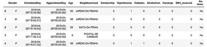
Here you can also check the number of memory used by the dataframe.Use head() method to display the first five rows of the dataframe:
Check the overall number of samples and features by using .shapeattribute:
We have 110527 records and 12 features.
Cleaning & preparing the data
*Cleaning the data is an art *that should be mastered in the first place before starting any data science or machine learning project. It makes data easier to investigate and build visualizations around.
After you’ve checked the data types of features, you may have noticed that ScheduledDay and AppointmentDay features have an object data type.
To make dealing with date features easies, let’s convert the type of ‘ScheduledDay’ and ‘AppointmentDay’ to datetime64[ns]. You need this to get access to useful methods and attributes.
Another way is to convert types of columns while reading the data.
To do this, pass a list of columns’ names which should be treated as date columns to parse*dates parameter of read*csv method. This way they will be formatted in a readable way:
Also, it’s a good idea to convert string data types to categorical because this data type helps you save some memory by making the dataframe smaller. The memory usage of categorical variables is proportional to the number of categories + the length of the data.
Also, a categorical column will be treated as a categorical variable by most statistical Python libraries.
Sometimes the data can be inconsistent. For example, if an appointment day comes before the scheduled day, then something is wrong and we need to swap their values.
Prettify the column names
You may have noticed that our features contain typing errors.
Let’s rename misspelled column names:
Optionally, you can rename “No-show” column to “Presence” and its values to ‘Present’ and ‘Absent’ so as to avoid any misinterpretation.
Now that our dataset is neat and accurate, let’s move ahead to extending the dataset with new features.
Feature engineering
We can add a new feature to the dataset — ‘Waiting Time Days’ to check how long the patient needs to wait for the appointment day.
Another new feature may be ‘WeekDay’ — a weekday of an appointment. With this feature, we can analyze on which days people don’t show up more often.
Similarly, add ‘Month’, ‘Hour’ features:
Dealing with missing values
Let’s check whether there are null values in each column in this elegant way:

Alternatively, if you want to check an individual column for the presence of null values, you can do it this way:
We are lucky — there are no null values in our dataset.
Still, what are the strategies to address missing values?
Analyzing existing techniques and approaches, I’ve come to the conclusion that the most popular strategies for dealing with missing data are:
- Leaving them as they are.
- Removing them with
dropna(). - Filling NA/NaN values with
fillna(). - Replacing missing values with expected values (mean) or zeros.
- Dropping a column in case the number of its missing values exceeds a certain threshold (e.g., > 50% of values).
Exploring the dataset
Once you’ve cleaned the data, it’s time to inspect it more profoundly.
Perform the following steps:
- Check unique values in all the columns

- Take a look at basic statistics of the numerical features:

Plotting data
- Check patients distribution by gender.
The best charts for *visualizing proportions *are pie, donut charts, treemaps, stacked area and bar charts. Let’s use a pie chart:
- Check how many people didn’t show up at the appointment date:
It’s clear that only 20.2% of patients didn’t show up while 79.8% were present on the appointment day.
- Measure the variability of the
Agedata.
A **box & whiskers plot **handles this task best:
With this interactive plot, you can see that the middle quartile of the data (median) is 37.
That means that 50% of patients are younger than 37 and the other 50% are older than 37.
Upper quartile means that 75% of the age values fall below 55. Lower quartile means that 25% of age values fall below 18.
The range of age values from lower to upper quartile is called the interquartile range. From the plot, you can conclude that 50% of patients are aged 18 to 55 years.
If you take a look at whiskers, you’ll** find **the greatest value (excluding outliers) which is 102.
Our data contains only one outlier — a patient with age 115. The lowest value is 0 which is quite possible since the patients can be small children.
Another insight this plot allows to get is that the data is clearly positively skewed since the box plot is not symmetric. Quartile 3 — Quartile 2 > Quartile 2 — Quartile 1.
- Check the interquartile ranges of the age of those people who show up and those who don’t.
For this, we can use the same box plot but it’s grouped by “Presence” column.
- Analyze the age ranges of men and women:
- Check the frequency of showing up and not showing up by gender
- On which weekdays people don’t show up most often:
You can see that people don’t show up mostly on Tuesdays and Wednesdays.
What’s next
Possible techniques that can be applied to this data later:
- Unsupervised ML techniques, namely KMeans clustering or hierarchical clustering (but don’t forget to scale the features!). Clustering may help to learn what are groups of patients that share common features.
- Analyze which variables have explanatory power to the “No-show up” column.
Bringing it all together
That’s it for now! You’ve finished exploring the dataset but you can continue revealing insights.
Hopefully, this simple project will be helpful in grasping the basic idea of the EDA. I encourage you to try experimenting with data and different types of visualizations to figure out what is the best way to get the most of your data.
#python #data-science