Colors are the most important factor in charts to make them more visually appealing. So, always choose a good set of eye-catching colors that will highlight your story for the user. The following tips in this blog post will convey various factors to take into consideration and common mistakes we often make while choosing the colors in a palette.
I have used the Syncfusion Flutter Charts widget to illustrate the tips in this post. But they are not limited to Flutter charts and are applicable to charts in any other platform as well.
Tip #1: Choose a color palette
You should choose a color palette based on the type of data you have. Color palettes can be commonly divided into three categories:
- Qualitative palette
- Sequential palette
- Diverging palette
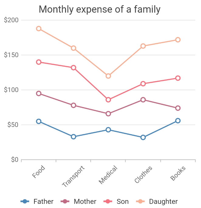
Qualitative palette: This can be preferred when your data has different sets. For example, we can consider the case-multiple series, in which one series of data points does not rely on another series of data points. For this scenario, qualitative palettes are highly suitable.
The Flutter Charts palette colors can be changed by specifying values to the palette property. Refer to the following code example.
[Dart]
SfCartesianChart(
 palette: <Color>[Colors.grey, Colors.green]
  //...
)
Sequential palette: As the name implies, sequential palettes are meant to have sequential colors in the palette. The hue is the same, but the intensity and brightness of the color differs. For example, forming a color palette with light green, green, and dark green forms a sequential palette.
#chart #flutter #syncfusion