In this graphic, we see the different values of sparsity in colors, the dropout in x and the accuracy in y. The matplotlib code is very basic at this point.
fig, ax = plt.subplots(figsize=(8, 5), dpi=200)
	ax.set(
	    title="Accuracy in function of dropout, over different sparsities (in color)",
	    xlabel="Dropout",
	    ylabel="Accuracy"
	)
	for i, sparsity in enumerate(df['sparsity'].unique()):
	    df_filtered = df[df['sparsity'] == sparsity]
	    ax.plot(df_filtered['dropout'], df_filtered['score'], label=sparsity)
	ax.legend()

	fig.show()
Step 1 : Fix axis labels by removing values and using percentages
As there are too many values in both axis, we want to make it more readable by removing some values and using percentages :
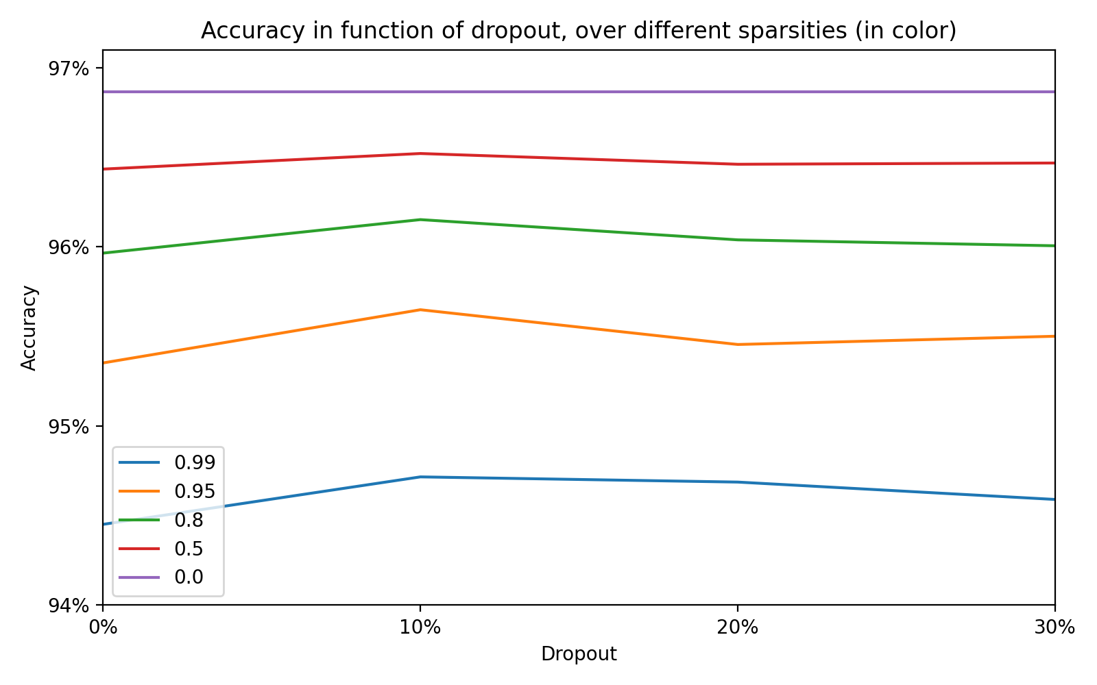
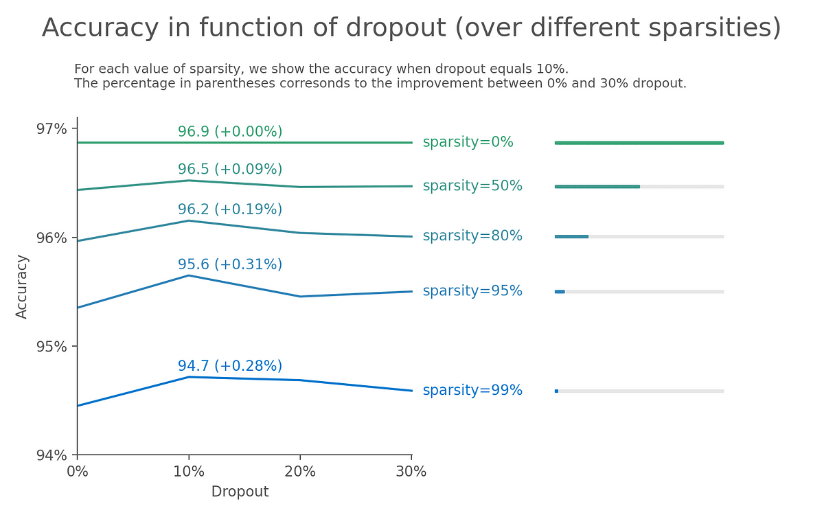
Image by Author
Step 2 : Show the sparsity value instead of using a legend
When looking at the different lines, we need to go back and forth between the legend and the line to understand which color correspond to which sparsity value. That’s not mentally comfortable to do that for the reader and we choose to show the sparsity value along each lines :
#matplotlib #data-visualization #data-science #graphic-design #visualization
1.15 GEEK