How to Build an Instagram clone using Vue.js vs CSSGram - Vuegram
What We’re Building
In this article, we’ll walk through the steps needed to build an Instagram clone that lets users add Instagram-like posts with Instagram-like filters on to a feed!
For reference - here’s a complete version of the application:
Note: Be sure to edit the application directly on CodeSandBox to view the app in a larger frame.
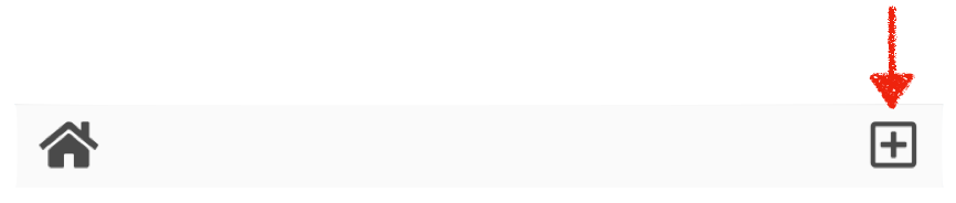
In the app, users are able to begin the submission process by clicking the plus-square icon in the footer to upload an image. When an image is uploaded, users can edit the image by selecting from a series of filters before providing a caption and finally “sharing” the post.

This tutorial walks through the all the steps needed to build the app UI with the Vue.js framework. Since we’re only going to be focusing on setting up the UI interface, no interactions with a server will be made.
Code Blocks
As we start building out the application, we’ll share both snippets of code changes we make as well as the final outcome of files.
We’ll highlight small specific changes within a simple code block. For clarity, we’ll bold the intended changes that are to be made:
<div id="app">
  We're adding this text within the element!
</div>
To reference how entire files are set-up; we’ll display embedded Github gists to take advantage of syntax-highlighting and easier readability:
<div id="app">
  We're adding this text within the element!
</div>
Preparing the App
The starting point of our application will be a scaffold from the Vue Command Line Interface ([vue-cli](https://github.com/vuejs/vue-cli)). The vue-cli is a tool built by the Vue team to help facilitate the rapid building and developing of Vue applications. The tool bundles our application with Webpack which allows us to write our components in Single-file format.
For this tutorial, we’ll build on top of a vue-cli scaffold in CodeSandBox, an online code editor geared towards prototyping and deploying web applications.
To help us get started, we’ll begin with some initial existing code. Here’s the starting boilerplate of our app.
Let’s take a brief look at the structure of the starting project directory.
data/
  filters.js
  posts.js
styles/
  app.scss
  filter-type.scss
  instagram-post.scss
App.vue
index.html
index.js
package.json
Note: The CodeSandbox editor extrapolates away the configuration files needed to configure our app. This makes it easier for us to simply focus on our application code.
data/ The data/ folder hosts the data that we’ll need in our application in two separate files, filters.js and posts.js.
The filters.js file references the type of filters that can be applied on to an uploaded image:
export default [
  { name: "normal" },
  { name: "clarendon" },
  { name: "gingham" },
  { name: "moon" },
  { name: "lark" },
  { name: "reyes" },
  { name: "juno" },
  { name: "slumber" },
  { name: "aden" },
  { name: "perpetua" },
  { name: "mayfair" },
  { name: "rise" },
  { name: "hudson" },
  { name: "valencia" },
  { name: "xpro2" },
  { name: "willow" },
  { name: "lofi" },
  { name: "inkwell" },
  { name: "nashville" }
];
posts.js is the collection of data objects that represent the posts that have already been submitted on to the feed. If our application persisted data to a server, we would probably make a GET request to a server to retrieve information similar to this:
export default [
  {
    username: "socleansofreshh",
    userImage: "https://s3-us-west-2.amazonaws.com/s.cdpn.io/1211695/me_3.jpg",
    postImage:
      "https://s3-us-west-2.amazonaws.com/s.cdpn.io/1211695/tropical_beach.jpg",
    likes: 36,
    hasBeenLiked: false,
    caption: "When you're ready for summer '18 ☀️",
    filter: "perpetua"
  },
  {
    username: "djirdehh",
    userImage: "https://s3-us-west-2.amazonaws.com/s.cdpn.io/1211695/me2.png",
    postImage:
      "https://s3-us-west-2.amazonaws.com/s.cdpn.io/1211695/downtown.jpg",
    likes: 20,
    hasBeenLiked: false,
    caption: "Views from the six...",
    filter: "clarendon"
  },
  {
    username: "puppers",
    userImage:
      "https://s3-us-west-2.amazonaws.com/s.cdpn.io/1211695/pug_personal.jpg",
    postImage:
      "https://s3-us-west-2.amazonaws.com/s.cdpn.io/1211695/puppers.jpg",
    likes: 49,
    hasBeenLiked: false,
    caption: "Current mood 🐶",
    filter: "lofi"
  }
];
Each post object contains properties relevant to that post, such as the username/user image of the user that posted, the post image, the number of likes, etc. In addition, each data object will contain a filter property that’ll dictate what filter will be applied on to the post image.
styles/ The styles/ folder hosts all the custom CSS we’ll need in our application. When we build our components, we’ll simply reference the correct stylesheet to the correct component and maintain our focus on the use of Vue.
App.vue App.vue is the main parent component that is to be rendered from our Vue instance. If we open up the App.vue file, we’ll see a simple single-file component:
<template>
  <div id="app">
    Let's build an Instagram Clone!
  </div>
</template>

<script>
export default {
  name: "App"
};
</script>

<style lang="scss" src="./styles/app.scss">
// Styles from stylesheet
</style>
Single-file components are an incredibly useful feature by allowing us to define the HTML/CSS and JS of a component all within a single .vue file.
In our App.vue file, the component currently just displays a simple welcome message. is where the component is exported and given the name of “App”. `` has a src attribute that tells us the styles for this component comes from the app.scss stylesheet in the styles/ folder.
index.html
The index.html file is the root markup page of our application.
<!-- Stylesheets -->
<link rel="stylesheet" href="https://cdn.rawgit.com/jgthms/bulma/9e1752b5/css/bulma.css">
<link rel="stylesheet" href="https://use.fontawesome.com/releases/v5.0.13/css/all.css">
<link rel="stylesheet" href="https://cssgram-cssgram.netdna-ssl.com/cssgram.min.css">

<!-- App -->
<div id="app"></div>
index.html is where we specify the external stylesheet dependancies that is to be used in our app. We’ve introduced Bulma as our applications CSS framework, Font Awesome for icons, and CSSGram to help us recreate Instagram filters.
The div element with the id of app is the DOM element where our Vue application is going to be mounted on, as dictated in the index.js file.
index.js index.js represents the starting point of our Vue application:
import Vue from "vue";
import App from "./App";

/* eslint-disable no-new */
new Vue({
  el: "#app",
  render: h => h(App)
});
At the top of the index.js file, we import the Vue library and the App component. We then create a new Vue instance by declaring new Vue({...}). The Vue instance is the starting point of all Vue applications and accepts an options object that contains the details of the instance.
In the instance above, we’re specifying the DOM element with the id of app to be where our Vue application is be mounted upon and we declare that the App component is the uppermost parent component that is to be rendered.
Now that we have an idea of how our application structure is prepared, we can start building the app.
1) The Homepage
The first thing we’ll begin to do is create the homepage feed by building out the main App component and binding the data from the data/posts.js file.
At a high level, we can break the upcomingApp component layout to three sections: the phone-header, the phone-body, and the phone-footer.

The majority of functionality in the app will live within the phone-body section; so it’ll be appropriate to establish a separate component that represents this section. We’ll create this component as PhoneBody.vue within a components/ folder:
components/
  PhoneBody.vue
data/
styles/
...
In the PhoneBody.vue file, we’ll set up a simple single-file component to begin:
<template>
  <div class="phone-body">
    This is the Phone Body
  </div>
</template>

<script>
export default {
  name: "PhoneBody"
};
</script>

<style lang="scss" src="../styles/phone-body.scss">
// Styles from stylesheet
</style>
In the `` of App.vue, we can import the PhoneBody component and define it in a components property.
<template>
  ...
</template>

<script>
import PhoneBody from "./components/PhoneBody";

export default {
  name: "App",
  components: {
    "phone-body": PhoneBody
  }
};
</script>

<style lang="scss" src="./styles/app.scss">
// Styles from stylesheet
</style>
We’ve mapped a phone-body declaration to the PhoneBody component object. This allows us to declare the newly imported component as phone-body in the template of App. We’ll do this and in addition establish elements that represent the phone-header and phone-footer sections. This will make our App.vue file now look like the following:
<template>
  <div id="app">
    <div class="app-phone">
      <div class="phone-header">
        <img src="https://s3-us-west-2.amazonaws.com/s.cdpn.io/1211695/vue_gram_logo_cp.png" />
      </div>
      <phone-body />
      <div class="phone-footer">
       <div class="home-cta">
        <i class="fas fa-home fa-lg"></i>
       </div>
       <div class="upload-cta">
        <i class="far fa-plus-square fa-lg"></i>
       </div>
      </div>
    </div>
  </div>
</template>

<script>
import PhoneBody from "./components/PhoneBody";
export default {
  name: "App",
  components: {
    "phone-body": PhoneBody
  }
};
</script>

<style lang="scss" src="./styles/app.scss">
// Styles from stylesheet
</style>
We’ve placed an Instagram logo image in the phone-header; and home/upload icons in the footer. At this moment our app will look like this:

Before we can begin to populate the content within the phone-body section (i.e. the PhoneBody component), let’s assess the data that represents the application.
To begin; we’ll import the posts and filters data arrays and declare them as data properties of the same name in the data() function of theApp component.
<template>
  ...
</template>

<script>
import PhoneBody from "./components/PhoneBody";
import posts from "./data/posts";
import filters from "./data/filters";
export default {
  name: "App",
  data() {
    return {
      posts,
      filters,
    };
  },
  components: {
    "phone-body": PhoneBody
  }
};
</script>

<style lang="scss" src="./styles/app.scss">
// Styles from stylesheet
</style>
We can then pass in the posts and filters data arrays as props on where we declare the phone-body component. We’ll use the shorthand syntax for the v-bind directive to do so:
<template>
  <div id="app">
    <div class="app-phone">
      <div class="phone-header">
        ...
      </div>
      <phone-body
        :posts="posts"
        :filters="filters" />
      <div class="phone-footer">
       ...
      </div>
    </div>
  </div>
</template>
<script>
..
export default {
  name: "App",
  ...
}
</script>
<style lang="scss" src="./styles/app.scss">
// Styles from stylesheet
</style>
With these changes, the entire App.vue file will look like this:
<template>
  <div id="app">
    <div class="app-phone">
      <div class="phone-header">
        <img src="https://s3-us-west-2.amazonaws.com/s.cdpn.io/1211695/vue_gram_logo_cp.png" />
      </div>
      <phone-body
        :posts="posts"
        :filters="filters" />
      <div class="phone-footer">
       <div class="home-cta">
        <i class="fas fa-home fa-lg"></i>
       </div>
       <div class="upload-cta">
        <i class="far fa-plus-square fa-lg"></i>
       </div>
      </div>
    </div>
  </div>
</template>

<script>
import PhoneBody from "./components/PhoneBody";
import posts from "./data/posts";
import filters from "./data/filters";
export default {
  name: "App",
  data() {
    return {
      posts,
      filters,
    };
  },
  components: {
    "phone-body": PhoneBody
  }
};
</script>

<style lang="scss" src="./styles/app.scss">
// Styles from stylesheet
</style>
With the posts array available as props in the PhoneBody component, we can now render a list of elements that represent submitted posts. When it comes to list rendering in Vue, the first thing that should come to mind is Vue’s [v-for](https://vuejs.org/v2/guide/list.html#Mapping-an-Array-to-Elements-with-v-for) directive.
Since each feed post will contain a significant amount of markup; we’ll create a VuegramPost component that a v-for directive will use to render a list. In the components/ folder, we’ll create this new component file as VuegramPost.vue:
components/
 VuegramPost.vue
 PhoneBody.vue
data/
styles/
...
The VuegramPost component will be a presentational shell that displays the properties of a single post object:

We’ll now go ahead and create the VuegramPost component. In the newly created VuegramPost.vue file, we’ll lay out the structure of the component like so:
<template>
  <div class="vuegram-post">
    <div class="header level">
        <div class="level-left">
          <figure class="image is-32x32">
            <img :src="post.userImage" />
          </figure>
          <span class="username">{{post.username}}</span>
        </div>
    </div>
    <div class="image-container"
      :class="post.filter"
      :style="{ backgroundImage: 'url(' + post.postImage + ')' }">
    </div>
    <div class="content">
      <div class="heart">
        <i class="far fa-heart fa-lg"></i>
      </div>
      <p class="likes">{{post.likes}} likes</p>
      <p class="caption"><span>{{post.username}}</span> {{post.caption}}</p>
    </div>
  </div>
</template>

<script>
export default {
  name: "VuegramPost",
  props: {
    post: Object
  }
};
</script>

<style lang="scss" src="../styles/vuegram-post.scss">
// Styles from stylesheet
</style>
There’s a few things to note here.
- In ``, we’ve stated that the
VuegramPostcomponent expects apostobject prop as seen in the prop validation requirement (props: {post: Object}). - We’re binding the properties of the
postobject prop on to the component template with the help of the Mustache syntax: ({{ }}), and to HTML template properties with thev-binddirective (:). - We’re specifying the styles of the component are to come from the
vuegram-post.scssstylesheet.
We now need to use the v-for directive to render a list of VuegramPost components based on the posts data collection. In the PhoneBody.vue file, we’ll first declare the posts and filters props being passed in for us to be able to use them in the PhoneBody component. We’ll do so by specifying a prop validation requirement by stating that both the posts and filters props should be arrays:
<template>
  <div class="phone-body">
    This is the Phone Body
  </div>
</template>
<script>
export default {
  name: "PhoneBody",
  props: {
    posts: Array,
    filters: Array
  }
};
</script>
<style lang="scss" src="../styles/phone-body.scss">
// Styles from stylesheet
</style>
We’ll also import the VuegramPost component and declare it in a components property of PhoneBody:
<template>
  <div class="phone-body">
    This is the Phone Body
  </div>
</template>
<script>
import VuegramPost from "./VuegramPost";

export default {
  name: "PhoneBody",
  props: {
    posts: Array,
    filters: Array
  },
  components: {
    "vuegram-post": VuegramPost
  }
};
</script>
<style lang="scss" src="../styles/phone-body.scss">
// Styles from stylesheet
</style>
Finally, we’ll render a list of them in the template making our entire PhoneBody.vue file be updated to:
<template>
  <div class="phone-body">
    <div class="feed">
      <vuegram-post v-for="post in posts"
        :post="post"
        :key="posts.indexOf(post)">
      </vuegram-post>
    </div>
  </div>
</template>

<script>
import VuegramPost from "./VuegramPost";
export default {
  name: "PhoneBody",
  props: {
    posts: Array,
    filters: Array
  },
  components: {
    "vuegram-post": VuegramPost
  }
};
</script>

<style lang="scss" src="../styles/phone-body.scss">
// Styles from stylesheet
</style>
Since posts is the collection we’re iterating over, post is an appropriate alias to use in the v-for directive. In each rendered vuegram-post, we alsopass in the iterated post object as props for it to be accessed in the component. Since an id doesn’t exist for each post object, we’re using the index of the post within the posts array as the key identifier - :key="posts.indexOf(post)".
At this moment, we can now scroll through a feed of posts in our application!

Before we continue elsewhere; let’s look to add the “liking” functionality that we expect to do on an Instagram post. In Instagram; we’re able to “like” a post by either clicking on the heart icon below a post image, or double-clicking the post image directly.
We have two properties in a post object that’s related to the “liking” functionality we’ll implement:
{
  ...,
  likes: 36,
  hasBeenLiked: false,
  ...,
},
likes is the number we’ll increment by one when the user “likes” a post. Since we won’t allow a user to continuously increase the likes of a single post, hasBeenLiked will be the boolean that we use to determine whether the user has already “liked” a post.
In the `` of VuegramPost, we’ll first create a like() method within a methods() property that will conditionally either like or unlike a post:
<template>
  <div class="vuegram-post">
    ...
  </div>
</template>
<script>
export default {
  name: "VuegramPost",
  props: {
    post: Object
  },
  methods: {
    like() {
      this.post.hasBeenLiked
        ? this.post.likes--
        : this.post.likes++;
      this.post.hasBeenLiked = !this.post.hasBeenLiked;
    }
  }
};
</script>
<style lang="scss" src="../styles/instagram-post.scss">
// Styles from stylesheet
</style>
In the like() method, we’re using a ternary statement to conditionally increment or decrement the post.likes value based on the truthiness of post.hasBeenLiked. We then toggle the value of the post.hasBeenLiked boolean.
In the template; we can now add the click event handlers on the elements that we expect the user to click on to like the post. We’ll use the shorthand syntax for the v-on directive and specify a dblclick handler on the post image, and a click handler on the heart icon.
<template>
  <div class="vuegram-post">
    <div class="header level">
      ...
    </div>
    <div class="image-container"
      :class="post.filter"
      :style="{ backgroundImage: 'url(' + post.postImage + ')' }"
      @dblclick="like">
    </div>
    <div class="content">
      <div class="heart">
        <i class="far fa-heart fa-lg"
          :class="{'fas': this.post.hasBeenLiked}"
          @click="like">
        </i>
      </div>
      ...
    </div>
  </div>
</template>
<script>
export default {
  name: "Vuegram",
  ...
}
</script>
<style lang="scss" src="../styles/vuegram-post.scss">
// Styles from stylesheet
</style>
We’ve also applied a conditional class binding on the heart icon, to conditionally add a .fas class if the post.hasBeenLiked boolean is true. This class fills the heart icon with red providing a visual indicator that the user has liked the post.
With these changes, the VuegramPost.vue file will be updated to:
<template>
  <div class="vuegram-post">
    <div class="header level">
        <div class="level-left">
          <figure class="image is-32x32">
            <img :src="post.userImage" />
          </figure>
          <span class="username">{{post.username}}</span>
        </div>
    </div>
    <div class="image-container"
      :class="post.filter"
      :style="{ backgroundImage: 'url(' + post.postImage + ')' }"
      @dblclick="like">
    </div>
    <div class="content">
      <div class="heart">
        <i class="far fa-heart fa-lg"
          :class="{'fas': this.post.hasBeenLiked}"
          @click="like">
        </i>
      </div>
      <p class="likes">{{post.likes}} likes</p>
      <p class="caption"><span>{{post.username}}</span> {{post.caption}}</p>
    </div>
  </div>
</template>

<script>
export default {
  name: "VuegramPost",
  props: {
    post: Object
  },
  methods: {
    like() {
      this.post.hasBeenLiked ? this.post.likes-- : this.post.likes++;
      this.post.hasBeenLiked = !this.post.hasBeenLiked;
    }
  }
};
</script>

<style lang="scss" src="../styles/vuegram-post.scss">
// Styles from stylesheet
</style>
Now when the user either clicks the heart icon or double clicks the post image, he/she would have “liked” the post:

2) The submission process
When the user begins the submission process, we want to change the UI depending on where the user is (e.g. if the user is at the 2nd step, he/she should be prompted to pick the filter that should be applied on to the image). In a real world production scale app, we would probably want to use an appropriate routing library like Vue Router, or at the very least build a custom routing solution.
For our application however, we’ll do something a lot simpler.We’ll change the UI of the app based on a step data property. When the user is in step === 1, he/she will be exposed to the newsfeed. step === 2 will involve selecting a filter and at step === 3, the user will be prompted to provide a caption to the post.

The elements being displayed in the header (e.g. the Cancel and Next links) will also be conditionally shown based on the step value.

In the parent App component; let’s first introduce a step data property and set it to a value of 1. Since we’ll be using the step property to dictate how elements in the phone-body section is shown, we’ll pass it down as props to the phone-body component.
<template>
  <div id="app">
    <div class="app-phone">
      ...
      <phone-body
        :step="step"
        :posts="posts"
        :filters="filters"
      />
      ...
    </div>
  </div>
</template>
<script>
...
export default {
  name: "App",
  data() {
    return {
      step: 1,
      posts,
      filters
    };
  },
  ...
};
</script>
When the user goes through the submission process; we want the final outcome to involve submitting a new post to the homepage feed. In other words, we want the user to be able to push (i.e. introduce) a new post object to the collection of posts (i.e. the posts.js file). We’ll control the username and userImage properties but we’ll need to capture the rest from the user.
In total, we need to capture the selectedFilter the user wants to apply, the post image they’d like to upload, and the caption to the post. With these properties in mind, let’s declare these properties as empty initial values in the App component and pass them down as props to phone-body as well:
<template>
  <div id="app">
    <div class="app-phone">
      ...
      <phone-body
        :step="step"
        :posts="posts"
        :filters="filters"
        :image="image"
        :selectedFilter="selectedFilter"
        v-model="caption"
      />
      ...
    </div>
  </div>
</template>
<script>
...
export default {
  name: "App",
  data() {
    return {
      step: 1,
      posts,
      filters,
      image: "",
      selectedFilter: "",
      caption: ""
    };
  },
...
};
</script>
Notice how we’re using the [v-model](https://vuejs.org/v2/guide/forms.html) directive to bind the value of the caption prop? This is because we want to avoid directly mutating the parent caption data property from the child component. We’ll explain this in a little more detail near the end of the article.
With the main properties initialized, we’ll create the method responsible in directing the user from step 1 to step 2. The one action responsible for this will be to upload an image by clicking the upload icon in the phone footer:
In App.vue, we’ll create a new method labelled uploadImage() that’ll hold the responsibility of uploading the image and then directing the user to step 2.
`` elements with [type="file"](https://developer.mozilla.org/en-US/docs/Web/HTML/Element/input/file) allows users to choose one or more files from their device storage to upload. So in the footer section of the template in App.vue, we’ll create an input element (of type="file") that has a change event listener that calls an uploadImage() method when triggered:
<template>
  <div id="app">
    <div class="app-phone">
      ...
      <div class="phone-footer">
        ...
        <div class="upload-cta">
          <input type="file"
            name="file"
            id="file"
            class="inputfile"
            @change="uploadImage"/>
          <label for="file">
            <i class="far fa-plus-square fa-lg"></i>
          </label>
        </div>
      </div>
    </div>
  </div>
</template>
<script>
...
export default {
  name: "App",
  ...
};
</script>
<style lang="scss" src="./styles/app.scss">
// Styles from stylesheet
</style>
Since we want the upload icon to be the action that involves uploading an image, we’ve set a visibility: hidden property to the class applied to the input element. In addition, we’ve wrapped a `` element around the upload icon. When the user clicks the upload icon (i.e. the label element), it will be treated as if he/she is clicking the input element.
The input element has a change event listener that calls an uploadImage() method when triggered. We’ll create this accompanying uploadImage() method within a methods property in the `` of App.vue. To upload images, we’ll use the [FileReader](https://developer.mozilla.org/en-US/docs/Web/API/FileReader) API. Here’s the uploadImage() method in its entirety:
<template>
  <div id="app">
    ...
  </div>
</template>
<script>
...
export default {
  name: "App",
  ...
  methods: {
    uploadImage(evt) {
      const files = evt.target.files;
      if (!files.length) return;
      const reader = new FileReader();
      reader.readAsDataURL(files[0]);
      reader.onload = evt => {
        this.image = evt.target.result;
        this.step = 2;
      };
      // To enable reuploading of same files in Chrome
      document.querySelector("#file").value = "";
    }
  },
  ...
};
</script>
<style lang="scss" src="./styles/app.scss">
// Styles from stylesheet
</style>
Let’s walk through what this method does.
- When the user uploads an image, the event object has a list of file objects that can be accessed from
evt.target.files. - If no files exist, we return early. If files do exist, we continue by setting
new FileReader()to areadervariable. FileReader()lets us asynchronously read the contents of the file object. We use thereadAsDataUrlfunction from thereadervariable to read the contents of the uploaded file (i.e. the firstfileobject fromevt.target.files).- When the file contents are being read with
readAsDataUrl, theonloadevent handler gets triggered with which we use to set the componentimageproperty to thetarget.resultof the event. We then set the componentstepvalue to 2. - The Chrome browser does not fire a change event if we decide to upload the same image twice. To perform a small change to bypass this, we’ve directly set the value of the input field to a blank string at the end of the method. Now when the user attempts to re-upload the same file again; it will always be detected as a change event.
With all of the changes we’ve laid out above; the entireApp.vue file will now look like the following:
<template>
  <div id="app">
    <div class="app-phone">
      <div class="phone-header">
        <img src="https://s3-us-west-2.amazonaws.com/s.cdpn.io/1211695/vue_gram_logo_cp.png" />
      </div>
      <phone-body
        :step="step"
        :posts="posts"
        :filters="filters"
        :image="image"
        :selectedFilter="selectedFilter"
        v-model="caption"
      />
      <div class="phone-footer">
       <div class="home-cta">
        <i class="fas fa-home fa-lg"></i>
       </div>
       <div class="upload-cta">
          <input type="file"
            name="file"
            id="file"
            class="inputfile"
            @change="uploadImage"/>
          <label for="file">
            <i class="far fa-plus-square fa-lg"></i>
          </label>
        </div>
      </div>
    </div>
  </div>
</template>

<script>
import PhoneBody from "./components/PhoneBody";
import posts from "./data/posts";
import filters from "./data/filters";
export default {
  name: "App",
  data() {
    return {
      step: 1,
      posts,
      filters,
      image: "",
      selectedFilter: "",
      caption: ""
    };
  },
  methods: {
    uploadImage(evt) {
      const files = evt.target.files;
      if (!files.length) return;
      const reader = new FileReader();
      reader.readAsDataURL(files[0]);
      reader.onload = evt => {
        this.image = evt.target.result;
        this.step = 2;
      };
      // To enable reuploading of same files in Chrome
      document.querySelector("#file").value = "";
    }
  },
  components: {
    "phone-body": PhoneBody
  }
};
</script>

<style lang="scss" src="./styles/app.scss">
// Styles from stylesheet
</style>
At this moment, we should be able to upload image files successfully.
The homepage feed should only be displayed when the user is in the very first step. To ensure this, we can add a [v-if](https://vuejs.org/v2/guide/conditional.html#v-if) statement on the feed DOM element in the PhoneBody.vue file to dictate that the feed should only be shown when the user is at step === 1. To access the step prop that’s being passed in, we’ll define the prop in the components props property as we use it:
<template>
  <div class="phone-body">
    <div v-if="step === 1" class="feed">
      <instagram-post v-for="post in posts"
        :post="post"
        :key="posts.indexOf(post)">
      </instagram-post>
    </div>
  </div>
</template>
<script>
...
export default {
  name: "PhoneBody",
  props: {
    step: Number,
    posts: Array,
    filters: Array
  },
...
};
</script>
<style lang="scss" src="../styles/phone-body.scss">
// Styles from stylesheet
</style>
Now, the feed will only be shown when the user is at the first initial step.
3) The Filter Screen
The image preview and list of filters
When the user uploads an image and is directed to step 2, we want to display the image that was selected as well as a series of filter choices that the user can apply.

Before we begin to display a list of filter choices, let’s establish a starting template for this second step. We’ll start by introducing a new div element that’s conditionally displayed when the step prop value is 2, in the template of the PhoneBody component. Since we aim to use the image that the user has uploaded, we’ll declare this prop in the component’s props property as well.
<template>
  <div class="phone-body">
    <div v-if="step === 1" class="feed">
      ...
    </div>
    <div v-if="step === 2">
      <div class="selected-image"
        :style="{ backgroundImage: 'url(' + image + ')' }"></div>
      <div class="filter-container">
        <!-- Where filter choices will be -->
      </div>
    </div>
  </div>
</template>
<script>
...
export default {
  name: "PhoneBody",
  props: {
    step: Number,
    posts: Array,
    filters: Array,
    image: String
  },
...
};
</script>
We’ve set the expected prop type of image to be of String since a file input’s value attribute is often represented as a string.
When we click the upload icon and upload an image, we’ll now be successfully directed to step 2:

Let’s now look to create the list of filter options that the user can select to apply. Similar to how we’ve used the v-for directive to render a list of posts in the feed; we’ll use the v-for directive to render a list of filter elements based on the filters data collection.
We’ll create a new FilterType component that holds the responsibility in displaying how the filter looks on the image.

In the components/ folder, we’ll create a new component file labelled FilterType.vue:
components/
 FilterType.vue
 InstagramPost.vue
 PhoneBody.vue
data/
styles/
...
We’ll first populate the FilterType.vue component file with the initial contents below:
<template>
  <div class="filter-type">
    <p>{{filter.name}}</p>
    <div class="img"
      :class="filter.name"
      :style="{ backgroundImage: 'url(' + image + ')' }">
    </div>
  </div>
</template>

<script>
export default {
  name: "FilterType",
  props: {
    filter: Object,
    image: String
  }
};
</script>

<style lang="scss" src="../styles/filter-type.scss">
// Styles from stylesheet
</style>
Let’s walk through what this component contains:
- We’re using the Mustache syntax to bind a
filter.namevalue on to the template. - The template also contains an image element that has its
background-imagestyle property set to animageprop. - On the same image element, we’re binding a class of
filter.nameon to the element. This is us taking advantage of the CSSGram library by allowing us to add Instagram-like filters on to images by simply adding a class of the filter name directly on to the element. - We’re declaring prop validations for the
filterandimageprops that the component is using. - We’re finally stating that the source of the component styles comes from the
styles/filter-type.scssfile.
In thePhoneBody.vue file, we’re now capable of rendering a list of FilterType components in the template. We’ll render this list within the element making the PhoneBody.vue file be updated to:
<template>
  <div class="phone-body">
    <div v-if="step === 1" class="feed">
      ...
    </div>
    <div v-if="step === 2">
      <div class="selected-image"
        :style="{ backgroundImage: 'url(' + image + ')' }">
      </div>
      <div class="filter-container">
        <filter-type v-for="filter in filters"
          :filter="filter"
          :image="image"
          :key="filters.indexOf(filter)">
        </filter-type>
      </div>
    </div>
  </div>
</template>
<script>
import VuegramPost from "./VuegramPost";
import FilterType from "./FilterType";
export default {
  name: "PhoneBody",
  ...,
  components: {
    "vuegram-post": VuegramPost,
    "filter-type": FilterType
  }
};
</script>
We’re importing the FilterType component and declaring it as filter-type in PhoneBody’s components property. We render a list of filter-type components based on the filters prop available in this component. For every rendered list item; we pass in the iterated filter object and the actual image.
With the updates, our entire PhoneBody.vue file will currently look like:
<template>
  <div class="phone-body">
    <div v-if="step === 1" class="feed">
      <vuegram-post v-for="post in posts"
        :post="post"
        :key="posts.indexOf(post)">
      </vuegram-post>
    </div>
    <div v-if="step === 2">
      <div class="selected-image"
        :style="{ backgroundImage: 'url(' + image + ')' }">
      </div>
      <div class="filter-container">
        <filter-type v-for="filter in filters"
          :filter="filter"
          :image="image"
          :key="filters.indexOf(filter)">
        </filter-type>
      </div>
    </div>
  </div>
</template>

<script>
import VuegramPost from "./VuegramPost";
import FilterType from "./FilterType";
export default {
  name: "PhoneBody",
  props: {
    step: Number,
    posts: Array,
    filters: Array,
    image: String
  },
  components: {
    "vuegram-post": VuegramPost,
    "filter-type": FilterType
  }
};
</script>

<style lang="scss" src="../styles/phone-body.scss">
// Styles from stylesheet
</style>
Now, when the user is directed to the second step - they’ll be able to see and scroll through a list of filter-type previews:

Selecting the filter
With the list of filters presented, we want to give the user the ability to select a filter which will result in applying the filter on to the larger image preview.
The selectedFilter prop is currently being passed down from the App component down to PhoneBody. To eventually display the selected filter on the image preview, we’ll need to declare the prop and bind it to a class on the large image div element (i.e. ).
This will involve updating the PhoneBody.vue file to:
<template>
  <div class="phone-body">
    ...
    <div v-if="step === 2">
      <div class="selected-image"
        :class="selectedFilter"
        :style="{ backgroundImage: 'url(' + image + ')' }">
      </div>
      <div class="filter-container">
        ...
      </div>
    </div>
  </div>
</template>
<script>
...
export default {
  name: "PhoneBody",
  props: {
    step: Number,
    posts: Array,
    filters: Array,
    image: String,
    selectedFilter: String
  },
  ...
};
</script>
<style lang="scss" src="../styles/phone-body.scss">
// Styles from stylesheet
</style>
We now have the selectedFilter prop being used to determine what filter type should be applied on the selected image div element. We’ll now look to determine how we can change this selectedFilter prop based on what filter from the filter list the user selects. Since we aim to affect the data value of the App component from its grandchild (PhoneBody), we can achieve this by sending some form of custom event.
The FilterType component is a child of the PhoneBody component and a grandchild of the App component.

When the user clicks on a particular filter type from the filter list (i.e. clicks on a certain FilterType component), we need to alert the App component that the selectedFilter value should change. Since we’ll be sending information up two levels; we’ll use an EventBus to directly propagate a custom event two levels up, when a filter type is selected.
Let’s see this in action. In the root of the folder; we’ll create an event-bus.js file:
...
styles/
App.vue
event-bus.js
...
In the event-bus.js file, we’ll create and export a new Vue instance:
import Vue from "vue";
const EventBus = new Vue();

export default EventBus;
We can now begin creating the event dispatcher and listener.
We’ll create the event dispatcher in the FilterType.vue file. In FilterType, we’ll attach a click listener that when triggered emits a custom event called filter-selected. As we trigger the event, we’ll pass in an object that contains the value of the filter selected. We’ll use the EventBus’s instance to create the custom event:
<template>
  <div class="filter-type">
    <p>{{filter.name}}</p>
    <div class="img"
      :class="filter.name"
      :style="{ backgroundImage: 'url(' + image + ')' }"
      @click="selectFilter">
    </div>
  </div>
</template>
<script>
import EventBus from "../event-bus.js";
export default {
  name: "FilterType",
  props: {
    filter: Object,
    image: String
  },
  methods: {
    selectFilter() {
      EventBus.$emit(
       "filter-selected", { filter: this.filter.name }
      );
    }
  }
};
</script>
<style lang="scss" src="../styles/filter-type.scss">
  // Styles from stylesheet
</style>
In the parent App component; we’ll now create the event listener in the components [created()](https://vuejs.org/v2/api/#created) lifecycle hook.
By creating the event listener within the components created() hook, we’re declaring the listener at the moment the component gets created. In the callback function of the listener, we’ll set the App component’s selectedFilter property to the filter value from the event handler object:
<template>
  <div id="app">
    ...
  </div>
</template>
<script>
...
import EventBus from "./event-bus.js";
export default {
  name: "App",
  ...
  created() {
    EventBus.$on("filter-selected", evt => {
      this.selectedFilter = evt.filter;
    });
  },
  ...
};
</script>
<style lang="scss" src="./styles/app.scss">
  // Styles from stylesheet
</style>
Now; when we pick a filter from the filter list, the selectedFilter property will update in App. Since selectedFilter is a prop passed down from thePhoneBody component, our UI will re-render to display the selected filter on the large image preview:

Navigating Onwards
The only thing left for us in this step is to create the navigation elements to allow the user to either proceed to step 3; or cancel the submission process.

In the phone header; we want to display the Cancel and Next navigation items when the user is in step 2. In fact; we’d want to display the Cancel link when the user is either in step 2 or in step 3. We can achieve this by introducing this conditional with the v-if directive in the phone-header element of the App component:
<template>
  <div id="app">
    <div class="app-phone">
      <div class="phone-header">
        <img src="https://s3-us-west-2.amazonaws.com/s.cdpn.io/1211695/vue_gram_logo_cp.png" />
        <a class="cancel-cta"
           v-if="step === 2 || step === 3"
           @click="goToHome">
            Cancel
        </a>
      </div>
      ...
    </div>
  </div>
</template>
<script>
...
export default {
  name: "App",
  ...
};
</script>
<style lang="scss" src="./styles/app.scss">
// Styles from stylesheet
</style>
We’ve introduced a new anchor element that’s only rendered when the component’s step value is equal to 2 or 3. We’ve also attached a click listener to the anchor element to call a goToHome() method that hasn’t been defined.
The goToHome() method will essentially take the user back to the first step. In addition; it will reset all the potentially captured values the user has entered - such as the image, selectedFilter, and caption. We’ll introduce this method to the components methods() property:
<template>
  <div id="app">
    ...
  </div>
</template>
<script>
...
export default {
  name: "App",
  ...,
  methods: {
    ...,
    goToHome() {
      this.image = "";
      this.selectedFilter = "";
      this.caption = "";
      this.step = 1;
    }
  },
  ...
};
</script>
<style lang="scss" src="./styles/app.scss">
// Styles from stylesheet
</style>
The Home icon in the phone footer should also serve the same functionality and direct the user to the first step when clicked.

As a result, we’ll attach the same click event listener on the home icon element as well:
<template>
  <div id="app">
    <div class="app-phone">
      ...
      <div class="phone-footer">
        <div class="home-cta" @click="goToHome">
          <i class="fas fa-home fa-lg"></i>
        </div>
        ...
      </div>
    </div>
  </div>
</template>
<script>
...
export default {
  name: "App",
  ...
};
</script>
<style lang="scss" src="./styles/app.scss">
// Styles from stylesheet
</style>
When we now click the Home icon in the phone footer or the Cancel link in the header, we’ll be directed back to the home screen.
Let’s also conditionally render the Next navigation link. The Next link will only be shown when the user is in step === 2 since a Share link will be shown in the upcoming step. We’ll add this element below the cancel-cta in the template of App:
<template>
  <div id="app">
    <div class="app-phone">
      <div class="phone-header">
        <img src="https://s3-us-west-2.amazonaws.com/s.cdpn.io/1211695/Instagram_logo.png" />
        <a class="cancel-cta"
           v-if="step === 2 || step === 3"
           @click="goToHome">
            Cancel
        </a>
        <a class="next-cta"
           v-if="step === 2"
           @click="step++">
            Next
        </a>
      </div>
      ...
    </div>
  </div>
</template>
<script>
...
export default {
  name: "App",
  ...
};
</script>
<style lang="scss" src="./styles/app.scss">
// Styles from stylesheet
</style>
For the Next navigation item; we’ve simply attached a click listener to increment the step data value by 1.
One thing we’ll want to avoid is allowing the user to be able to upload an image if not in the home index screen (i.e. when step !== 1). To prevent the user to being able to click the input element to upload an image; we’ll bind a disabled property on the type=file input and set it’s value to step !== 1:
<template>
  <div id="app">
    <div class="app-phone">
      ...
      <div class="phone-footer">
        ...
        <div class="upload-cta">
          <input type="file"
            name="file"
            id="file"
            class="inputfile"
            @change="uploadImage"
            :disabled="step !== 1"
          />
          <label for="file">
            <i class="far fa-plus-square fa-lg"></i>
          </label>
        </div>
      </div>
    </div>
  </div>
</template>
<script>
...
export default {
  name: "App",
  ...
};
</script>
<style lang="scss" src="./styles/app.scss">
// Styles from stylesheet
</style>
The upload image input will now be disabled unless the user is in the very first step. That completes building the second step of our UI. With all the changes made, our App.vue file will look like the following:
<template>
  <div id="app">
    <div class="app-phone">
      <div class="phone-header">
        <img src="https://s3-us-west-2.amazonaws.com/s.cdpn.io/1211695/vue_gram_logo_cp.png" />
        <a class="cancel-cta"
           v-if="step === 2 || step === 3"
           @click="goToHome">
            Cancel
        </a>
        <a class="next-cta"
           v-if="step === 2"
           @click="step++">
            Next
        </a>
      </div>
      <phone-body
        :step="step"
        :posts="posts"
        :filters="filters"
        :image="image"
        :selectedFilter="selectedFilter"
        v-model="caption"
      />
      <div class="phone-footer">
       <div class="home-cta" @click="goToHome">
        <i class="fas fa-home fa-lg"></i>
       </div>
       <div class="upload-cta">
          <input type="file"
            name="file"
            id="file"
            class="inputfile"
            @change="uploadImage"
            :disabled="step !== 1"
          />
          <label for="file">
            <i class="far fa-plus-square fa-lg"></i>
          </label>
        </div>
      </div>
    </div>
  </div>
</template>

<script>
import PhoneBody from "./components/PhoneBody";
import posts from "./data/posts";
import filters from "./data/filters";
import EventBus from "./event-bus.js";
export default {
  name: "App",
  data() {
    return {
      step: 1,
      posts,
      filters,
      image: "",
      selectedFilter: "",
      caption: ""
    };
  },
  created() {
    EventBus.$on("filter-selected", evt => {
      this.selectedFilter = evt.filter;
    });
  },
  methods: {
    uploadImage(evt) {
      const files = evt.target.files;
      if (!files.length) return;
      const reader = new FileReader();
      reader.readAsDataURL(files[0]);
      reader.onload = evt => {
        this.image = evt.target.result;
        this.step = 2;
      };
      // To enable reuploading of same files in Chrome
      document.querySelector("#file").value = "";
    },
    goToHome() {
      this.image = "";
      this.selectedFilter = "";
      this.caption = "";
      this.step = 1;
    }
  },
  components: {
    "phone-body": PhoneBody
  }
};
</script>

<style lang="scss" src="./styles/app.scss">
// Styles from stylesheet
</style>
All that’s left for us to do is capture a user entered caption in the third step, and allow the user to finally share the newly created post!
4) Completing the submission process
Capturing Content
When the user is in step 3, we want to display the selected image preview but in this case also present a textarea input where we can allow the user to submit a caption to their post.

In the template of PhoneBody.vue, we’ll introduce a new element that’s only displayed when the step is equal to 3. This element will contain a preview element just like the second step but will now also contain a textarea input:
<template>
  <div class="phone-body">
    <div v-if="step === 1" class="feed">
      ...
    </div>
    <div v-if="step === 2">
      ...
    </div>
    <div v-if="step === 3">
      <div class="selected-image"
        :class="selectedFilter"
        :style="{ backgroundImage: 'url(' + image + ')' }">
      </div>
      <div class="caption-container">
        <textarea class="caption-input"
          placeholder="Write a caption..."
          type="text">
        </textarea>
      </div>
    </div>
  </div>
</template>
<script>
...
export default {
  name: "PhoneBody",
  ...
};
</script>
<style lang="scss" src="../styles/phone-body.scss">
// Styles from stylesheet
</style>
We need to capture the value of what the user types and bind it to the caption data value in the parent App component. To make this happen, we’ll be inclined to pass the caption prop down to the PhoneBody component and use the [v-model](https://vuejs.org/v2/guide/forms.html#Text) directive on the textarea input to create two way data binding. Though this would usually work, it won’t work in this case.
Using v-model in PhoneBody to directly bind to the caption prop won’t work because that will be having the child component, PhoneBody, directly mutate a parent component’s (App) data value. This is a known bad practice that Vue will generate a console warning for.
We can avoid this by declaring a more specific two way data binding. First, we’ve already declared a v-model attribute on where the PhoneBody component is being rendered on the template of App.vue:
<template>
  <div id="app">
    <div class="app-phone">
      <div class="phone-header">
        ...
      </div>
      <phone-body
        :step="step"
        :posts="posts"
        :filters="filters"
        :image="image"
        :selectedFilter="selectedFilter"
        v-model="caption"
      />
      <div class="phone-footer">
        ...
      </div>
    </div>
  </div>
</template>
<script>
...
export default {
  name: "App",
  ...
};
</script>
<style lang="scss" src="./styles/app.scss">
// Styles from stylesheet
</style>
v-model is essentially binding a value prop and creating an input handler that changes the value prop. This blurb within the Vue documentation explains it some more - Using v-model on components.
In PhoneBody, we can now declare the value prop that’s being passed down and bind it to the caption textarea. This updates the PhoneBody.vue file to the following:
<template>
  <div class="phone-body">
    ...
    <div v-if="step === 3">
      ...
      <div class="caption-container">
        <textarea class="caption-input"
          placeholder="Write a caption..."
          type="text"
          :value="value">
        </textarea>
      </div>
    </div>
  </div>
</template>
<script>
...
export default {
  name: "PhoneBody",
  props: {
    step: Number,
    posts: Array,
    filters: Array,
    image: String,
    selectedFilter: String,
    value: String
  },
  ...
};
</script>
<style lang="scss" src="../styles/phone-body.scss">
// Styles from stylesheet
</style>
To capture what the user types in real-time, we’ll need to emit a new custom input event and pass the new input value.
<template>
  <div class="phone-body">
    ...
    <div v-if="step === 3">
      ...
      <div class="caption-container">
        <textarea class="caption-input"
          placeholder="Write a caption..."
          type="text"
          :value="value"
          @input="$emit('input', $event.target.value)">
        </textarea>
      </div>
    </div>
  </div>
</template>
<script>
...
export default {
  name: "PhoneBody",
  props: {
    step: Number,
    posts: Array,
    filters: Array,
    image: String,
    selectedFilter: String,
    value: String
  },
  ...
};
</script>
<style lang="scss" src="./styles/phone-body.scss">
// Styles from stylesheet
</style>
Since
PhoneBodyis a direct child ofApp, we’re able to use thePhoneBodyevents interface to directly emit an event.
Now when the user types a caption in PhoneBody, the caption data property in App is updated with the help of a custom input event that gets triggered.
The PhoneBody.vue file in its entirety will now look like this:
<template>
  <div class="phone-body">
    <div v-if="step === 1" class="feed">
      <vuegram-post v-for="post in posts"
        :post="post"
        :key="posts.indexOf(post)">
      </vuegram-post>
    </div>
    <div v-if="step === 2">
      <div class="selected-image"
        :class="selectedFilter"
        :style="{ backgroundImage: 'url(' + image + ')' }">
      </div>
      <div class="filter-container">
        <filter-type v-for="filter in filters"
          :filter="filter"
          :image="image"
          :key="filters.indexOf(filter)">
        </filter-type>
      </div>
    </div>
    <div v-if="step === 3">
      <div class="selected-image"
        :class="selectedFilter"
        :style="{ backgroundImage: 'url(' + image + ')' }">
      </div>
      <div class="caption-container">
        <textarea class="caption-input"
          placeholder="Write a caption..."
          type="text"
          :value="value"
          @input="$emit('input', $event.target.value)">
        </textarea>
      </div>
    </div>
  </div>
</template>

<script>
import VuegramPost from "./VuegramPost";
import FilterType from "./FilterType";
export default {
  name: "PhoneBody",
  props: {
    step: Number,
    posts: Array,
    filters: Array,
    image: String,
    selectedFilter: String,
    value: String
  },
  components: {
    "vuegram-post": VuegramPost,
    "filter-type": FilterType
  }
};
</script>

<style lang="scss" src="../styles/phone-body.scss">
// Styles from stylesheet
</style>
Sharing the Post
To complete the submission process, we need to provide the ability for the user to share the post by clicking a Share link on the header:

This Share navigation link should only be present when the user is in the third and final step. So we’ll add this element conditionally in the header section of App:
<template>
  <div id="app">
    <div class="app-phone">
      <div class="phone-header">
        <img src="https://s3-us-west-2.amazonaws.com/s.cdpn.io/1211695/vue_gram_logo_cp.png"/>
        <a class="cancel-cta"
           v-if="step === 2 || step === 3"
           @click="goToHome">
            Cancel
        </a>
        <a class="next-cta"
           v-if="step === 2"
           @click="step++">
            Next
        </a>
        <a class="next-cta"
           v-if="step === 3"
           @click="sharePost">
            Share
        </a>
      </div>
      ...
    </div>
  </div>
</template>
<script>
...
export default {
  name: "App",
  ...
};
</script>
<style lang="scss" src="./styles/app.scss">
// Styles from stylesheet
</style>
We’ve attached a click listener that calls a sharePost() method when the Share link is clicked. This method would do three things:
It will prepare a **post** object that contains the data submitted by the user In addition to what the user has submitted, the prepared post object will contain information like the username and userImage of the poster. For simplicity, we’ll just set the username to fullstack_vue and the userImage to point to an image of the Vue logo.
It will push the new **post** object to the **posts** data array in **App**To push a new item to the beginning of the array, we’ll use the native Array.unshift() method.
It will reset all information and direct the user back to the homepage We already have a goToHome() method that we’ll finally use to reset user information and set the step value back to 1.
With all that said, we’ll introduce this sharePost() method to the methods() property of App:
<template>
  <div id="app">
    ...
  </div>
</template>
<script>
...
export default {
  name: "App",
  ...
  methods: {
    ...
    sharePost() {
      const post = {
        username: "fullstack_vue",
        userImage:
          "https://s3-us-west-2.amazonaws.com/s.cdpn.io/1211695/vue_lg_bg.png",
        postImage: this.image,
        likes: 0,
        caption: this.caption,
        filter: this.filterType
      };
      this.posts.unshift(post);
      this.goToHome();
    }
  },
  ...
};
</script>
<style lang="scss" src="./styles/app.scss">
// Styles from stylesheet
</style>
We won’t be making any more updates to the App component making the App.vue file look like this at the final state:
<template>
  <div id="app">
    <div class="app-phone">
      <div class="phone-header">
        <img src="https://s3-us-west-2.amazonaws.com/s.cdpn.io/1211695/vue_gram_logo_cp.png" />
        <a class="cancel-cta"
           v-if="step === 2 || step === 3"
           @click="goToHome">
            Cancel
        </a>
        <a class="next-cta"
           v-if="step === 2"
           @click="step++">
            Next
        </a>
        <a class="next-cta"
           v-if="step === 3"
           @click="sharePost">
            Share
        </a>
      </div>
      <phone-body
        :step="step"
        :posts="posts"
        :filters="filters"
        :image="image"
        :selectedFilter="selectedFilter"
        v-model="caption"
      />
      <div class="phone-footer">
       <div class="home-cta" @click="goToHome">
        <i class="fas fa-home fa-lg"></i>
       </div>
       <div class="upload-cta">
          <input type="file"
            name="file"
            id="file"
            class="inputfile"
            @change="uploadImage"
            :disabled="step !== 1"
          />
          <label for="file">
            <i class="far fa-plus-square fa-lg"></i>
          </label>
        </div>
      </div>
    </div>
  </div>
</template>

<script>
import PhoneBody from "./components/PhoneBody";
import posts from "./data/posts";
import filters from "./data/filters";
import EventBus from "./event-bus.js";
export default {
  name: "App",
  data() {
    return {
      step: 1,
      posts,
      filters,
      image: "",
      selectedFilter: "",
      caption: ""
    };
  },
  created() {
    EventBus.$on("filter-selected", evt => {
      this.selectedFilter = evt.filter;
    });
  },
  methods: {
    uploadImage(evt) {
      const files = evt.target.files;
      if (!files.length) return;
      const reader = new FileReader();
      reader.readAsDataURL(files[0]);
      reader.onload = evt => {
        this.image = evt.target.result;
        this.step = 2;
      };
      // To enable reuploading of same files in Chrome
      document.querySelector("#file").value = "";
    },
    sharePost() {
      const post = {
        username: "fullstack_vue",
        userImage:
          "https://s3-us-west-2.amazonaws.com/s.cdpn.io/1211695/vue_lg_bg.png",
        postImage: this.image,
        likes: 0,
        caption: this.caption,
        filter: this.filterType
      };
      this.posts.unshift(post);
      this.goToHome();
    },
    goToHome() {
      this.image = "";
      this.selectedFilter = "";
      this.caption = "";
      this.step = 1;
    }
  },
  components: {
    "phone-body": PhoneBody
  }
};
</script>

<style lang="scss" src="./styles/app.scss">
// Styles from stylesheet
</style>
We can now go through the entire submission process to submit a post!

5) Drag-scroll
Our app UI is pretty much complete. We’ll introduce one new additional feature to complete the tutorial.
As you may have noticed; we’ve had to scroll through the feed (and filter-list) to navigate through the list of items. In traditional mobile applications, we’re often able to navigate by dragging the screen_._ To enable a similar drag-like feature in our app, we’ll use the [vue-dragscroll](https://github.com/donmbelembe/vue-dragscroll) library.
To introduce a new library into our app; we’d usually have to install it with yarn or npm (or access it through a CDN):
npm install vue-dragscroll --save
In our sandbox; we already have the vue-dragscroll library introduced as a dependancy.
With the library available we’ll first want to register it into our app. In the index.js file, we’ll import the vue-dragscroll library and specify Vue.use() to use the plugin in our module-based app:
import Vue from "vue";
import App from "./App";
import VueDragscroll from "vue-dragscroll";
Vue.use(VueDragscroll);
/* eslint-disable no-new */
new Vue({
  el: "#app",
  render: h => h(App)
});
With the plugin installed; we can use the v-dragscroll directives in our templates. We want the feed and filter lists of the app to be draggable along the Y and X axes respectively:

In the template of PhoneBody.vue; we’ll specify a vertical dragging capability on the feed by adding v-dragscroll.y to the feed element. Similarly, we’ll add v-dragscroll.x to the filter container that holds the list of filter types in step 2.
<template>
  <div class="phone-body">
    <div v-if="step === 1" class="feed" v-dragscroll.y>
      <instagram-post v-for="post in posts"
        :post="post"
        :key="posts.indexOf(post)">
      </instagram-post>
    </div>
    <div v-if="step === 2">
      <div class="selected-image"
        :class="selectedFilter"
        :style="{ backgroundImage: 'url(' + image + ')' }">
      </div>
      <div class="filter-container" v-dragscroll.x>
        <filter-type v-for="filter in filters"
          :filter="filter"
          :image="image"
          :key="filters.indexOf(filter)">
        </filter-type>
      </div>
    </div>
    ...
  </div>
</template>
<script>
...
export default {
  name: "PhoneBody",
  ...
};
</script>
<style lang="scss" src="./styles/phone-body.scss">
// Styles from stylesheet
</style>
And our app is now complete! With everything implemented, we’re able to drag through the feed, upload an image, select a filter, provide a caption, and finally share a post!
Conclusion
Without taking into account CSS styling, we walked through building a complete UI that mimics how we can submit posts on Instagram on a mobile device. In addition; we’ve taken advantage of the CSSGram library to add Instagram-like filters, and vue-dragscroll to help us add dragging in certain areas.
Thank you for reading !
#Vuejs #Vue #JavaScript #Instagram #Tutorial