If you’re a frequent Twitter user, you’re used to that chaotic jumble of political rants, bad jokes, animal videos, and conspiracy theories that has become part of our daily routine.
But when you dig a little deeper, there’s a fairly well-structured set of data that can be mined for meaningful insights into the relationships that shape the Twitterverse. An estimated 500 million tweets are sent on Twitter very day. That works out to about 5,787 per second. But if you concentrate on meaningful subsets in that flood of data, you can make sense of it.
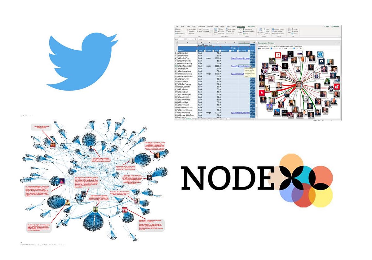
In this article, I’ll take a look at some of the tools and techniques available to obtain, analyze and visualize the data in a way that discerns the Twitter influencers from those who are just shouting into an empty space. I’ll also introduce NodeXL, a network visualization tool that makes analysis of your data much easier.
I’ll be using graph database technology, which structures your data as a network of nodes and connections between them, as opposed to the traditional rows and columns. I wrote about the use of graph database technology in two previous articles: ‘How I learned to stop worrying and love the graph database’ and ‘The Boogaloo Underworld’.
#osint #data-visualization #politics #twitter #data-science