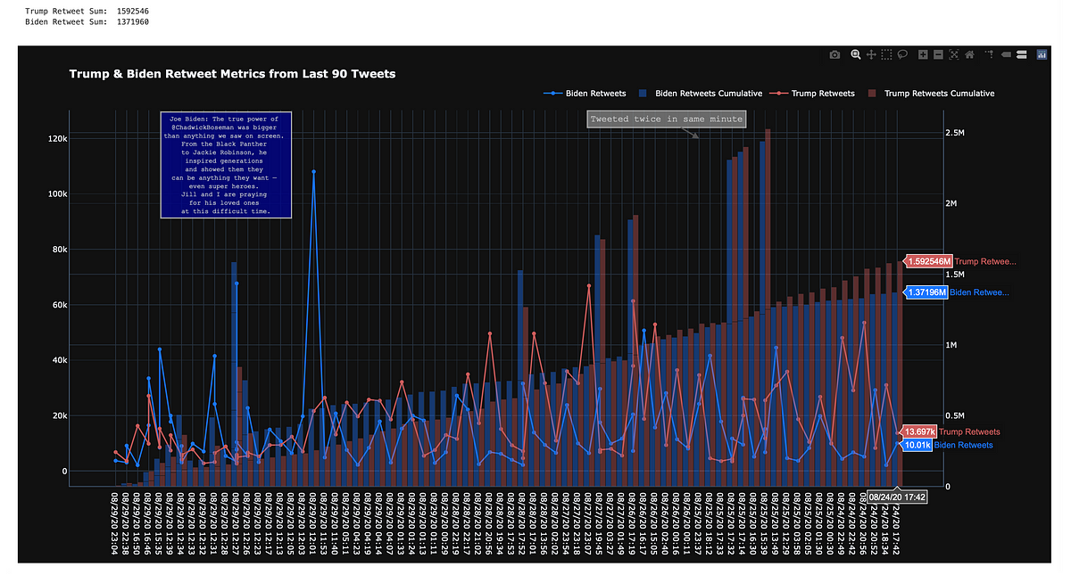
First, How to read this chart, because I know it’s easier to have it explained than to guess
- Red and blue lines are Trump and Biden tweets over the past week
- Red and blue bars are Trump and Biden cumulative retweet totals over the past week
- Y1 axis is the retweet count per tweet
- Y2 axis is the cumulative sum of tweet retweets
- X axis is the date
This will not be redundant
There are plenty of articles out there that give an overview of the Twitter API. This is not that.
My goal here is to get you up and running in a few minutes by just showing you the code, and offering a few tips that helped me while building this graph.
Code Piece 1
*Broken up into 3 pieces
import tweepy
import numpy as np
import pandas as pd
import re
import plotly.express as px
import plotly.graph_objects as go
from plotly.subplots import make_subplots
api_key = 'x'
api_secret_key = 'y'
bearer_token = 'a'
access_token = 'b'
access_token_secret = 'd'
password = 'd'
auth = tweepy.OAuthHandler(api_key, api_secret_key)
auth.set_access_token(access_token, access_token_secret)
api = tweepy.API(auth)
public_tweets = api.home_timeline()
for tweet in public_tweets:
    print(tweet.text)
A few bullet points:
- Install
tweepyandplotlywith:pip install tweepyor in juypter!pip install tweepy - Create your account for a twitter api — it’s quick. I used my personal twitter account: https://developer.twitter.com/en/portal/projects-and-apps
- insert your creds in the api key and access token rows
The above code produces a few tweets that look like this:
A few tweets from code piece 1
#trump #donald-trump #twitter #biden #python
2.50 GEEK