
“Styled JSX is a CSS-in-JS library that allows you to write encapsulated and scoped CSS to style your components. The styles you introduce for one component won’t affect other components, allowing you to add, change and delete styles without worrying about unintended side effects.” — Kristian Heruc
Styled-JSX is a very lightweight library (only 3kb) built and maintained by Next.JS. In the last couple of years, it has grown massively in popularity.
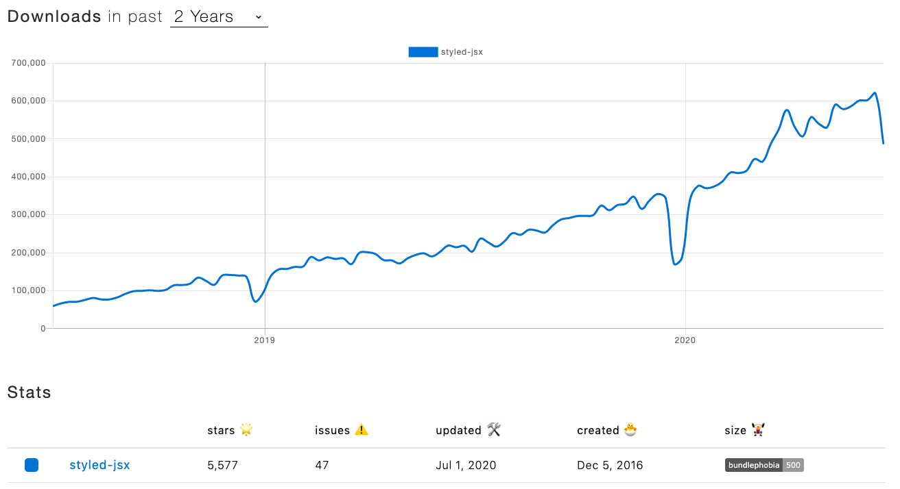
https://www.npmtrends.com/styled-jsx
As mentioned above, it does a very good job of making sure not to include unused CSS and encapsulate styling. Styled JSX also has source map support, and CSS preprocessing capabilities.
Styling in the Shared Components Era
Encapsulating styling has become an even greater concern in recent years as components are much more frequently shared and reused via tools and platforms like Bit (Github).
Unlike the “old days” when sharing components between apps meant building a complete ‘component library project’ — these days, sharing components is done continuously and from any project at all.
That means, what you build can easily be used in multiple other apps. You need to make sure everything is as modular and independent as possible. You also want to keep things clean without any unused CSS, following along a shared component.

Example: shared React components on Bit
Styled JSX vs other CSS-in-JS
If you’re not already familiar with that library, I suspect the first thing the comes to mind is: how is that different/better than other JS-in-CSS libraries?
Styled JSX is written in a more declarative way than you would usually see in other similar solutions. Writing declaratively is, after all, the “CSS way”. So, for those of us who prefer writing our styles as close as possible to plain CSS (without all the drawbacks of CSS), that could be a good solution.
In this article, we’ll look at the different benefits Styled JSX brings. We’ll try it out, both in a demo single-page app and server-side rendering app.
For example, this is a Button component that can receive the ‘padding’ prop to override the value set as default. The CSS part is plain and simple. The way to override is straightforward.
const Button = ({ padding, children }) => (
  <button style={{ padding }}>

  { children }

     <style jsx>{`
        button {
          padding: 20px;
          background: #eee;
          color: #999
        }
     `}</style>

  </button>
)
In contrast, a similar button will look like so, in styled-components:
const Button = styled.button`
    padding: ${props => props.padding || "20px"};
    background: #eee;
    color: #999
`
It’s more elegant but, again, may not be what you’re after. It’s less CSS-like.
#reactjs #css #javascript #react #nextjs #programming