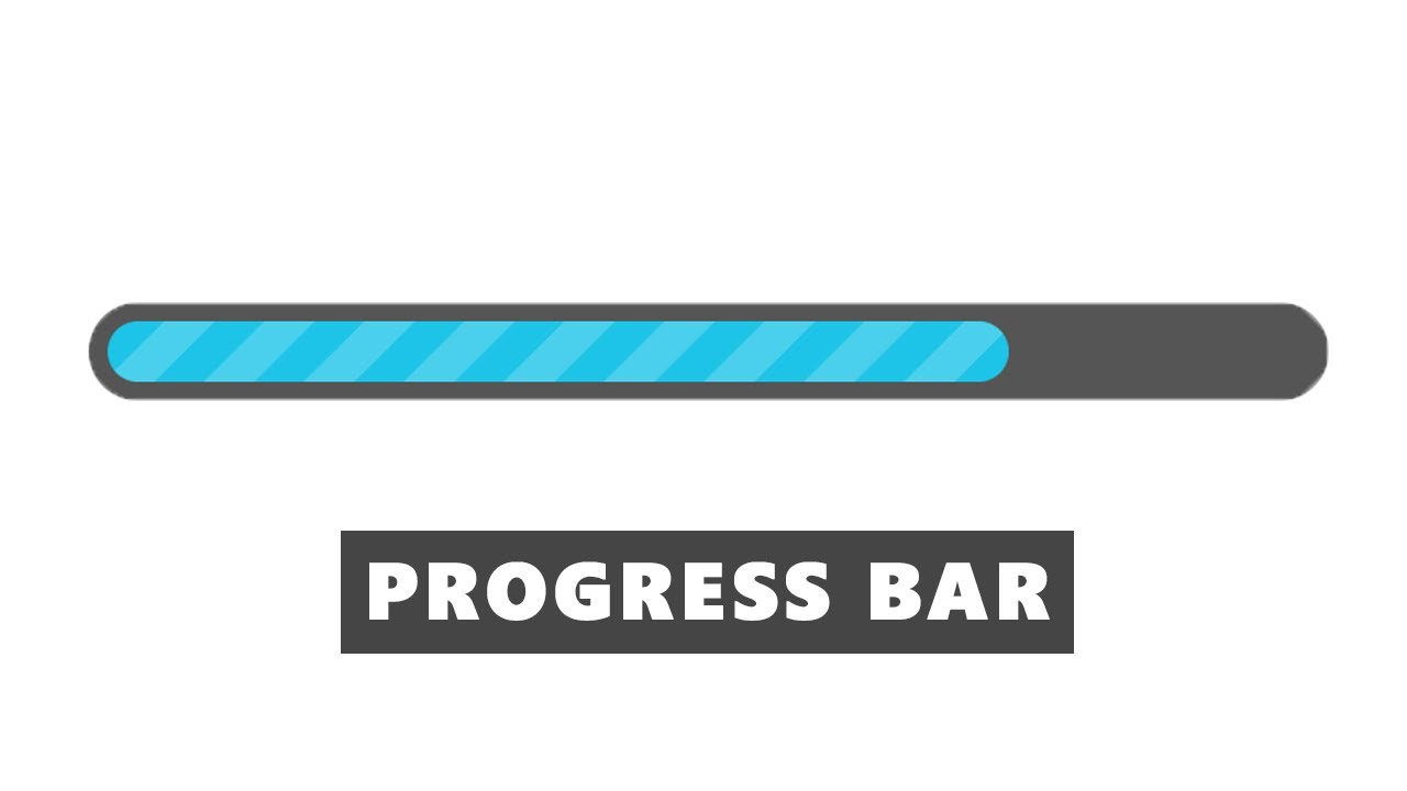
In this video, you are going to learn how to design an awesome animated progress bar using HTML, CSS, and JQuery. First, let’s see what is a progress bar. Simply progress bar is a graphical control element used to visualize the progress of an operation like a download, file transfer, installation, and etc. So in this video, you will learn how to design this progress bar with an animation.
Subscribe: https://www.youtube.com/channel/UCNDmzGYwwT3rdY3xQuW8QOA
Source code
index.html
<!DOCTYPE html>
<html lang="en" dir="ltr">
	<head>
		<meta charset="utf-8">
		<title>Progress Bar</title>
		<link rel="stylesheet" href="style.css">
		<script src="https://cdnjs.cloudflare.com/ajax/libs/jquery/3.4.1/jquery.min.js" charset="utf-8"></script>
	</head>
	<body>

		<!--progress bar start-->
		<div class="progress-bar">
			<span style="width:100%"></span>
		</div>
		<!--progress bar end-->

		<script type="text/javascript">
		$(function(){
			$("span").each(function(){
				$(this)
				.data("origWidth", $(this).width())
				.width(0)
				.animate({
					width: $(this).data("origWidth")
				},2000);
			});
		});
		</script>

	</body>
</html>
style.css
body{
  margin: 0;
  padding: 0;
  height: 100vh;
  display: flex;
  justify-content: center;
  align-items: center;
}

.progress-bar{
  background: #555;
  width: 600px;
  height: 30px;
  position: relative;
  border-radius: 25px;
  padding: 10px;
}

.progress-bar span{
  background: #1DC4E7;
  display: block;
  height: 100%;
  border-radius: 25px;
  position: relative;
}

.progress-bar span:after{
  content: "";
  position: absolute;
  top: 0;
  left: 0;
  bottom: 0;
  right: 0;
  background-image: -webkit-gradient(linear, 0 0, 100% 100%,
    color-stop(.25, rgba(255, 255, 255, .2)),
    color-stop(.25, transparent),
    color-stop(.5, transparent),
    color-stop(.5, rgba(255, 255, 255, .2)),
    color-stop(.75, rgba(255, 255, 255, .2)),
    color-stop(.75, transparent), to(transparent)
    );
  background-size: 50px 50px;
  animation: move 2s linear infinite;
  border-radius: 25px;
}

@-webkit-keyframes move{
  0%{
    background-position: 0 0;
  }
  100%{
    background-position: 50% 50%;
  }
}
#html #css #jquery
3.15 GEEK