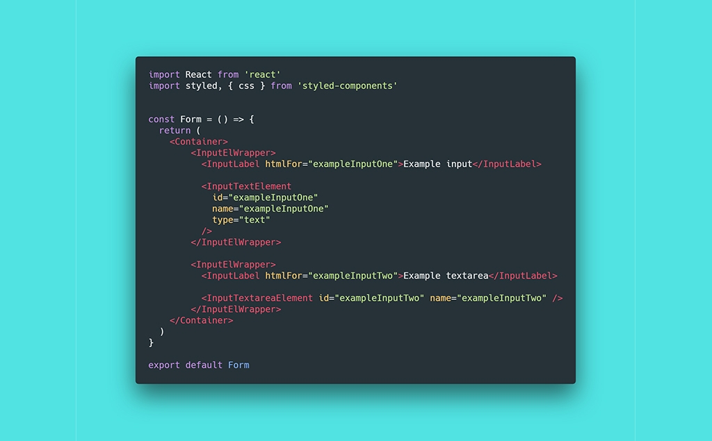
When you work on a design project it is easy to lose track of how all elements should look like. This leads to inconsistent design and more work later. That is why having a style guide is so useful. Style guide helps us work fast while keeping the design consistent. Learn how to build your own style guide from scratch with React and styled-components.
How to Build a Great Style Guide with React & styled-components part 1.
How to Build a Great Style Guide with React & styled-components part 2.
Adding Font Awesome
Let’s start with one very quick digression. The section of our style guide with buttons will contain button variant with icon. This gives us two options. First, we can use our own icon and implement it through img element or CSS background property. Second, we can use one of the available icon fonts hosted on CDN and implement it by adding its stylesheet.
If we would want to add just one icon, the first option a no-brainer. However, you may want to use another icons in other sections of this style guide. Let’s prepare for this use case and choose the second option. The font we will use will be Font Awesome. This is a very popular icon font that offers very rich palette of good-looking icons we can use. We will add this stylesheet to index.html in ./public/.
Side note: Two things. First, there are two versions of Font Awesome icon font-version 4 and 5. Version 4 is completely for free and contains around 675 icons. Version 5 has two variants, free and Pro. Free version contains approximately 1 341 icons. Pro around 3 978 icons. Not all icons are unique. Some icons have multiple variants, filled, outlined, thicker, lighter, etc.
The second thing is that you will probably find the CDN link for version 5 only on Font Awesome website. Other CDNs, such as cdnjs, host only version 4, 4.7.0 to be more specific. So, if you want to use version 5, you don’t have to look for CDNs. Instead, head on right to Font Awesome website and grab the CDN link from there.
<!-- public/index.html -->

<!DOCTYPE html>
<html lang="en">
  <head>
    <meta charset="utf-8">
    <meta name="viewport" content="width=device-width, initial-scale=1, shrink-to-fit=no">
    <meta name="theme-color" content="#000000">

    <!--
        manifest.json provides metadata used when your web app is added to the
        homescreen on Android. See https://developers.google.com/web/fundamentals/engage-and-retain/web-app-manifest/
      -->
    <link rel="manifest" href="%PUBLIC_URL%/manifest.json">
    <link rel="shortcut icon" href="%PUBLIC_URL%/favicon.ico">
    <!--
        Notice the use of %PUBLIC_URL% in the tags above.
        It will be replaced with the URL of the `public` folder during the build.
        Only files inside the `public` folder can be referenced from the HTML.

        Unlike "/favicon.ico" or "favicon.ico", "%PUBLIC_URL%/favicon.ico" will
        work correctly both with client-side routing and a non-root public URL.
        Learn how to configure a non-root public URL by running `npm run build`.
      -->

    <title>UI Style Guide</title>

    <!-- Roboto typeface -->
    <link href="https://fonts.googleapis.com/css?family=Roboto:300,400,500,700" rel="stylesheet">

    <!-- Font Awesome stylesheet -->
    <link rel="stylesheet" href="https://use.fontawesome.com/releases/v5.3.1/css/all.css" integrity="sha384-mzrmE5qonljUremFsqc01SB46JvROS7bZs3IO2EmfFsd15uHvIt+Y8vEf7N7fWAU" crossorigin="anonymous">
  </head>

  ... rest of the code ...

</html>
#react #styled-components #javascript #webdesign