R Pie Chart Tutorial
A pie chart is a circular statistical graphic, which is divided into slices to illustrate numerical proportion.
Pie charts represents data visually as a fractional part of a whole, which can be an effective communication tool.
Create Pie Chart in R
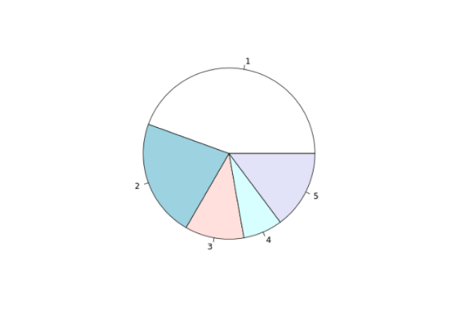
In R, we use the pie() function to create a pie chart. For example,
expenditure <- c(600, 300, 150, 100, 200)

# pie chart of of expenditure vector
result <- pie(expenditure)

print(result)
Output
Create Pie Chart
In the above example, we have used the pie() function to create a pie chart of the expenditure vector.
The pie chart we have created above is plain and simple, we can add so many things to the pie chart.
Add Title to a Pie Chart in R
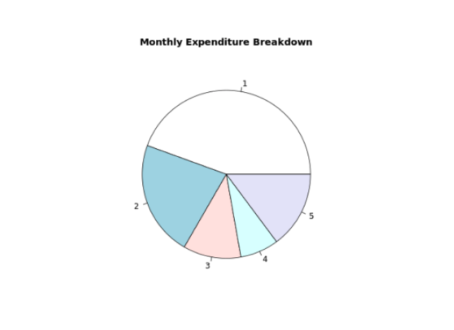
To add a title to our pie chart in R, we pass the main parameter inside the pie() function. For example,
expenditure <- c(600, 300, 150, 100, 200)

result <- pie(expenditure,
  main = "Monthly Expenditure Breakdown"
)

print(result)
Output
Pie Chart With TItle
In the above figure, we can see that we have added a title to the pie chart of the expenditure vector.
result <- pie(expenditure
  main = "Monthly Expenditure Breakdown"
)
Here, the main parameter adds the title "Monthly Expenditure Breakdown" to our pie chart.
Add Labels to Each Pie Chart Slice in R
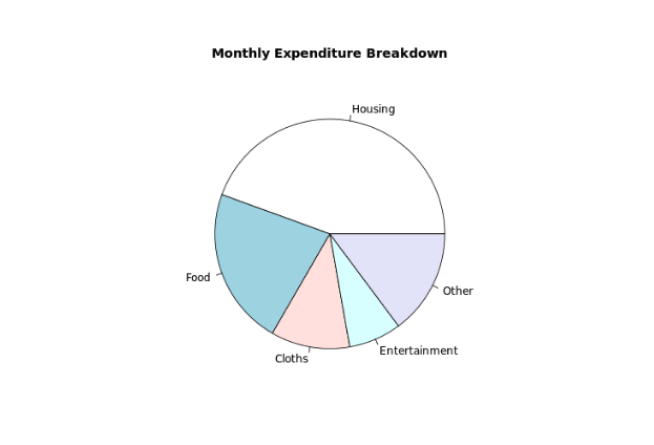
We pass the labels parameter inside pie() to provide labels to each slice of a pie chart in R.
For example,
expenditure <- c(600, 300, 150, 100, 200)

result <- pie(expenditure,
  main = "Monthly Expenditure Breakdown",
  labels = c("Housing", "Food", "Cloths", "Entertainment", "Other")
)

print(result)
Output
Pie Chart With Label
In the above example, we have used the labels parameter to provide names to each slice of pie chart. Notice the code,
pie(expenditure,
  labels = c("Housing", "Food", "Cloths", "Entertainment", "Other")
)
Here, we have assigned "Housing" to the first vector item 600, "Food" to the second vector item 300 and so on.
Change Color of Pie Slices in R
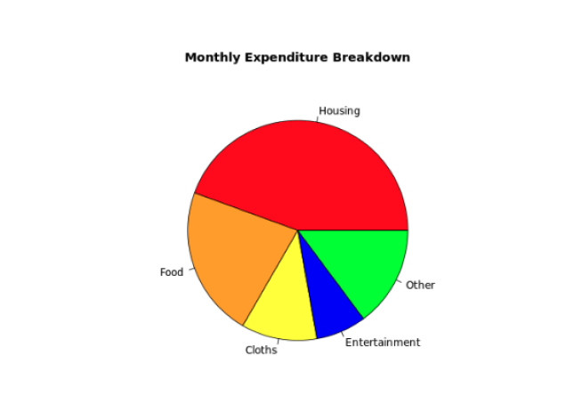
In R, we pass the col parameter inside pie() to change the color of each pie slices. For example,
expenditure <- c(600, 300, 150, 100, 200)

result <- pie(expenditure,
  main = "Monthly Expenditure Breakdown",
  labels = c("Housing", "Food", "Cloths", "Entertainment", "Other"),
  col = c("red", "orange", "yellow", "blue", "green")
)

print(result)
Output
Change Pie Chart Color
In the above example, we have used the col parameter inside pie() to change the color of each slice of a pie chart.
pie(expenditure,
  ...
  labels = c("Housing", "Food", "Cloths", "Entertainment", "Other"),
  col = c("red", "orange", "yellow", "blue", "green")
)
Here, we have provided a vector of colors which corresponds to each label of a pie chart.
Create a 3D Pie Chart in R
In order to create a 3D pie chart, first we need to import the plotrix package. Then, we use the pie3D() function to create a 3D pie chart. For example,
# import plotrix to use pie3D()
library(plotrix)

expenditure <- c(600, 300, 150, 100, 200)

result <- pie3D(expenditure,
  main = "Monthly Expenditure Breakdown",
  labels = c("Housing", "Food", "Cloths", "Entertainment", "Other"),
  col = c("red", "orange", "yellow", "blue", "green")
)

print(result)
Output
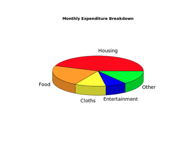
Create 3D Pie Chart
Here, we have used the pie3D() function to create a 3D pie chart.
- This blog post was originally published at:https://www.programiz.com/