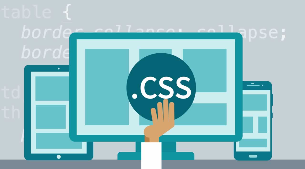
Basics CSS Grid Layout and CSS Frameworks
“CSS Grid or CSS Framework? What should I use for my next project?” It is a question often asked by web developers, specifically new ones after they are introduced to the CSS Grid layout. CSS Grid layouts allow developers to build custom complex layouts with absolute control only by using Native CSS properties without relying on any frameworks which are bound by basic 12 column grid layouts plagued with default styling rules and do not offer a lot of room for customization.
On the other hand building grid layouts with frameworks like Bootstrap feels like a breeze without the need of writing any CSS style rules or media queries to make the layout responsive.
Initially, when CSS Grid layout was introduced, it lacked cross-browser compatibility, which made many web developers a bit hesitant towards its implementation but that is not the case now! This brings us to a question where we evaluate whether the CSS grid layout has eliminated the need for CSS frameworks like Bootstrap to create layouts.
Don’t worry! If you have faced such questions yourself then you are at the right post. I am going to highlight the differences between CSS Grid vs CSS Framework. We will also look into the cross-browser compatibility between these two. By the end of this article, you will be able to make a judgment call about your next pick among CSS Grid or CSS Framework. Let’s hit the road with a basic definition of these two!
What Are CSS Frameworks?
A CSS framework is also interchangeably referred to as a CSS library The basic purpose is to bring a more standardized practice for web development. Using a CSS Framework or CSS library you can fast-track your web development effort as it allows you to use predefined web elements. Meaning, if you wish to add a UI element for your web-application then all you need to do is include the framework CSS and JS file in your project and specify the HTML class for the element you want to style. This is how a CSS framework works.
Almost every CSS Framework has a grid, few of them have more grids to offer, few CSS frameworks even offer advanced JavaScript functions around interactive UI patterns.
To make it clear, we can take an example of a Bootstrap framework which is, in my opinion, one of the most famous CSS frameworks.
Bootstrap is a frontend CSS framework, open-source and on GitHub, which helps in the UI development of the basic components of CSS. You can change the style of your buttons, fonts, and much more using Bootstrap.
Let us take an example, say you have to define a rounded button to your website, now instead of writing a fresh piece of code, you can leverage the CSS frameworks, such as Bootstrap to provide you with an already defined code for the button you wish to have.

To display the above buttons in your website, all you need to do is copy the below HTML code and paste it in your web application project, of course, you will have to specify the button text as per your requirements but the rest is all taken care of!
<button type="button" class="btn btn-primary">Primary</button>
<button type="button" class="btn btn-secondary">Secondary</button>
<button type="button" class="btn btn-success">Success</button>
<button type="button" class="btn btn-danger">Danger</button>
<button type="button" class="btn btn-warning">Warning</button>
<button type="button" class="btn btn-info">Info</button>
<button type="button" class="btn btn-light">Light</button>
<button type="button" class="btn btn-dark">Dark</button>
<button type="button" class="btn btn-link">Link</button>
view raw CSS_button_code.css hosted with ❤ by GitHub
CSS Frameworks provides a lot of flexibility for developers in their projects and saves a lot of time. They can develop something more pleasing to the eyes with the help of frameworks without writing everything from scratch and not worrying about any cross-browser issues or inconsistencies.
Cross-Browser Compatibility Of CSS Frameworks
Cross-browser compatibility is a headache for web developers to face every day. With such an overwhelming advancement in browser development, the need to develop a web page that delivers a uniform cross-browser experience is increasing day-by-day.
Gone are those days when everyone was on Safari and Internet Explorer. Many other browsers have taken the internet by storm like Google Chrome, Mozilla Firefox, Opera. Millions of people prefer different browsers, and every browser focuses on being different.
CSS Frameworks lifts this burden for you. A framework is not coded for a single browser. If it is, how do you think it will get popular? A framework developer already knows that it will be used by millions of people who will be using many different browsers. Hence, frameworks are neutral and resolve cross-browser compatibility issues. You can just focus on the designing and creative parts of the website while using each framework.
Keep in mind though, that irrespective of which CSS framework you use and no matter how much cross-browser compatible it may be, it’s always recommended to perform end-to-end integration testing of your web application across different browsers.
When Should You Use CSS Frameworks?
If you are a beginner in frontend web development and haven’t yet mastered CSS, then using a CSS framework is the right fit for you. Frameworks like Bootstrap are super easy to master and can be used to create complete web page layouts within seconds without the need of writing any CSS code.
Offering unprecedented ease of use, lightning-fast deployment, close to 100% cross-browser support, standardization of the codebase, and easy learning curve makes CSS frameworks an attractive choice for you. If your aim to build standard cross-browser compatible layouts at a lightning fast-pace rather than complex cutting edge layouts, you should pick CSS frameworks over CSS grid.
Moreover, CSS frameworks like Materialize or Bootstrap are much more than Grid systems. In fact, grids are just a tiny feature of a CSS framework. If you want to build different UI components like navbar, carousel, sliders, cards, accordions, tabs, pop-ups, modals, buttons, etc at lightning pace with a minimum CSS styling, then you should be using CSS frameworks.
Now, that we have a good understanding of what a CSS Framework is! It is time to dwell on a CSS Grid layout.
What Is CSS Grid?
CSS Grid is a layout technique to create a grid on your web page. It is a technique that is only described in CSS and not in HTML. So, to adhere to the needs of web developers, CSS grids provide the ease of developing complex and responsive web pages. If you are a web developer or web tester, then you already know the relevance of a responsive website.
A simple CSS Grid example looks like below:

The above image shows different grids for different elements of a web page like Header, Sidebar, etc.
While there is no way that CSS Grid can match the versatility of CSS Frameworks, there are some times when a developer has to think about the two for one particular project or certain parts of a project.
Considering you have to build a layout that is visually appealing, it is very easy if you go for CSS Grid. Using CSS Grid minimizes the efforts and layout complexities. So, if you need to change the structure anytime afterward, the other structures won’t be affected to a greater extent.
For example, let’s say you have two grids side-by-side and an image after the grids in the same plane. Now, in the future, if you want to add another grid in the same plane, CSS Grid will divide the required space equally without affecting the coordinates of the image.
Grids are very adaptable to the space assigned to them. It helps the elements never overlap or create certain layout problems.
Cross-Browser Compatibility of CSS Grid
The largest hurdle faced by CSS Grid on the path to wider adoption by the web developer community was its poor cross-browser compatibility and support. Until 2017, CSS Grid was only supported by Google Chrome and Firefox.
Using CSS Grid in production-ready code would mean either serving a massive user base still using legacy browsers’ messy and broken webpages or wasting hours to somehow code feasible float/flexbox fallbacks. This is why the majority of developers were stuck with using either Float or Flexbox based Grid layouts or relying on CSS frameworks like Bootstrap, Materialize or Bulma to create 12 column grid layouts. This is where CSS frameworks held a key advantage over CSS Grid and continued their dominance.
However, since 2017, CSS Grid has witnessed a massive improvement in browser support. This has completely eroded the key advantage CSS frameworks enjoyed before. As of November 2019, CSS Grid is supported by 93.85% browsers. Previously unsupported browsers like IE (v10-11), Edge (v16+), Opera(v44+) and Safari(v10.1+) now support the CSS Grid, including mobile browsers for both Android and iOS.

When Should You Use CSS Grid?
One of the biggest arguments against the use of CSS frameworks, like Bootstrap, Materialize or Bulma is excessive code bloating — introducing tons of needless CSS styling rules that will never be used will weigh down your project. If you want to keep your website compact in size to boost load speed and performance, CSS Grid is the better choice.
Another reason to pick CSS Grid over CSS framework is that with frameworks like Bootstrap, you’ll be stuck with a primitive 12 column grid system. Achieving a 5 or 7 or 9 column layout would be very difficult. This problem is completely eliminated by the CSS grid. If your project requires a highly custom layout that cannot be achieved by a basic 12 column grid, then CSS Grid is the right fit for your needs. The third argument in favor of the CSS grid is that it offers you unmatched flexibility to rearrange sections/areas.
With CSS framework grid systems, you can only achieve basic responsive changes in layout according to screen sizes. But CSS Grid offers much more powerful flexibility to complete change layout structure in both horizontal and vertical directions.
Future of CSS Grid vs CSS Frameworks
This question pops up in the minds of many developers who are used to using the frameworks and grids for their use.
CSS Grid has continued to gain popularity ever since it was made cross-browser compatible. CSS Subgrid is also currently being developed. This will provide a way for you to develop a website as you want on a more granular level than your normal CSS Grid Layout. However, the cross-browser compatibility for CSS Subgrid is not so looking great right now.

However, if CSS Grid was accepted by various browsers, it is only natural to believe that CSS Subgrid will be before too long. Users of CSS Grid layout are hoping for CSS Subgrid to be cross-browser compatible soon.
Users of CSS frameworks believe that CSS Grid should CSS frameworks should adopt CSS Grid. Though this may seem like a good idea, the challenge is that the framework’s weight will increase much more. But the future can only be seen in the future, and we will see whether these two roads will merge or diverge in the coming years. Whatever the scenario will be, I will be here to give you an update. Until then, Adios!
Thank for reading !
#cssgrid #css #frontend #angular #vue