A discrete set of colour bars on the right (Original Content)
I like to use the python library for Plotly, however I noticed that when I am trying to use the Graph Object to do things like make Choropleth maps I was having trouble getting discrete colour ranges for my data.
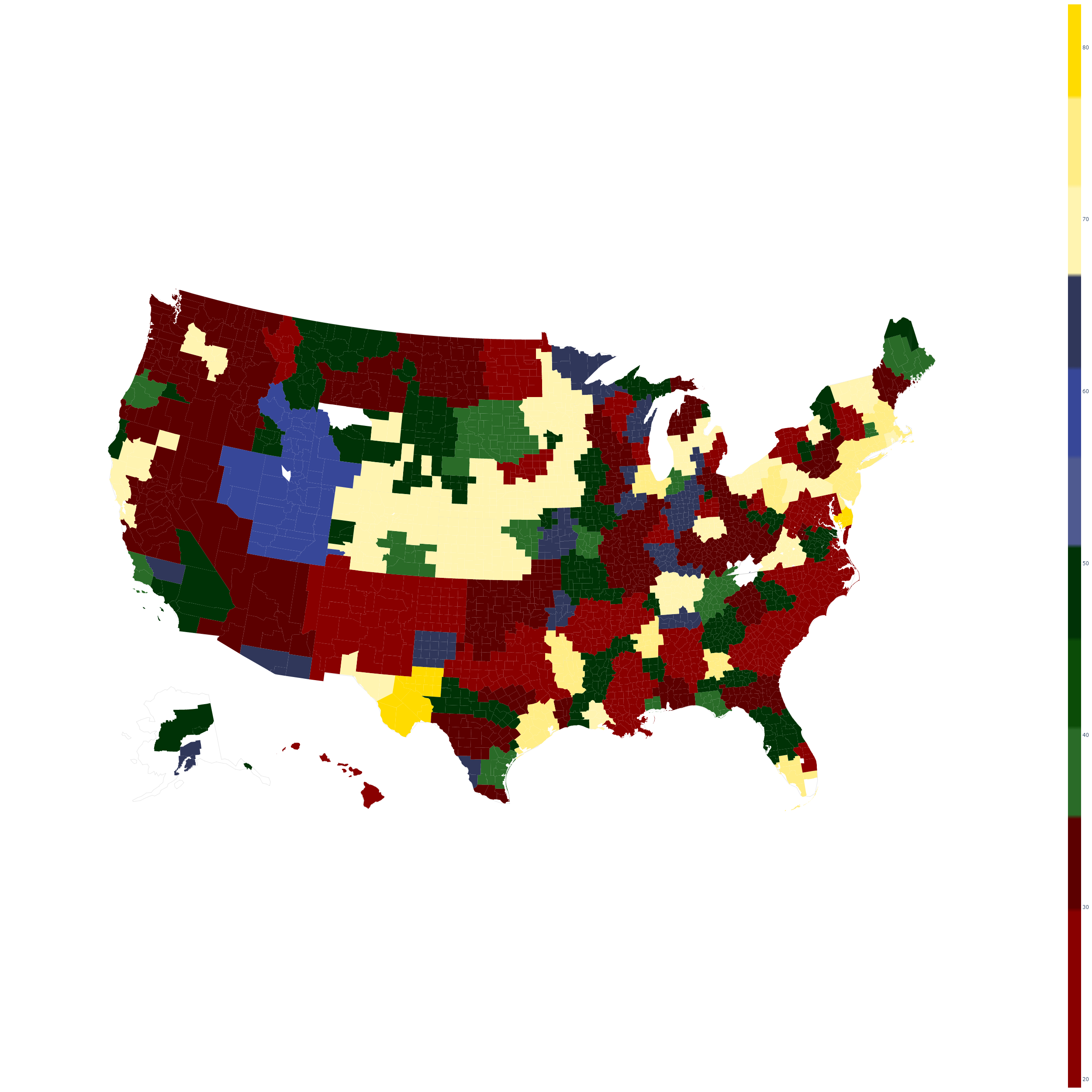
I like to segment my data into regions based on category. For example if I am trying to show three categories of data I will use the ranges of 0–33 for the first set set, 34–66 for the second and finally 67–100. Within each of these categories I wanted to display its own set of discrete colours (see the main image above). To do this I wrote the following function that I hope will help anyone out there trying to do the same!
The Function
All the function does is take in a list of lists of colour elements. It then figures out how to make discrete blocks of colour for the various inputs. Take a read and see how to actually call it below.
def generateDiscreteColourScale(colour_set):
    #colour set is a list of lists
    colour_output = []
    num_colours = len(colour_set)
    divisions = 1./num_colours
    c_index = 0.
    # Loop over the colour set
    for cset in colour_set:
        num_subs = len(cset)
        sub_divisions = divisions/num_subs
        # Loop over the sub colours in this set
        for subcset in cset:
            colour_output.append((c_index,subcset))
            colour_output.append((c_index + sub_divisions-
                .001,subcset))
            c_index = c_index + sub_divisions
    colour_output[-1]=(1,colour_output[-1][1])
    return colour_output
The above is a pretty short piece of code but it does a lot of work for us.
#data-science #visualization #python #programming #plotly