Time Series Prediction with TensorFlow
In this article, we focus on ‘Time Series Data’ which is a part of Sequence models. In essence, this represents a type of data that changes over time such as the weather of a particular place, the trend of behaviour of a group of people, the rate of change of data, the movement of body in a 2D or 3D space or the closing price for a particular stock in the markets.
Analysis of time series data can be done for anything that has a ‘time’ factor involved in it.
So what can machine learning help us achieve over time series data?
1) Forecasting — The most conspicuous application of all is forecasting the future based on historical data collected.
2) Imputation of data — Projecting data in the past thereby predicting data from the past even though we haven’t collected it. It can also be used to predict missing values in the data.
3) Detect anomalies — Can be used to detect potential denial of service attacks.
4) Detecting patterns — Can be used to predict words in a sound wave series of data.
There are certain keywords that always come up when dealing with time series data.
Trend

The time series has a specific direction in which the data is moving in. The above picture is of a series of data having an upwards facing trend.
Seasonality

Patterns repeating at predictable intervals. The above is the data for a website for software developers. The data has an upward value for 5 units and down for 2. Therefore we can infer for each individual hump, the dips at the beginning of the hump and at the end correspond to the weekends and the data in between corresponds to the working days
Combination

The above pic is the combination of the types of data having an upward trend and a seasonality.
White Noise

This is just a set of random values and can’t be used for prediction. This is therefore referred to as white noise.
Autocorrelation

There is no seasonality or trend and spikes appear to occur at random intervals but the spikes aren’t random. Between the spikes, there is a very deterministic type of decay.

The next time step is 99% the value of the previous time step plus an occasional spike. The above is an auto correlated series, namely, it correlates with a delayed copy of itself also called a lag.

The values in the above highlighted box seem to have a strong autocorrelation, a time series like this is describes as having memory where steps are dependent on the previous ones. The spikes are often called innovation. In other words, these innovations cannot be predicted using past values.
Therefore we know now that a time series data is a combination of Trend, Seasonality, Autocorrelation and Noise.

Machine Learning models are trained to spot patterns and based on these patterns, it predicts the future. This, therefore, for the most part, it is relevant with respect to time series except for the noise which is unpredictable, but still, this gives the model an intuition that patterns that existed in the past may exist in the future.

A stationary (time) series is one whose statistical properties such as the mean, variance and autocorrelation are all constant over time. Hence, a non-stationary series is one whose statistical properties change over time.
Of course the real life time series, there can also be unforeseen events that may influence the data. Take for example the above graph. If the above graph was for a stock, the “Big Event” that may have caused such a change may be due to some financial crisis or a scandal.

One way to predict the data is using “Naive Forecasting”, i.e. taking the last value and assuming that the next value will be the same one.

Dividing the data into three parts for training, validation and testing is called “Fixed Portioning”. While doing this one has to ensure that each period contains a whole number of seasons.
Eg: — If the time series has a yearly seasonality, then each period must contain a span of 1 year or 2 year or 3 year seasonality. If we take a period that contains a span of 1 1/2 years, then some months will be represented more than the others.
This is a bit different when compared to non-time series data set wherein we picked random values to do the same and it didn’t affect the end result. Here, however, we’ll notice that the choice of span and period effects the final result as data is time sensitive.
Another thing to consider is that while training we can use the strategy as portrayed above to split the data into the three parts, however once the training is complete and we have the model ready, we should retrain it on the entire data as the portion of the data used for testing correlates to the most recent data to the current point of time and is the strongest signal in determining the future values.

Metrics for evaluating performance


The most basic method for forecasting is the ‘Moving Average’. The idea is that the yellow line in the above graph is the average of a blue values taken in a particular fixed time-frame called an ‘Averaging Window’.
The above curve gives a nice smooth curve for the time-series but it does not anticipate the trend or seasonality. It can even give a poor performance than a naive forecast, giving a large MSE.

One way to eliminate this is by removing the trend or seasonality by a method called ‘Differencing’. In this method, we study the value at time ‘t’ and at time ‘t-365’. Depending on the time period of the time-series, the period over which differencing is done can change.
Doing this we get the above result. The above values have no trend and no seasonality.

We can then use a moving average to forecast the time series. The yellow line therefore gives us the moving average of the above data, but this is just the forecast of the difference in the time-series. To get the real data, we add the ‘differenced’ data with the data of ‘ t-365’.
In the picture below, since the seasonality period is 365, we will subtract the value t-365 from the value at time t.


The result of the above operation is shown in the above graph. Compared to the previous moving average forecasting, we get a low ‘MSE’. This is a slightly better version than the Naive method.
We would notice that the forecast predicted has a lot of noise. This is because while taking the difference, the noise from the ‘t-365’ data got added into our prediction. To avoid that, we can take a moving average on the ‘t**-365**’ data and then add it to our ‘Differenced’ data.

If we do that, we end up with the above forecast depicted by the yellow line. The above curve is smooth and has a better ‘MSE’.
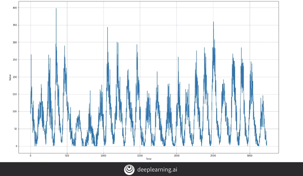
Let’s get our hands dirty with the actual coding part. We’ll follow a few steps mentioned below to simulate a time series dataset and attempt to build a model on it.
We create a dataset with values ranging from 0 to 9 and explicitly convert it to numpy array.

The dataset is broken into windows of size 5, i.e. each window of data contains 5 instances of data. A shift of 1 causes the next window of data to have the first instance of data to shift by 1 unit.

The drop_remainder causes the residual windows not containing a set of 5 data points to be dropped.

Each window of data is flat mapped into batches of 5.

Mapping is done to contain the first 4 instances as training data and remaining data at the end of each window as the label. The dataset is then shuffled with the buffer size of the same size of the range of data.
Data is shuffled in order to avoid Sequence Bias.
Sequence bias is when the order of things can impact the selection of things. For example, if I were to ask you your favorite TV show, and listed “Game of Thrones”, “Killing Eve”, “Travelers” and “Doctor Who” in that order, you’re probably more likely to select ‘Game of Thrones’ as you are familiar with it, and it’s the first thing you see. Even if it is equal to the other TV shows. So, when training data in a dataset, we don’t want the sequence to impact the training in a similar way, so it’s good to shuffle them up.

The dataset is broken into batches of 2 with each X as a list containing training data and each Y mapped to the data as label.

The data is split so that the training data contains the seasonality and trend to be incorporated into the training data.

The data is broken down into different windows using the function below.

Windowed instance of the dataset is created by name dataset and the model is created.

Iterating over each window, we try to predict the validation data.

We incorporate a learning rate scheduler in an attempt to gauge the optimum learning rate for the model.

We plot the series of different learning rates that have been implemented and identify the best suited learning rate for our model.

From the graph above we observe that the lowest cost associated to the learning rate is somewhere around 1e-5. However, an interesting thing to notice here is that the graph seems to be quite shaky around this and a few subsequent points. Using this learning rate might adversely affect our prediction model. Therefore the best suited learning rate seems to be 1e-6, being both smooth as well as low.
We now plot the loss function with respect to epochs.

It may seem that the model has stopped learning and consequently, the graph seems to have been saturated in the first few epochs, but this is not the case. When we plot the loss function for the first 10 epochs, we notice that the loss keeps on decreasing. This means that even though the learning rate is quite slow, the model continues to learn.

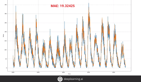
Finally, we plot the graph for the data. Blue being the original and yellow being the predicted,

Our mean squared error is given below.

Recurrent Layer

We begin to use Machine Learning techniques in order to predict the future values for the data. In the above picture, we have an input batch vector of size (4, 1). Imagine if the Memory Cell has 3 neurons, the output of the Memory Cell will have a shape of (4, 3). Therefore, if the entire series has 30 memory cells, the overall size of the output of the network would be (4, 3, 30).

The previous diagram was an example of Sequence-to-Sequence network where a sequence was given as an input and a sequence was received as an output, i.e. the output was of the shape of (4, 3, 30). This type of architecture is useful when we need to stack one RNN layer above the other.
The diagram above is of a Sequence-to-Vector network where a sequence is given as an input but we receive a vector as an output, i.e. the output is of the shape of (4, 3, 1).

To demonstrate the working of the Sequence-to-Vector model, we use the above diagram. For the first layer, the “return_sequences = True” causes every time-step in the layer below to return an output which is a sequence. This is then fed into the next layer. The next layer has by default, “return_sequences = False”, this causes only a vector to be given as an output.
Notice the input_shape = [None, 1] parameter. Tensorflow assumes the first dimension is the batch size and it being set to “None” means that it can have any size as the input batch size, the next dimension is the no. of time-steps which can be set to “None” meaning, that the RNN model can handle sequences of any length, the final value is “1” as the data is univariate.
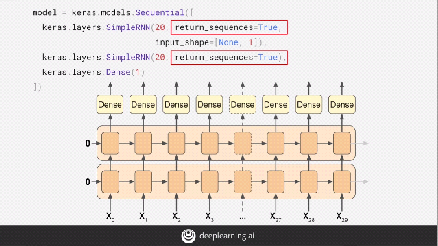
If we add the parameter of “return_sequences = True” in the above model, the second layer of the model now gives a sequence as an output instead of a vector. The Dense layer now gets a sequence as an input. Tensorflow handles this by using the same Dense layer independently with the output of each time-step.
LSTMs
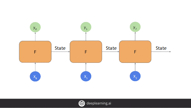
When we looked at an RNN, it appeared to be something like the above diagram. Here the individual nodes were fed inputs on batch sized data X[i] and gave an output y[i] while passing the cell state from this node to the next, the state being an important factor to calculate subsequent outputs.
The problem with this approach is that, as the cell state passes from one node to another, it’s value diminishes and it’s effect gradually fades off.
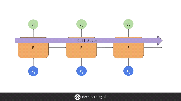
To cope with this, a new approach called LSTMs are applied.
LSTMs eliminates this problem by introducing a Cell State which passes the cell state from cell to cell and timestep to timestep and therefore the state can be better maintained.
The cell state can be both uni-directional as shown above or bi-directional as shown below.
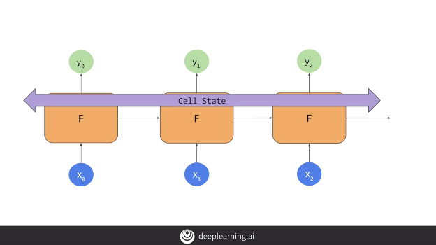
This means that the data in the earlier window can have a greater impact on the overall projection than in the case of RNNs.
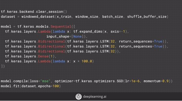
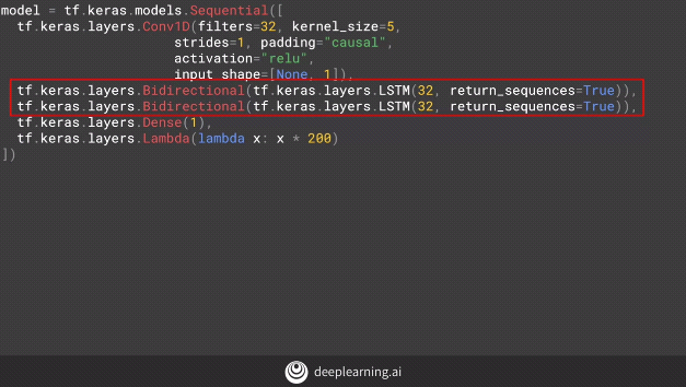
Implementing the LSTMs in our code.
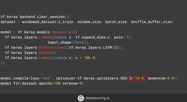
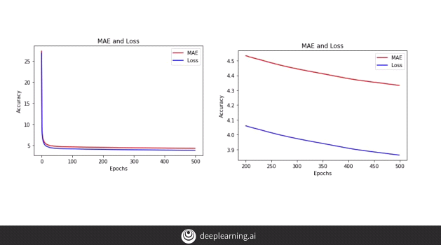
Upon adding another layer of bi-directional LSTM to our model.
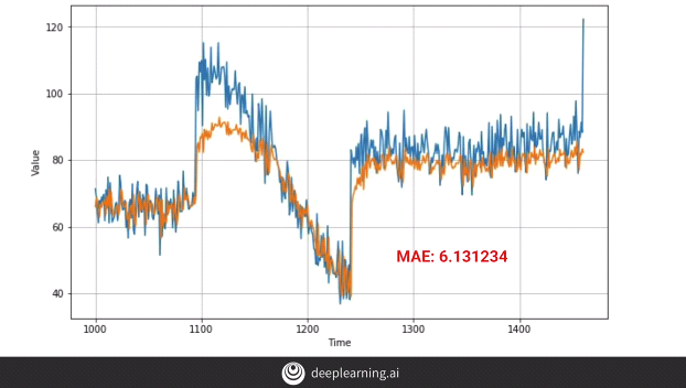
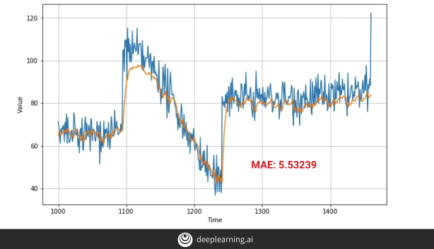
The above code gives us the following output:-
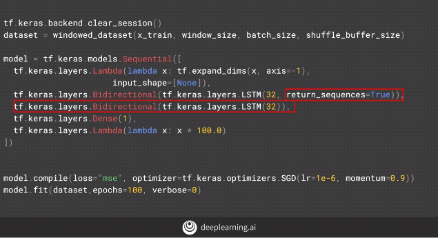
By adding a new layer of bi-directional code below, we get the following results.
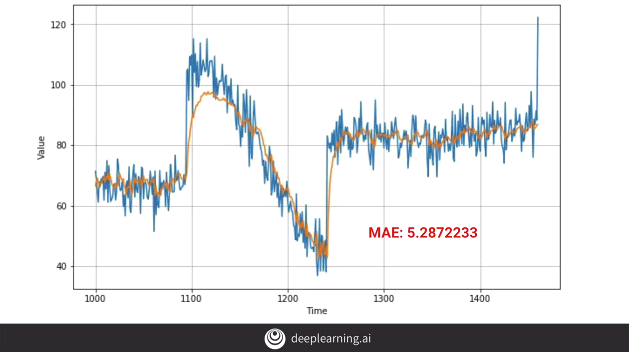
We don’t observe much difference, in fact, the MAE appears to have fallen down, i.e. our model’s performance has dropped.
Therefore, one must experiment with different types of layers in the model and select the optimal one.
Implementing Convolutions to the model
Why do we use convolutions in a time series analysis problem?
One reason is because they are cheaper to train.
Second, they are best suited for many practical problems. For example, in certain instances where we apply RNNs, we assume that the “every” data that occurred previously will be required to guess the next data. RNNs work on this concept as it takes into consideration all the historical data to predict the next item of data. The fact is that we don’t really require the entire lot of data.
To understand this, let’s consider an example of a bullet projectile. In order to predict the next value of the projectile, we don’t really require all the historical projectile data. Suppose the projectile data is a set of ’n’ instances, we’ll require only the latest ‘k’ instances to predict the next projectile data where k<n.
Thus one can limit the time dependence and instead use a CNN architecture to model a time series. So now each assumption becomes a time instance dependent on the previous ‘k’instances which is the receptive field on the convolutions. Each CNN filter learns a set of rules and applies those rules to a particular portion of data that best fit the rule. This, therefore, becomes a non-linear system.
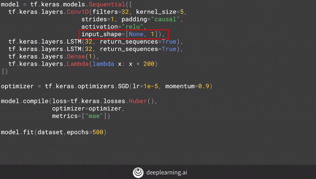
We notice the ‘input shape’ which is converting the data to 1 dimensional data in contrast to a 2 dimensional data normally used by convolutions to process images (images being a 2-D data).
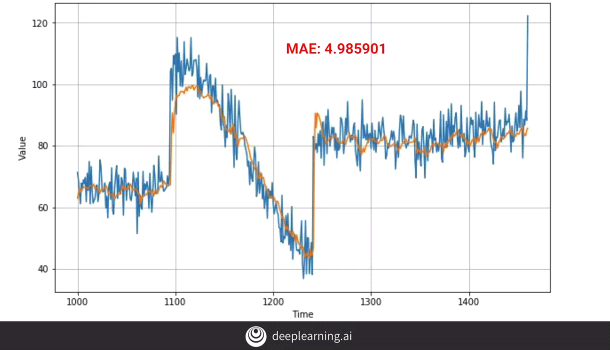
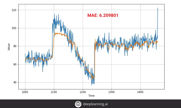
The above plot is obtained after we apply the conv layers. It’s a huge improvement from the earlier plots. The plot however can still be improved by:-
- Training it for a longer period of time.
One can see from the plot that model is still learning perhaps at a small pace and therefore if we continue to train the model for a longer period of time, the overall efficiency of the model can improve.
2. Another method is to make the model bi-directional.
However, we notice that the model is now beginning to overfit the data and the ‘MAE’ has in fact increased.
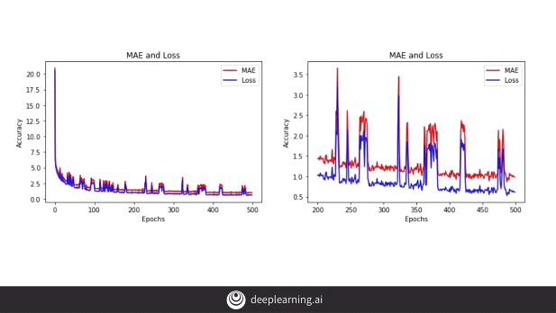
When we plot the data we can clearly see that there is a lot of noise in the data and since we are feeding the model with data in mini-batches, we end up with this result. So this allows us to conclude that the above step is a step in the right direction and with a few tweaks in the hyperparameters like the batch size, we can improve our results. We can experiment with batch size and try to get to proper result.
Process of tuning our model
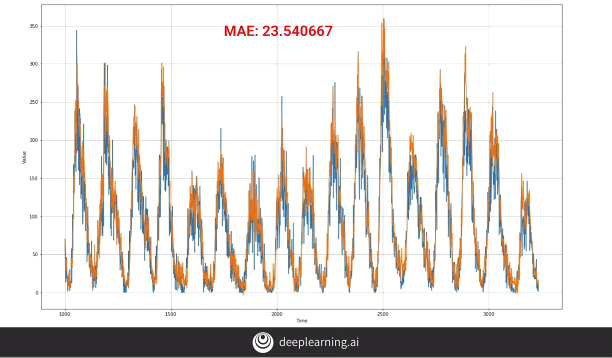
We take an example of ‘Sunspot activity dataset’. We train our model using the basic ‘Dense’ layer network with two layers having 10 neurons in each layer. We therefore get the above result.
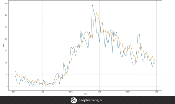
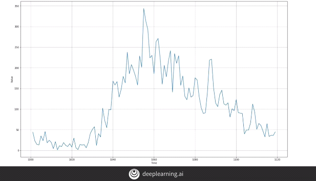
Indeed when we zoom in we can see how our forecast behaves when compared to the original data.
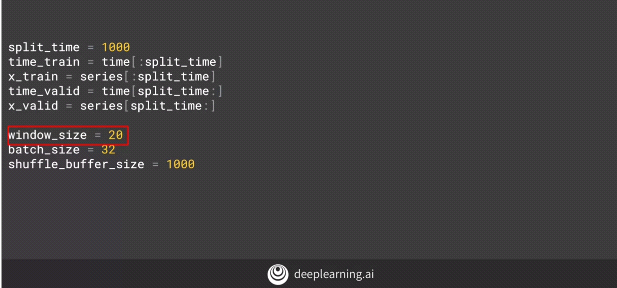
We can see that the train window size is 20 which basically means we have 20 time slices worth of data. Each time slice corresponds to a month.
Upon viewing the data we realize that we have a seasonality of 11 to 22 years.
So we now use a time slice of 132 which is again equal to 11 years (132 months = 11 years).
But we notice that the MAE actually increased. Therefore increasing the window size didn’t work.
When we analyze our data, we find out that even though the data has an 11 year seasonality, the noise makes it behave as a typical time series data.
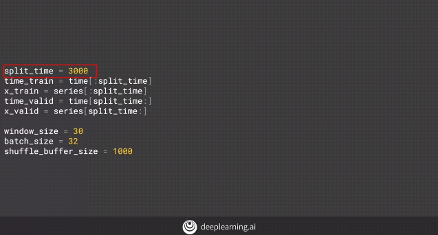
Therefore, we change the ‘window size’ to 30 and focus more on the amount of data being given for training and testing. Giving more data to training improves the efficiency of the model.
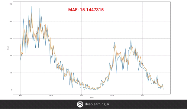
Now the ‘MAE’ has reduced to 15.14. We can further make changes by changing the number of input nodes. Now that our input data has increased to 30, we can have the input nodes as 30. However, this caused our network to perform worse than before, on the other hand, tweaking the ‘learning rate’ improved the efficiency of the model.
Let’s appreciate the fact that although changing the:-
1. Batch Size
2. No. of neurons
3. Window size
4. Training data size
5. Learning rate
Resulted in many changes in our model, some facilitating the prediction efficiency while some deteriorating it, each one is equally important and needs to be experimented with to achieve better results.
This brings us to the end of the documented course. One should appreciate the multitude of ways in which machine learning can be used to predict on sequential and time series data. However, what we have witnessed here are just the superficial aspects and there is a lot more to delve deeper into. With what we have learnt over the course of this article, we are ready to take up new and complex challenges. To mention one… ‘Multivariate time series data’.
I hope this motivates you to actually take up the course and try to implement it yourself.
#tensorflow #programming #ai
