I am pleased to present volcano3D, an R package which is now available on CRAN! The volcano3D package enables exploration of probes differentially expressed between three groups. Its main purpose is for the visualisation of differentially expressed genes in a three-dimensional volcano plot. These plots can be converted to interactive visualisations using plotly:

Here I will explore a case study from the PEAC rheumatoid arthritis trial (Pathobiology of Early Arthritis Cohort). The methodology has been published in Lewis, Myles J., et al. Molecular portraits of early rheumatoid arthritis identify clinical and treatment response phenotypes. Cell reports 28.9 (2019): 2455–2470. (DOI: 10.1016/j.celrep.2019.07.091) with an accompanying interactive website available at https://peac.hpc.qmul.ac.uk:
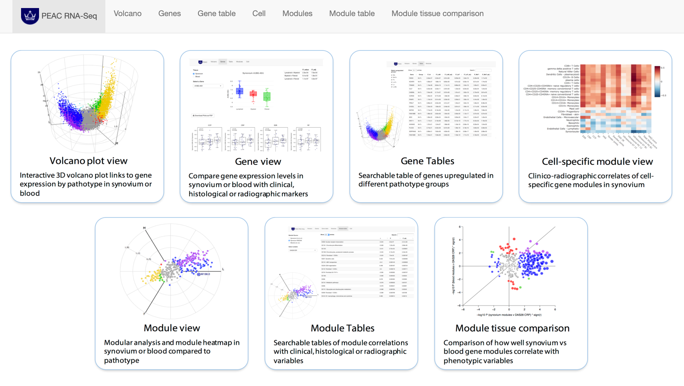
PEAC RNAseq website hosted using R Shiny and featuring volcano3D plots
This tool acts as a searchable interface to examine relationships between individual synovial and blood gene transcript levels and histological, clinical, and radiographic parameters, and clinical response at 6 months. An interactive interface allows the gene module analysis to be explored for relationships between modules and clinical parameters. The PEAC interactive web tool was creating as an R Shiny app and deployed to the web using a server.
Getting Started
Prerequisites
Install from CRAN
install.packages("volcano3D")
library(volcano3D)
Install from Github
library(devtools)
install_github("KatrionaGoldmann/volcano3D")
library(volcano3D)
volcano3D data
The sample data can then also be installed either from source or using:
install_github("KatrionaGoldmann/volcano3Ddata")
library(volcano3Ddata)
data("syn_data")
Samples in this cohort fall into three pathotype groups:
table(syn_metadata$Pathotype)

╔═══════════╦═══════╗
║ Pathotype ║ Count ║
╠═══════════╬═══════╣
║ Fibroid   ║ 16    ║
║ Lymphoid  ║ 45    ║
║ Myeloid   ║ 20    ║
╚═══════════╩═══════╝
In this example we are interested in genes that are differentially expressed between each of these groups.
First we will set up a polar object, using the polar_coords function, which maps the expression and p-values to polar coordinates using:

For more information on how to create p-values data frames see the pvalue generator vignette.
syn_polar <- polar_coords(sampledata = syn_metadata,
                          contrast = "Pathotype",
                          pvalues = syn_pvalues,
                          expression = syn_rld,
                          p_col_suffix = "pvalue",
                          padj_col_suffix = "padj",
                          fc_col_suffix = "log2FoldChange",
                          multi_group_prefix = "LRT",
                          non_sig_name = "Not Significant",
                          significance_cutoff = 0.01,
                          label_column = NULL,
                          fc_cutoff = 0.1)
This creates a polar class object with slots for: sampledata, contrast, pvalues, multi_group_test, expression, polar and non_sig_name. The pvalues slot which should have a data frame with at least two statistics for each comparison — p-value and adjusted p-value — and an optional logarithmic fold change statistic.
If there is a fold change column previously provided, we can now investigate the comparisons between pathotypes using the volcano_trio function. This creates three ggplot outputs:
syn_plots <-
     volcano_trio(
                  polar = syn_polar,
                  sig_names = c("not significant","significant",
                                "not significant","significant"),
                  colours = rep(c("grey60",  "slateblue1"), 2),
                  text_size = 9,
                  marker_size=1,
                  shared_legend_size = 0.9,
                  label_rows = c("SLAMF6", "PARP16", "ITM2C"),
                  fc_line = FALSE,
                  share_axes = FALSE)

syn_plots$All
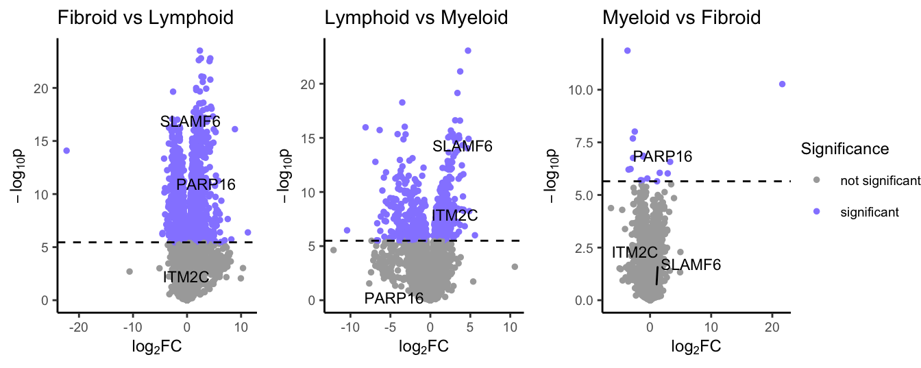
volcano plots showing differential expression for each comparison
#plotly #data-science #data analysis
