Uber Movement allows users to select an origin and a destination zone to see the average, lower bound and upper bound travel times taken by drivers on from A to B on a given day or time interval across multiple cities worldwide.
In this article, I will dig into what that data looks like and some into of its characteristics, discuss a few of its issues and start a discussion on how to look at it from a time series forecasting perspective.
Unfortunately, if you’d like to download the data yourself, Uber only provides cross-sectional data across a span of a maximum of 3 months.
Fortunately, in a previous post I expanded on how I created time series data out of the data available for download on their website, so check it out if you’re interested in generating time series data out of it.
Ok, enough chatting… let’s open up that csv file!
Creating time travel values per date
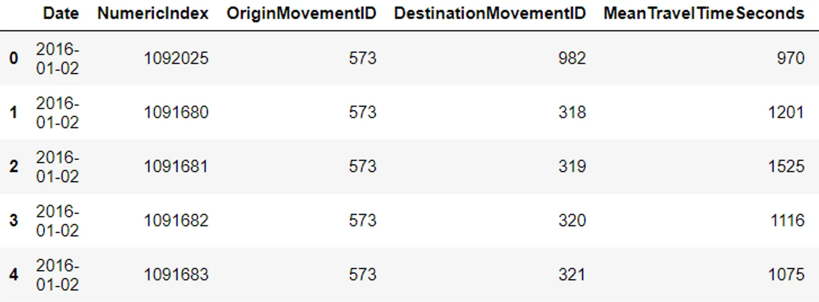
Let’s look at the dataset for the city of London.
Our datasets range from January 2nd 2016 to March 31st 2020 and consist of hundreds of thousands or millions of rows (London has 1M+ rows) where each date contains many mean travel times (one for each trip from the origin zone to the destination zone). Therefore, we have to first average all the mean travel times.
## Plot average travel time per date
avg_times = df.groupby('Date')['MeanTravelTimeSeconds'].mean()
Now we have a Series object containing a single value per date, essentially making the “Date” column our index.
Let’s start plotting.
#statistics #time-series-analysis #uber #python #data-science