One of the most common components in web applications is the modal dialog. Vue modals are rather easy to create and work with, and in this tutorial, we’ll show you how!
Let’s dive right in.
Getting Started: Configuring the Development Environment
For this tutorial, we will be using the Eclipse IDE with the CodeMix plugin installed.
- Download Eclipse IDE here.
- CodeMix can be installed from the Eclipse marketplace
- Install the Vue pack using the CodeMix extension browser.
Creating a Vue Project using CodeMix
We can now create our application using the CodeMix Project Wizard. We’ll be using the latest version of all the tech libraries and stacks as at the time of this writing. To create a new Vue Project, navigate to File > New > Project > CodeMix > Vue Project. Ensure you choose the, “A Vue CLI-built application” option in the wizard before clicking Finish.

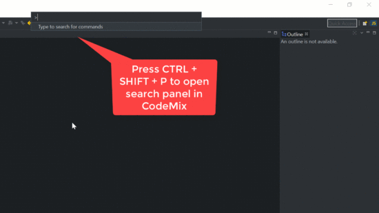
Once the project is completed, open the integrated Terminal+ for the project using Ctrl/Cmd + Shift + P, and executing the command, “Terminal: Create New Integrated Terminal”. If you have more than one project in your workspace, you will be asked to select your project in the command palette before the Terminal is opened.
In the Terminal, run the following commands to install the required Node modules.
npm install
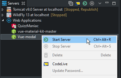
After the installation is complete, you can serve the application right away, find your application in the Servers view and use the context menu run action to start serving it.
Creating the Component
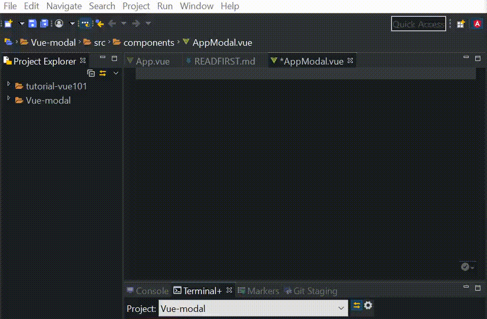
In the components folder, create a file named AppModal.vue. You can do this by using the New > Vue file wizard accessible from the project’s context menu. We’ll create a very basic component for now.
Note: For more on CodeMix’s Vue capabilities
<template>
    <div>
        <div>
            <h1>Modal heading</h1>
        </div>
        <hr>
        <div>
            <h1>Modal content</h1>
        </div>
        <hr>
        <div>
            <button>Close</button>
        </div>
    </div>
</template>
<script>
  export default {
    name: 'app-modal',
  };
</script>
In App.vue, we import the AppModal component like below:
<template>
  <div id="app">
    <h1>Vue Modal Tutorial</h1>
    <app-modal></app-modal>
  </div>
</template>
<script>
import AppModal from './components/AppModal';
export default {
  components: {
    AppModal
  }
}
</script>
<style>
#app {
  font-family: "Avenir", Helvetica, Arial, sans-serif;
  -webkit-font-smoothing: antialiased;
  -moz-osx-font-smoothing: grayscale;
  text-align: center;
  color: #2c3e50;
}
</style>
If you’re using a recent version of CodeMix, you’ve probably noticed a new browser pane beside the editor – this pane will update after you save your changes, to show you the current state of the app after your changes have been rebuilt. Your application will now look like this:
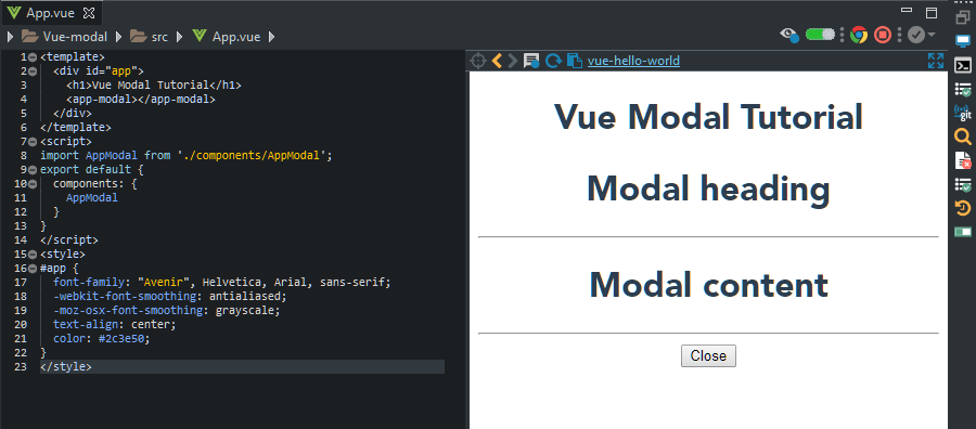 Obviously this is no good as the modal is open over our app – we’re going to add a condition under which the modal will show, and a button to display it.
<template>
  <div id="app">
    <h1>Vue Modal Tutorial</h1>
    <app-modal v-if="showModal"></app-modal>
    <button @click="openModal" v-if="!showModal">Open Modal</button>
  </div>
</template>
<script>
import AppModal from './components/AppModal';
export default {
  components: {
    AppModal
  },
  data() {
    return {
      showModal: false
    }
  },
  methods: {
    openModal() {
      this.showModal = true;
    }
  },
}
</script>
Here we created our modal template with two div tags and one button element. The button is used to open our modal. In our second div tag, we added a v-if=isOpen directive so that our modal will only display if the isOpen property is true.
Introducing Vue.js Slots
Vue.js slots are handy when we want to embed content inside child components. So let’s allow the App.vue component to pass DOM elements into the AppModal.vue component. At the same time, we’ll take the opportunity to add some style to our modal, so replace the contents of AppModal.vue with the source below.
<template>
    <div class="modal" v-if="showModal">
        <div v-if="showModal" class="modal-content">
            <div class="modal-header">
                <slot name="header"></slot>
            </div>
            <hr>
            <div class="modal-body">
                <slot name="body"></slot>
            </div>
            <hr>
            <div>
                <button>Close</button>
            </div>
        </div>
    </div>
</template>
<script>
  export default {
    name: 'app-modal',
    props: {
        showModal: Boolean
    }
  };
</script>
<style>
    .modal {
        position: fixed;
        top: 50%;
        left: 50%;
        transform: translate(-50%, -50%);
        width: 600px;
        max-width: 100%;
        height: 400px;
        max-height: 100%;
        background: #FFFFFF;
        box-shadow: 2px 2px 20px 1px;
        overflow-x: auto;
        display: flex;
        flex-direction: column;
    }
</style>
We’ll modify the template section of App.vue with the template below, to actually pass data to our modal component.
<template>
  <div id="app">
    <h1>Vue Modal Tutorial</h1>
    <button @click="openModal" v-if="!showModal">Open Modal</button>
    <app-modal v-if="showModal" :showModal=showModal>
      <div slot="header">
        <h3 class="modal-title">
          CodeMix
        </h3>
      </div>
      <div slot="body">
        <p>
          With CodeMix, you can join the modern web movement right from your Eclipse IDE!
        </p>
      </div>
    </app-modal>
  </div>
</template>
<script>
Closing the Modal
We need to find a way for passing data from the child component back to the parent, so AppModal component can say, “Hey, App component, can you close this me?”.
We’ll implement a closeModal method that will use $emit for this purpose, and we’ll call this from the button, on click.
In AppModal.vue, add the following to the scripts section
methods: {
        closeModal() {
            this.$emit('clicked');
        }
    },
And we’ll modify our button to call this method:
<button @click="closeModal">Close</button>
Back in App.vue we need to receive the clicked event and close the modal, so add the following method to the methods section which already exists:
onChildClick () {
      this.showModal = false;
    }
And we’ll modify the reference to the app-modal component to call the above method when receiving a clicked event:
<app-modal v-if="showModal" :showModal=showModal @clicked="onChildClick">
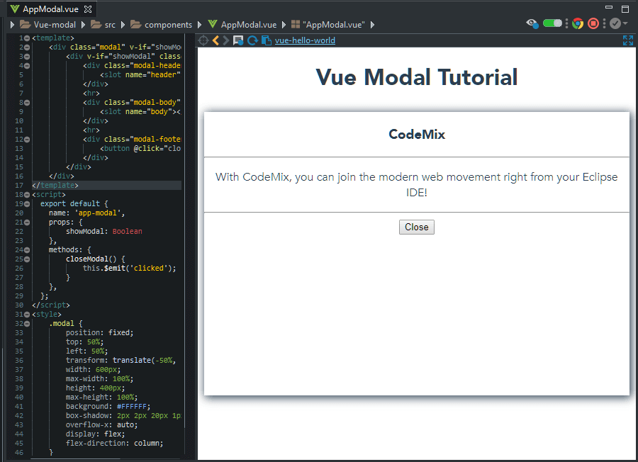
This is how your app should finally look:
Here are two vue files in their entirety, just in case you missed something.
AppModal.vue
<template>
    <div class="modal" v-if="showModal">
        <div v-if="showModal" class="modal-content">
            <div class="modal-header">
                <slot name="header"></slot>
            </div>
            <hr>
            <div class="modal-body">
                <slot name="body"></slot>
            </div>
            <hr>
            <div class="modal-footer">
                <button @click="closeModal">Close</button>
            </div>
        </div>
    </div>
</template>
<script>
  export default {
    name: 'app-modal',
    props: {
        showModal: Boolean
    },
    methods: {
        closeModal() {
            this.$emit('clicked');
        }
    },
  };
</script>
<style>
    .modal {
        position: fixed;
        top: 50%;
        left: 50%;
        transform: translate(-50%, -50%);
        width: 600px;
        max-width: 100%;
        height: 400px;
        max-height: 100%;
        background: #FFFFFF;
        box-shadow: 2px 2px 20px 1px;
        overflow-x: auto;
        display: flex;
        flex-direction: column;
    }
</style>
App.vue
<template>
  <div id="app">
    <h1>Vue Modal Tutorial</h1>
    <button @click="openModal" v-if="!showModal">Open Modal</button>
    <app-modal v-if="showModal" :showModal=showModal @clicked="onChildClick">
      <div slot="header">
        <h3 class="modal-title">
          CodeMix
        </h3>
      </div>
      <div slot="body">
        <p>
          With CodeMix, you can join the modern web movement right from your Eclipse IDE!
        </p>
      </div>
    </app-modal>
  </div>
</template>
<script>
import AppModal from './components/AppModal';
export default {
  components: {
    AppModal
  },
  data() {
    return {
      showModal: false
    }
  },
  methods: {
    openModal() {
      this.showModal = true;
    },
    onChildClick () {
      this.showModal = false;
    }
  },
}
</script>
<style>
#app {
  font-family: "Avenir", Helvetica, Arial, sans-serif;
  -webkit-font-smoothing: antialiased;
  -moz-osx-font-smoothing: grayscale;
  text-align: center;
  color: #2c3e50;
}
</style>
Conclusion
In this article we’ve learnt how to create a modal dialog with Vue, and explored the use of named slots to distribute content between components.
You can download the source code from our GitHub repository here.
#vue-js #javascript #web-development