A short tutorial to transform simple D3.js graphs to wonderful graphs with a context
The Data Driven Library (D3) is one of the most famous Javascript libraries used to build graphs and draw paintings. Regarding graphs, there are many web sites providing ready-to-use code, such as the D3 Graph Gallery and From Data to Viz. However, these web sites provide only the basic code, without tips or details to highlight data context or insights.
In this tutorial, I exploit the d3-annotation library to extend two simple graphs provided by the D3 Graph Gallery, in order to make them more readable from general audience:
- a simple bar chart
- a simple line chart
No one ever made a decision because of a number. They need a story. (Dan Kahneman)
All the code is available in my GitHub repository.
Bar Chart
The first example is the simple bar chart, provided by the D3 Graph Gallery and shown in the following figure:
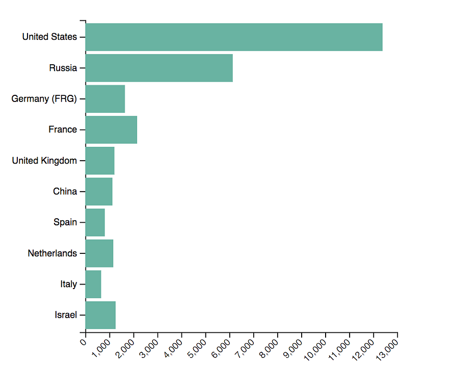
Image by Author
The graph tries to plot the following dataset:
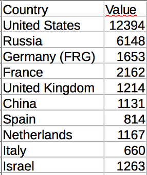
Image by Author
From the point of view of data context, this graph presents at least two problems:
- countries in the bar are not ordered, thus it is difficult to understand which country behaves better than the others.
- there is no focus on the graph, thus the reader should imagine what the graph wants to say.
#javascript #graph #data-science #d3js
