An excellent way to visualize proportions and composition
Bar charts are by far my favourite visualization technique. They are very versatile, usually easy to read, and relatively straightforward to build.

Just like any visualization, they do have some disadvantages as well. For example, they struggle with scalability.Too many bars in a bar chart make it confusing and hard to read. That is more than ordinary when we’re working with hierarchical categories — In other words, when we have groups and subgroups that we need to visualize.
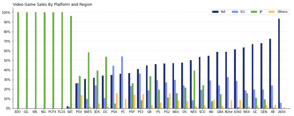
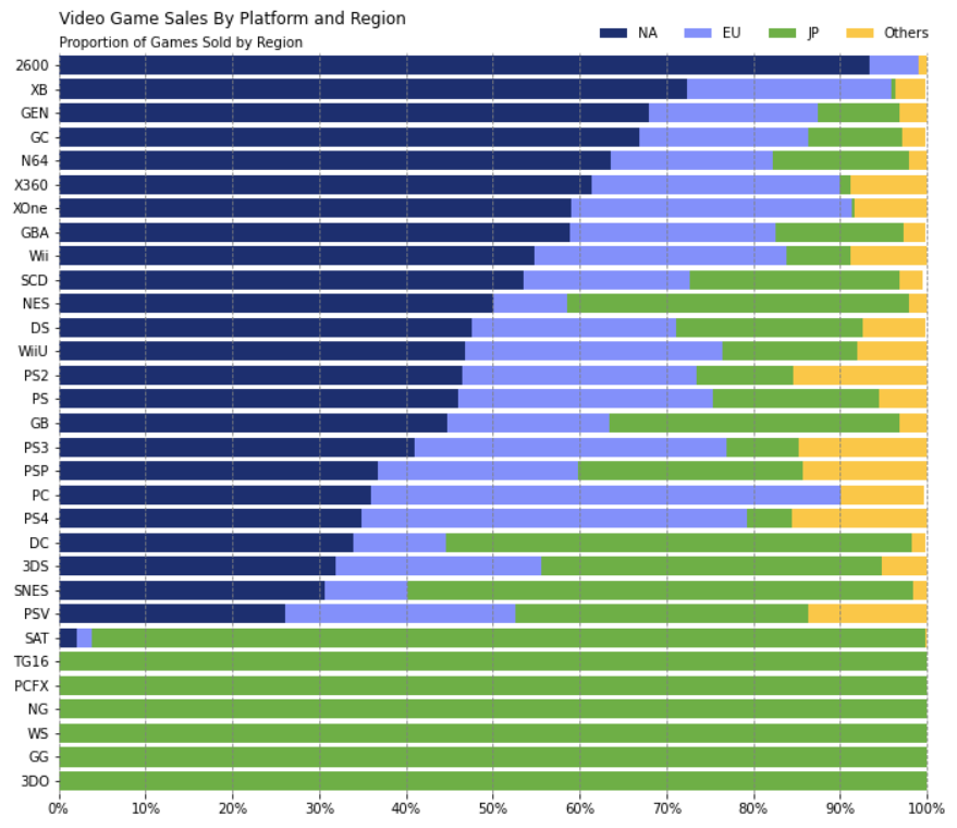
Stacked bars are a great alternative in those cases, allowing us to compare and analyze those groups’ composition.
In this article, we’ll explore how to build those visualizations with Python’s Matplotlib.
#python #data-science #matplotlib #data-visualization #developer