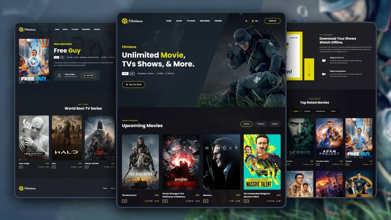
In this video, we will show you how to build a (mobile-first responsive) movie website using html css and javascript.
⏱️ Timestamps
-----------------------------
0:00 - Demo
5:50 - File structure
6:19 - Project initial
10:47 - Header
26:25 - Hero section
37:18 - Upcoming movie section
54:31 - Service section
1:03:47 - Top rated movie section
1:13:53 - Tv series section
1:18:05 - CTA section
1:23:02 - Footer
1:38:11 - Movie detail page
1:51:18 - Media queries
Live Website: https://codewithsadee.github.io/filmlane
Github Repo: https://github.com/codewithsadee/filmlane
🔗 Essential links
-----------------------------
Starter file : https://drive.google.com/file/d/1jghp54vEYmRqOsW5YfMVigIKmJqrzmI-/view?usp=sharing
Subscribe: https://www.youtube.com/@codewithsadee/featured