A Simple Options Selector With React
react-simple-options-selector
A Simple Options Selector With React.
Creates a row of buttons that can be toggled on/off
Installation
The easiest way to use react-simple-options-selector is to install it from NPM and include it in your own React build process (using Browserify, Webpack, etc).
You can also use the standalone build by including dist/react-simple-options-selector.js in your page. If you use this, make sure you have already included React, and it is available as a global variable.
npm install react-simple-options-selector --save
Usage
import ReactSimpleOptionsSelector from "react-simple-options-selector"
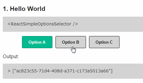
<ReactSimpleOptionsSelector />
Props
From …/src/ReactSimpleOptionsSelector.js
options
Default:

[

        {
            id: uuid.v4(),
            label: 'Option A',
            selected: true,
        },
        {
            id: uuid.v4(),
            label: 'Option B',
            selected: false,
        },
        {
            id: uuid.v4(),
            label: 'Option C',
            selected: false,
        }

]
name
Default : 'react_simple_options_selector_example'
onSelectionChange
// Default
(name, selected)=>{
    console.log(name, selected);
}
type
/**
 Options: 'radio' or 'checkbox'

 radio: One selection can be made
 checkbox: Multiple selections can be made

 **/
 Default: 'radio'
align
Default: : "center"
margin_bottom
Default: : 10
margin_left
Default: : 0
margin_right
Default: : 10
margin_top
Default: : 0
padding_bottom
Default: : 0
padding_left
Default: : 0
padding_right
Default: : 0
padding_top
Default: : 0
selected_background_color
Default: : "#06BA90"
selected_border_color
Default: : "#04755B"
selected_text_color
Default: : "#ffffff"
Examples
To build the examples locally, run:
npm install
npm start
Then open localhost:8000 in a browser.
Notes
Version 1.0.0 is a bare minium example I’ve built for my own project. Please submit any feature requests or pull requests with new feature to make this awesome.
This has been scaffolded by - JedWatson’s generator-react-component
Development (src, lib and the build process)
NOTE: The source code for the component is in src. A transpiled CommonJS version (generated with Babel) is available in lib for use with node.js, browserify and webpack. A UMD bundle is also built to dist, which can be included without the need for any build system.
To build, watch and serve the examples (which will also watch the component source), run npm start. If you just want to watch changes to src and rebuild lib, run npm run watch (this is useful if you are working with npm link).
Download Details:
Author: ankithkonda
Demo: https://ankithkonda.github.io/react-simple-options-selector/
Source Code: https://github.com/ankithkonda/react-simple-options-selector
#react