.NET Core 3.1 Preview 2 is now available. This release is primarily focused on bug fixes, but it contains a few new features as well.
Here’s what’s new in this release for ASP.NET Core:
- New component tag helper
- Prevent default actions for events in Blazor apps
- Stop event propagation in Blazor apps
- Validation of nested models in Blazor forms
- Detailed errors during Blazor app development
See the release notes for additional details and known issues.
Get started
To get started with ASP.NET Core in .NET Core 3.1 Preview 2 install the .NET Core 3.1 Preview 2 SDK.
If you’re on Windows using Visual Studio, for the best experience we recommend installing the latest preview of Visual Studio 2019 16.4. Installing Visual Studio 2019 16.4 will also install .NET Core 3.1 Preview 2, so you don’t need to separately install it. For Blazor development with .NET Core 3.1, Visual Studio 2019 16.4 is required.
Alongside this .NET Core 3.1 Preview 2 release, we’ve also released a Blazor WebAssembly update. To install the latest Blazor WebAssembly template also run the following command:
dotnet new -i Microsoft.AspNetCore.Blazor.Templates::3.1.0-preview2.19528.8
Upgrade an existing project
To upgrade an existing ASP.NET Core 3.1 Preview 1 project to 3.1 Preview 2:
- Update all Microsoft.AspNetCore.* package references to 3.1.0-preview2.19528.8
See also the full list of breaking changes in ASP.NET Core 3.1.
That’s it! You should now be all set to use .NET Core 3.1 Preview 2!
New component tag helper
Using Razor components from views and pages is now more convenient with the new component tag helper.
Previously, rendering a component from a view or page involved using the RenderComponentAsync HTML helper.
@(await Html.RenderComponentAsync<Counter>(RenderMode.ServerPrerendered, new { IncrementAmount = 10 }))
The new component tag helper simplifies the syntax for rendering components from pages and views. Simply specify the type of the component you wish to render as well as the desired render mode. You can also specify component parameters using attributes prefixed with param-.
<component type="typeof(Counter)" render-mode="ServerPrerendered" param-IncrementAmount="10" />
The different render modes allow you to control how the component is rendered:
| RenderMode | Description |
|---|---|
| Static | Renders the component into static HTML. |
| Server | Renders a marker for a Blazor Server application. This doesn’t include any output from the component. When the user-agent starts, it uses this marker to bootstrap the Blazor app. |
| ServerPrerendered | Renders the component into static HTML and includes a marker for a Blazor Server app. When the user-agent starts, it uses this marker to bootstrap the Blazor app. |
Prevent default actions for events in Blazor apps
You can now prevent the default action for events in Blazor apps using the new @oneventname:preventDefault directive attribute. For example, the following component displays a count in a text box that can be changed by pressing the “+” or “-” keys:
<p>Press "+" or "-" in change the count.</p>
<input value="@count" @onkeypress="@KeyHandler" @onkeypress:preventDefault />

@code {
    int count = 0;

    void KeyHandler(KeyboardEventArgs ev)
    {
        if (ev.Key == "+")
        {
            count++;
        }
        else if (ev.Key == "-")
        {
            count--;
        }
    }
}
The @onkeypress:preventDefault directive attribute prevents the default action of showing the text typed by the user in the text box. Specifying this attribute without a value is equivalent to @onkeypress:preventDefault="true". The value of the attribute can also be an expression: @onkeypress:preventDefault="shouldPreventDefault". You don’t have to define an event handler to prevent the default action; both features can be used independently.
Stop event propagation in Blazor apps
Use the new @oneventname:stopPropagation directive attribute to stop event propagation in Blazor apps.
In the following example, checking the checkbox prevents click events from the child div from propagating to the parent div:
<input @bind="stopPropagation" type="checkbox" />
<div @onclick="OnClickParentDiv">
    Parent div
    <div @onclick="OnClickChildDiv" @onclick:stopPropagation="stopPropagation">
        Child div
    </div>
</div>

<button @onclick="OnClick">Click me!</button>

@code {
    bool stopPropagation;

    void OnClickParentDiv() => Console.WriteLine("Parent div clicked.");
    void OnClickChildDiv() => Console.WriteLine("Child div clicked.");
}
Detailed errors during Blazor app development
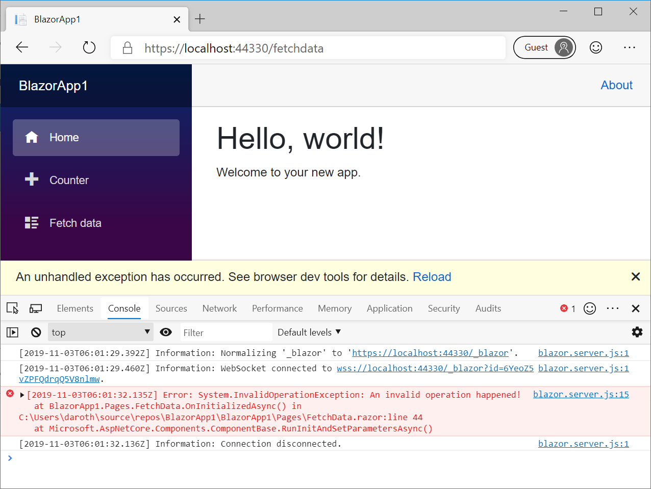
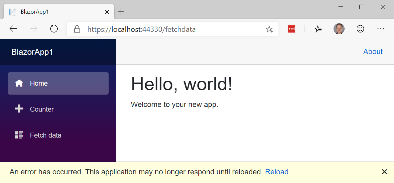
When your Blazor app isn’t functioning properly during development, it’s important to get detailed error information so that you can troubleshoot and fix the issues. Blazor apps now display a gold bar at the bottom of the screen when an error occurs.
During development, in Blazor Server apps, the gold bar will direct you to the browser console where you can see the exception that has occurred.

In production, the gold bar notifies the user that something has gone wrong, and recommends the user to refresh the browser.

The UI for this error handling experience is part of the updated Blazor project templates so that it can be easily customized:
_Host.cshtml
<div id="blazor-error-ui">
    <environment include="Staging,Production">
        An error has occurred. This application may no longer respond until reloaded.
    </environment>
    <environment include="Development">
        An unhandled exception has occurred. See browser dev tools for details.
    </environment>
    <a href="" class="reload">Reload</a>
    <a class="dismiss">🗙</a>
</div>
Validation of nested models in Blazor forms
Blazor provides support for validating form input using data annotations with the built-in DataAnnotationsValidator. However, the DataAnnotationsValidator only validates top-level properties of the model bound to the form.
To validate the entire object graph of the bound model, try out the new ObjectGraphDataAnnotationsValidator available in the experimental Microsoft.AspNetCore.Blazor.DataAnnotations.Validation package:
<EditForm Model="@model" OnValidSubmit="@HandleValidSubmit">
    <ObjectGraphDataAnnotationsValidator />
    ...
</EditForm>
The Microsoft.AspNetCore.Blazor.DataAnnotations.Validation is not slated to ship with .NET Core 3.1, but is provided as an experimental package to get early feedback.
Give feedback
We hope you enjoy the new features in this preview release of ASP.NET Core! Please let us know what you think by filing issues on GitHub.
Thanks for trying out ASP.NET Core!
#aspnet #aspnetcore #asp.net
