We at Syncfusion are continuously reviewing the constructive questions and comments we receive from our customers, which includes various feature requests. From these requests, we handpicked the most widely requested features and made them available in the Essential Studio 2020 Volume 2 release.
In this blog post, I’ll quickly review the new features included in the Flutter Charts widget for the 2020 Volume 2 release.
Let’s see them!
New chart types
We extended the Syncfusion Flutter Charts widget to support two more chart types:
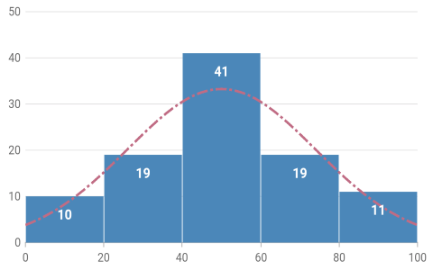
Histogram chart
A histogram chart looks like a bar chart. It is used to represent the distribution of numerical data by rendering vertical bars. Non-discrete values comparison is graphically visualized using the histogram chart.
Refer to the following code example.
[Dart]
SfCartesianChart(
  series: <ChartSeries<_ChartSampleData, double>>[
    HistogramSeries<_ChartSampleData, double>(
      dataSource: <_ChartSampleData>[
        _ChartSampleData(y: 5.250),
        _ChartSampleData(y: 7.750),
        _ChartSampleData(y: 8.275),
        // More data
      ],
      yValueMapper: (_ChartSampleData sales, _) => sales.y
    )
  ]
)
 Histogram Chart
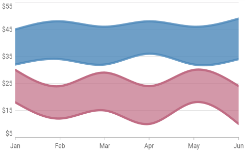
Spline range area chart
A spline range area chart is typically used to display the difference between minimum and maximum values over a period of time, which includes the visualization of set of prices, temperatures, and so on. It connects the data points with a smooth curved line.
Refer to the following code example.
[Dart]
SfCartesianChart(
  series: <ChartSeries<_ChartSampleData, String>>[
    SplineRangeAreaSeries<_ChartSampleData, String>(
      dataSource: chartData,
      xValueMapper: (_ChartSampleData sales, _) => sales.x,
      lowValueMapper: (_ChartSampleData sales, _) => sales.low,
      highValueMapper: (_ChartSampleData sales, _) => sales.high
    ),
    // Add more series.
  ]
)
 Spline Range Area Chart
Axis features
The axis features have the following enhancements in this release.
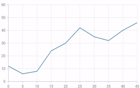
Animation for axis elements
Axis elements such as labels, ticks, and grid lines can be animated when the axis range is changed dynamically. This is applicable for all the primary and secondary axes in the chart.
Refer to the following code example.
[Dart]
SfCartesianChart(
    enableAxisAnimation: true,
    // Other properties configuration.
)
 Axis Animation
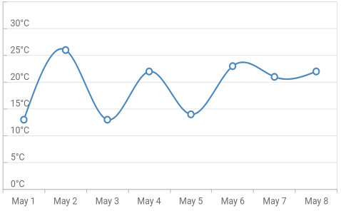
Axis label alignment
Alignment of the axis labels can be changed to before, after, or to the center of the grid lines in the axis. This is applicable for both the vertical and horizontal axes.
Refer to the following code example.
[Dart]
SfCartesianChart(
  primaryYAxis: NumericAxis(
    // Changes the y-axis labels alignment to end.
    labelAlignment: LabelAlignment.end
  ),
  // Other properties configuration.
)
#chart #essential studio #flutter #mobile #what's new #android #charts #ios #what's new