Introduction
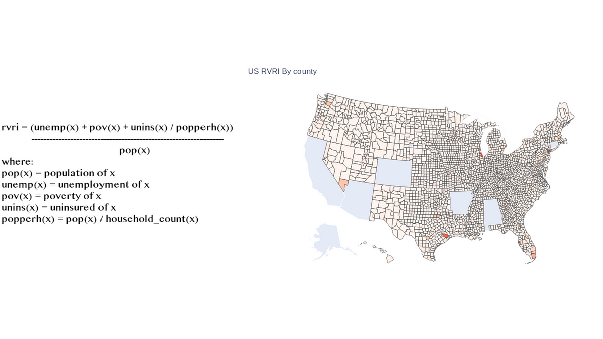
As COVID-19 cases rise again in the United States, an interesting and exciting development that might have been somewhat overlooked is the actual level of threat that each state has against a virus of this nature. When I decided I wanted to write a quit introduction to visualizing geo-data with the Plot.ly plotting library in Python, I quickly realized that this was the project I wanted to do. As a result, today we will take a walk through creating choropleth maps with Plot.ly and visualizing FIPS data while also learning interesting information about our country as a whole. As always, the data and notebook are both available at these links:
Data Reading and Cleaning
Fortunately for today’s work, the data is already wrangled and ready to go — although we could have alternatively queried an API, I decided to go with CSV data, so let’s read that in using the read_csv() function from the Pandas library:
import pandas as pd
import numpy as np

import plotly.express as px
df = pd.read_csv("data/CDC_SVI.csv")
#data-science #science #programming #analytics #python