Build a Custom Toggle Switch with React
We could use third-party libraries for this, but building from scratch allows us to better understand how our code is working and allows us to customize our component completely.
Forms provide a major means for enabling user interactions. The checkbox is traditionally used for collecting binary data — such as yes or no, true or false, enable or disable, on or off, etc. Although some modern interface designs steer away from form fields when creating toggle switches, I’ll stick with them here due to their greater accessibility.
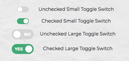
Here’s a screenshot of the component we’ll be building:
Getting Started
We can start with a basic HTML checkbox input form element with its necessary properties set:
<input type="checkbox" name="name" id="id" />
To build around it, we might need an enclosing <div> with a class, a <label> and the <input /> control itself. Adding everything, we might get something like this:
<div class="toggle-switch">
  <input type="checkbox" class="toggle-switch-checkbox" name="toggleSwitch" id="toggleSwitch" />
  <label class="toggle-switch-label" for="toggleSwitch">
        Toggle Me!
  </label>
</div>
In time, we can get rid of the label text and use the <label> tag to check or uncheck the checkbox input control. Inside the <label>, let’s add two <span>s that help us construct the switch holder and the toggling switch itself:
<div class="toggle-switch">
  <input type="checkbox" class="toggle-switch-checkbox" name="toggleSwitch" id="toggleSwitch" />
  <label class="toggle-switch-label" for="toggleSwitch">
    <span class="toggle-switch-inner"></span>
    <span class="toggle-switch-switch"></span>
  </label>
</div>
Converting to a React Component
Now that we know what needs to go into the HTML, all we need to do is to convert the HTML into a React component. Let’s start with a basic component here. We’ll make this a class component, and then we’ll convert it into hooks, as it’s easier for new developers to follow state than useState:
import React, { Component } from "react";

class ToggleSwitch extends Component {
  render() {
    return (
      <div className="toggle-switch">
        <input
          type="checkbox"
          className="toggle-switch-checkbox"
          name="toggleSwitch"
          id="toggleSwitch"
        />
        <label className="toggle-switch-label" htmlFor="toggleSwitch">
          <span className="toggle-switch-inner" />
          <span className="toggle-switch-switch" />
        </label>
      </div>
    );
  }
}

export default ToggleSwitch;
At this point, it’s not possible to have multiple toggle switch sliders on the same view or same page due to the repetition of ids. We could leverage React’s way of componentization here, but in this instance, we’ll be using props to dynamically populate the values:
import React, { Component } from "react";

class ToggleSwitch extends Component {
  render() {
    return (
      <div className="toggle-switch">
        <input
          type="checkbox"
          className="toggle-switch-checkbox"
          name={this.props.Name}
          id={this.props.Name}
        />
        <label className="toggle-switch-label" htmlFor={this.props.Name}>
          <span className="toggle-switch-inner" />
          <span className="toggle-switch-switch" />
        </label>
      </div>
    );
  }
}

export default ToggleSwitch;
The this.props.Name will populate the values of id, name and for (note that it is htmlFor in React JS) dynamically, so that you can pass different values to the component and have multiple of them on the same page. Also, the <span> tag doesn’t have an ending </span> tag; instead it’s closed in the starting tag like <span />, and this is completely fine.
Styling and CSS
I recently wrote 8 Ways to Style React Components, and we’ll use SCSS here (which I consider the best way). Since our SCSS file is already included through the starting index.js script, we don’t need to include another SCSS file again in the component itself. Let’s first have a look how the base CSS is done. After that, we’ll make improvements on it. A few things that we’ll be doing with the styling are as follows:
- By default, the switch is going to be only
75pxwide and vertically alignedinline-blockso that it’s inline with the text and doesn’t cause layout problems. - We’ll make sure that the control is not selectable so that users can drag and drop it.
- We’ll also be hiding the original checkbox input.
- Both the
::afterand::beforeneeds to be styled and made as elements to get them into the DOM and style it. - We’ll also add some CSS transitions to make it look cool and animated.
.toggle-switch {
  position: relative;
  width: 75px;
  display: inline-block;
  vertical-align: middle;
  -webkit-user-select: none;
  -moz-user-select: none;
  -ms-user-select: none;
  text-align: left;
}
.toggle-switch-checkbox {
  display: none;
}
.toggle-switch-label {
  display: block;
  overflow: hidden;
  cursor: pointer;
  border: 0 solid #ccc;
  border-radius: 20px;
  margin: 0;
}
.toggle-switch-inner {
  display: block;
  width: 200%;
  margin-left: -100%;
  transition: margin 0.3s ease-in 0s;
}
.toggle-switch-inner::before, .toggle-switch-inner::after {
  display: block;
  float: left;
  width: 50%;
  height: 34px;
  padding: 0;
  line-height: 34px;
  font-size: 14px;
  color: white;
  font-weight: bold;
  box-sizing: border-box;
}
.toggle-switch-inner:before {
  content: "Yes";
  text-transform: uppercase;
  padding-left: 10px;
  background-color: #f90;
  color: #fff;
}
.toggle-switch-disabled {
  background-color: #ccc;
  cursor: not-allowed;
}
.toggle-switch-disabled::before {
  background-color: #ccc;
  cursor: not-allowed;
}
.toggle-switch-inner::after {
  content: "No";
  text-transform: uppercase;
  padding-right: 10px;
  background-color: #ccc;
  color: #fff;
  text-align: right;
}
.toggle-switch-switch {
  display: block;
  width: 24px;
  margin: 5px;
  background: #fff;
  position: absolute;
  top: 0;
  bottom: 0;
  right: 40px;
  border: 0 solid #ccc;
  border-radius: 20px;
  transition: all 0.3s ease-in 0s;
}
.toggle-switch-checkbox:checked + .toggle-switch-label .toggle-switch-inner {
  margin-left: 0;
}
.toggle-switch-checkbox:checked + .toggle-switch-label .toggle-switch-switch {
  right: 0px;
}
If we look at this, the "Yes" and "No" can be sent to here dynamically from the control using data-* attributes in HTML5. This is required, because it’s not always the same "Yes" and "No" values. Let’s make it dynamic for now:
.toggle-switch-inner::before {
  content: attr(data-yes);
  /* other styles */
}
.toggle-switch-inner::after {
  content: attr(data-no);
  /* other styles */
}
Also, it would be a great idea to use a smaller version of switch, without the text, so let’s add some more CSS for it with some minimal sizes and removing the text:
.toggle-switch.small-switch {
  width: 40px;
}
.toggle-switch.small-switch .toggle-switch-inner:after, .toggle-switch.small-switch .toggle-switch-inner:before {
  content: "";
  height: 20px;
  line-height: 20px;
}
.toggle-switch.small-switch .toggle-switch-switch {
  width: 16px;
  right: 20px;
  margin: 2px;
}
With respect to responsiveness, we should be changing the complete size. For a hacky version, we’re going to use the CSS scale function. Here we’ve covered all the Bootstrap-based responsive widths of devices:
@media screen and (max-width: 991px) {
  .toggle-switch {
    transform: scale(0.9);
  }
}
@media screen and (max-width: 767px) {
  .toggle-switch {
    transform: scale(0.825);
  }
}
@media screen and (max-width: 575px) {
  .toggle-switch {
    transform: scale(0.75);
  }
}
Converting the above code to SCSS, we’ll get something like:
.toggle-switch {
  position: relative;
  width: 75px;
  display: inline-block;
  vertical-align: middle;
  -webkit-user-select: none;
  -moz-user-select: none;
  -ms-user-select: none;
  text-align: left;
  &-checkbox {
    display: none;
  }
  &-label {
    display: block;
    overflow: hidden;
    cursor: pointer;
    border: 0 solid #ccc;
    border-radius: 20px;
    margin: 0;
  }
  &-inner {
    display: block;
    width: 200%;
    margin-left: -100%;
    transition: margin 0.3s ease-in 0s;
    &:before,
    &:after {
      display: block;
      float: left;
      width: 50%;
      height: 34px;
      padding: 0;
      line-height: 34px;
      font-size: 14px;
      color: white;
      font-weight: bold;
      box-sizing: border-box;
    }
    &:before {
      content: attr(data-yes);
      text-transform: uppercase;
      padding-left: 10px;
      background-color: #f90;
      color: #fff;
    }
  }
  &-disabled {
    background-color: #ccc;
    cursor: not-allowed;
    &:before {
      background-color: #ccc;
      cursor: not-allowed;
    }
  }
  &-inner:after {
    content: attr(data-no);
    text-transform: uppercase;
    padding-right: 10px;
    background-color: #ccc;
    color: #fff;
    text-align: right;
  }
  &-switch {
    display: block;
    width: 24px;
    margin: 5px;
    background: #fff;
    position: absolute;
    top: 0;
    bottom: 0;
    right: 40px;
    border: 0 solid #ccc;
    border-radius: 20px;
    transition: all 0.3s ease-in 0s;
  }
  &-checkbox:checked + &-label {
    .toggle-switch-inner {
      margin-left: 0;
    }
    .toggle-switch-switch {
      right: 0px;
    }
  }
  &.small-switch {
    width: 40px;
    .toggle-switch-inner {
      &:after,
      &:before {
        content: "";
        height: 20px;
        line-height: 20px;
      }
    }
    .toggle-switch-switch {
      width: 16px;
      right: 20px;
      margin: 2px;
    }
  }
  @media screen and (max-width: 991px) {
    transform: scale(0.9);
  }
  @media screen and (max-width: 767px) {
    transform: scale(0.825);
  }
  @media screen and (max-width: 575px) {
    transform: scale(0.75);
  }
}
Theming in SCSS
Since we can use variables in SCSS, theming becomes easier. Adding support for multiple color themes in our app is made easier using SCSS. Sass Theming: The Neverending Story explains some of it. We’ll be using some color themes here and change all the raw colors to variables. The first three lines are a configurable set of colors, which helps us theme our little control:
// Colors
$label-color: #ccc;
$toggle-color: #f90;
$white: #fff;

// Styles
.toggle-switch {
  position: relative;
  width: 75px;
  display: inline-block;
  vertical-align: middle;
  -webkit-user-select: none;
  -moz-user-select: none;
  -ms-user-select: none;
  text-align: left;
  &-checkbox {
    display: none;
  }
  &-label {
    display: block;
    overflow: hidden;
    cursor: pointer;
    border: 0 solid $label-color;
    border-radius: 20px;
    margin: 0;
  }
  &-inner {
    display: block;
    width: 200%;
    margin-left: -100%;
    transition: margin 0.3s ease-in 0s;
    &:before,
    &:after {
      display: block;
      float: left;
      width: 50%;
      height: 34px;
      padding: 0;
      line-height: 34px;
      font-size: 14px;
      color: white;
      font-weight: bold;
      box-sizing: border-box;
    }
    &:before {
      content: attr(data-yes);
      text-transform: uppercase;
      padding-left: 10px;
      background-color: $toggle-color;
      color: $white;
    }
  }
  &-disabled {
    background-color: $label-color;
    cursor: not-allowed;
    &:before {
      background-color: $label-color;
      cursor: not-allowed;
    }
  }
  &-inner:after {
    content: attr(data-no);
    text-transform: uppercase;
    padding-right: 10px;
    background-color: $label-color;
    color: $white;
    text-align: right;
  }
  &-switch {
    display: block;
    width: 24px;
    margin: 5px;
    background: $white;
    position: absolute;
    top: 0;
    bottom: 0;
    right: 40px;
    border: 0 solid $label-color;
    border-radius: 20px;
    transition: all 0.3s ease-in 0s;
  }
  &-checkbox:checked + &-label {
    .toggle-switch-inner {
      margin-left: 0;
    }
    .toggle-switch-switch {
      right: 0px;
    }
  }
  &.small-switch {
    width: 40px;
    .toggle-switch-inner {
      &:after,
      &:before {
        content: "";
        height: 20px;
        line-height: 20px;
      }
    }
    .toggle-switch-switch {
      width: 16px;
      right: 20px;
      margin: 2px;
    }
  }
  @media screen and (max-width: 991px) {
    transform: scale(0.9);
  }
  @media screen and (max-width: 767px) {
    transform: scale(0.825);
  }
  @media screen and (max-width: 575px) {
    transform: scale(0.75);
  }
}
Interactions and JavaScript
Now let’s concentrate on getting the basic component working. Since everything in React happens on the fly, we need to use states for storing local component information. Just a friendly reminder: whenever you change any value in the state of a component, the render() life cycle method of React JS will be fired. Keeping that in mind, let’s build our default state:
state = {
  checked: this.props.defaultChecked
};
All we require is just the checked state. It’s going to be a boolean value and it will be received from a defaultChecked prop of the component. We’ll be using a static defaultProps in our class component as a fallback. This looks something similar to the following code:
// Set text for rendering.
static defaultProps = {
  Text: ["Yes", "No"]
}
Since most of the props have to be user set and we can’t use arbitrary values, it’s always better to stop rendering if the required props aren’t passed on. This can be done using a simple JavaScript if statement or a ternary operator using ? : or a short-circuited “and” &&:
{this.props.id ? (
  <!-- display the control -->
) : null}
We might as well add the event listeners using the props for the component like onChange. Along with that, we can also add few more props for the following:
id(required): this is theidthat’s going to be passed to the checkbox input control. Without this, the component won’t render.Text(required): if you aren’t using theSmallversion of the control, you might need to pass this to the Toggle Switch as an array of two values, which signify the text for True and False. An example would beText={["Yes", "No"]}.Name(optional): this will be label text of the checkbox input, but we generally won’t be using this.onChange(optional): this will be directly passed to the<input type="checkbox" />.defaultChecked(optional): this will be directly passed to the<input type="checkbox" />.Small(optional): this is a boolean value, which renders the Toggle Switch in a small mode, where the text isn’t rendered.currentValue(optional): this will be directly passed to the<input type="checkbox" />asdefaultValue.disabled(optional): this will be directly passed to the<input type="checkbox" />.
As our app grows, we can catch a lot of bugs with type checking. React has some built-in type-checking abilities. To run type checking on the props for a component, you can assign the special propTypes property. We can enforce the above list of props using React’s PropType library, which is a separate library that exports a range of validators that can be used to make sure the data you receive is valid.
In this example, we’re using the following:
PropTypes.string.isRequired: this is a string value and it’s required and mandatory.PropTypes.string: this is a string value but it isn’t mandatory.PropTypes.func: this is a prop that takes in a function as value but it isn’t mandatory.PropTypes.bool: this is a boolean value but it isn’t mandatory.
You need to import the PropTypes library using:
import PropTypes from "prop-types";
And after the class definition and before the export statement, if you have it separately, we’ll define the PropTypes in the following way.
ToggleSwitch.propTypes = {
  id: PropTypes.string.isRequired,
  Text: PropTypes.string.isRequired,
  Name: PropTypes.string,
  onChange: PropTypes.func,
  defaultChecked: PropTypes.bool,
  Small: PropTypes.bool,
  currentValue: PropTypes.bool,
  disabled: PropTypes.bool
};
With all the above said elements, our component now looks like this:
import React, { Component } from "react";
import PropTypes from "prop-types";

/*
Toggle Switch Component
Note: id is required for ToggleSwitch component to function. Name, currentValue, defaultChecked, Small and onChange're optional.
Usage: <ToggleSwitch id="id" onChange={function (e) { console.log("Checkbox Current State: " + e.target.checked); }} />
*/

class ToggleSwitch extends Component {
  state = {
    checked: this.props.defaultChecked
  };
  onChange = e => {
    this.setState({
      checked: e.target.checked
    });
    if (typeof this.props.onChange === "function") this.props.onChange();
  };
  render() {
    return (
      <div
        className={"toggle-switch" + (this.props.Small ? " small-switch" : "")}
      >
        <input
          type="checkbox"
          name={this.props.Name}
          className="toggle-switch-checkbox"
          id={this.props.id}
          checked={this.props.currentValue}
          defaultChecked={this.props.defaultChecked}
          onChange={this.onChange}
          disabled={this.props.disabled}
        />
        {this.props.id ? (
          <label className="toggle-switch-label" htmlFor={this.props.id}>
            <span
              className={
                this.props.disabled
                  ? "toggle-switch-inner toggle-switch-disabled"
                  : "toggle-switch-inner"
              }
              data-yes={this.props.Text[0]}
              data-no={this.props.Text[1]}
            />
            <span
              className={
                this.props.disabled
                  ? "toggle-switch-switch toggle-switch-disabled"
                  : "toggle-switch-switch"
              }
            />
          </label>
        ) : null}
      </div>
    );
  }
  // Set text for rendering.
  static defaultProps = {
    Text: ["Yes", "No"]
  };
}

ToggleSwitch.propTypes = {
  id: PropTypes.string.isRequired,
  Text: PropTypes.string.isRequired,
  Name: PropTypes.string,
  onChange: PropTypes.func,
  defaultChecked: PropTypes.bool,
  Small: PropTypes.bool,
  currentValue: PropTypes.bool,
  disabled: PropTypes.bool
};

export default ToggleSwitch;
Unit Testing
Any code that has been created needs to be unit tested, at least to a basic level. In my current workplace, we’re using a snapshot based unit testing. We’ll be checking for the following conditions in the component. We’re using the library enzyme by AirBNB for testing purposes and jest as the default test runner. By writing these tests, we’re making sure our Toggle Switch component:
- should render without crashing
- should match the snapshot
- should fail if the ID isn’t supplied
- should render if the ID is supplied
- should disable the switch slider if it contains disabled props
Here’s the complete ToggleSwitch.test.js:
import React from "react";
import { shallow } from "enzyme";
import ToggleSwitch from "../components/ToggleSwitch";

const text = ["Yes", "No"];
const chkID = "checkboxID";

describe("Toggle Switch Component", () => {
  it("should render without crashing", () => {
    const ToggleSwitchComponent = shallow(<ToggleSwitch />);
    expect(ToggleSwitchComponent.html()).not.toHaveLength(0);
  });

  it("should match snapshot", () => {
    const ToggleSwitchComponent = shallow(<ToggleSwitch />);
    expect(ToggleSwitchComponent).toMatchSnapshot();
  });

  it("should fail if id is not supplied", () => {
    const ToggleSwitchComponent = shallow(<ToggleSwitch />);
    expect(ToggleSwitchComponent.find("label")).toHaveLength(0);
  });

  it("should render if id is supplied", () => {
    const ToggleSwitchComponent = shallow(
      <ToggleSwitch id={chkID} Text={text} />
    );
    expect(ToggleSwitchComponent.find("label")).not.toHaveLength(0);
  });

  it("should disable switch slider if it contains disabled props", () => {
    const ToggleSwitchComponent = shallow(
      <ToggleSwitch id={chkID} Text={text} disabled={true} />
    );
    expect(ToggleSwitchComponent.find("#" + chkID).props().disabled).toBe(true);
  });
});
Summary
You can get the complete source code from praveenscience/ToggleSwitch: Implementing a Toggle Switch in React JS as a Reusable Component. The usage instructions are updated in the GitHub Repository.
#reactjs #javascript
