How to Making Maps with Python
In working with geospatial data, I’ve often needed to visualize this data in the most natural way possible: a map. Wouldn’t it be nice if we could use Python to quickly and easily create interactive maps of your data? We’ll be using a data set on all Starbucks locations in Los Angeles County for this tutorial. By the end of this introductory post you will be able to create:
- A basic point map of all Starbucks locations in LA County
- A choropleth map which shades in zip codes in LA County based on how many Starbucks are contained in each one
- A heatmap which highlights “hotspots” of Starbucks in LA County
Let’s do it!
You will need …
- The Python package pandas. This is used to easily manipulate data in Python
- The Python package folium. This is used to very easily create maps
- A spreadsheet with latitude/longitude of Starbucks in LA County
- A GeoJSON (basically a json which describes a complex shape) of LA County and a GeoJSON of all the zip codes in LA County
To get familiar with the data, here’s a snapshot of the first few rows:
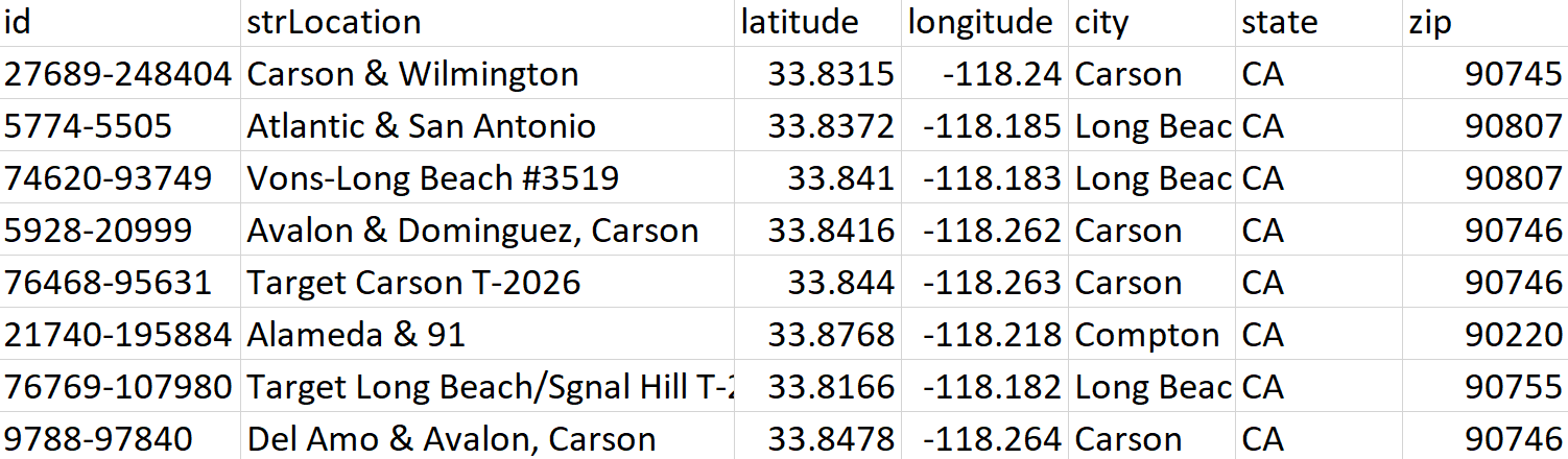
We only need to worry about the latitude, longitude, and zip fields for this analysis.
Here are the needed Python imports, loading the Starbucks data, and loading the LA County GeoJSON:
import folium
import pandas as pd
import json
from folium import plugins
df = pd.read\_csv('starbucksInLACounty.csv')


with open('laMap.geojson') as f:
    laArea = json.load(f)
Basic Point Map
Creating a basic point map of all Starbucks in LA County from the latitude/longitude pairs in our dataframe is pretty straightforward.
#initialize the map around LA County
laMap = folium.Map(location=[34.0522,-118.2437], tiles=‘Stamen Toner’, zoom_start=9)
#add the shape of LA County to the map
folium.GeoJson(laArea).add\_to(laMap)


#for each row in the Starbucks dataset, plot the corresponding latitude and longitude on the map
for i,row in df.iterrows():
    folium.CircleMarker((row.latitude,row.longitude), radius=3, weight=2, color='red', fill\_color='red', fill\_opacity=.5).add\_to(laMap)


#save the map as an html
laMap.save('laPointMap.html')
Opening up laPointMap.html, we see the following map:

We can clearly see all the Starbucks in LA County as little red dots within the LA County region. Of course, you can customize any of the colors and shapes of the dots.
Choropleth Map
I actually didn’t know what a choropleth map was before playing with maps in Python but it turns out they are very useful in visualizing aggregated geospatial data.
Our choropleth map will answer the question: “Which zip codes in LA County have the most Starbucks?”. The choropleth map essentially colors in each zip code based on the value of some other variable, the number of Starbucks stores in our case.
Let’s first go over the basic code needed to create one:
#group the starbucks dataframe by zip code and count the number of stores in each zip code
numStoresSeries = df.groupby(‘zip’).count().id
#initialize an empty dataframe to store this new data
numStoresByZip = pd.DataFrame()
#populate the new dataframe with a ‘zipcode’ column and a ‘numStores’ column
numStoresByZip[‘zipcode’] = [str(i) for i in numStoresSeries.index]
numStoresByZip[‘numStores’] = numStoresSeries.values
#initialize the LA County map
laMap = folium.Map(location=\[34.0522,-118.2437\], tiles='Stamen Toner', zoom\_start=9)


#draw the choropleth map. These are the key components:
#--geo\_path: the geojson which you want to draw on the map \[in our case it is the zipcodes in LA County\]


#--data: the pandas dataframe which contains the zipcode information
# AND the values of the variable you want to plot on the choropleth


#--columns: the columns from the dataframe that you want to use
#\[this should include a geospatial column \[zipcode\] and a variable \[numStores\]


#--key\_on: the common key between one of your columns and an attribute in the geojson.
#This is how python knows which dataframe row matches up to which zipcode in the geojson


laMap.choropleth(geo\_path='laZips.geojson', data=numStoresByZip, columns=\['zipcode', 'numStores'\], \\
                 key\_on='feature.properties.zipcode', fill\_color='YlGn', fill\_opacity=1)


laMap.save('laChoropleth.html')
Since I’ve personally found it more difficult to understand how to get all the components in place for a choropleth, let’s take a look at a separate visual to see how it works.
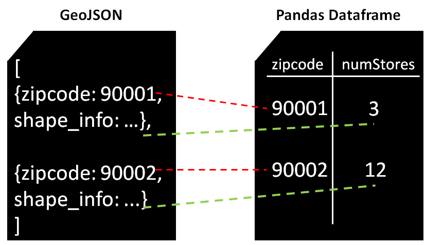
The choropleth needs to know what color to fill in for zip code 90001, for example. It checks the pandas dataframe referenced by the data field, searches the key_on column for the zip code and finds the other column listed in columns which is numStores. It then knows that it needs to fill in the color corresponding to 3 stores in zip code 90001.
It then looks in the GeoJSON referenced by the geo_path field, and finds zip code 90001 and its associated shape info, which tells it which shape to draw for that zip code on the map. Through these links, it has all the necessary information. Let’s look at the resulting choropleth in laChoropleth.html!

We see that it comes with a nice color bar at the top for reference.
Heatmap
In the choropleth map above, we see that areas in south LA County seem to have more Starbucks stores in general, but can we get a bit more specific? Can we maybe figure out where there are a lot of Starbucks stores in a small vicinity? Basically, let’s create a heatmap to highlight Starbucks “hotspots” in LA County.
#initialize the LA County map
laMap = folium.Map(location=[34.0522,-118.2437], tiles=‘Stamen Toner’, zoom_start=9)
#add the shape of LA County to the map
folium.GeoJson(laArea).add\_to(laMap)


#for each row in the Starbucks dataset, plot the corresponding latitude and longitude on the map
for i,row in df.iterrows():
    folium.CircleMarker((row.latitude,row.longitude), radius=3, weight=2, color='red', fill\_color='red', fill\_opacity=.5).add\_to(laMap)


#add the heatmap. The core parameters are:
#--data: a list of points of the form (latitude, longitude) indicating locations of Starbucks stores


#--radius: how big each circle will be around each Starbucks store


#--blur: the degree to which the circles blend together in the heatmap


laMap.add\_children(plugins.HeatMap(data=df\[\['latitude', 'longitude'\]\].as\_matrix(), radius=25, blur=10))


#save the map as an html
laMap.save('laHeatmap.html')
The main parameters in the heatmap that need some trial and error are radius which controls how big the circles are around each Starbucks store and blur which controls how much the circles “blend” together.
A higher radius means any given Starbucks influences a wider area and a higher blur means that two Starbucks which are further away from each other can still contribute to a hotspot. The parameters are up to you!
Let’s see a picture of our heatmap in laHeatmap.html.
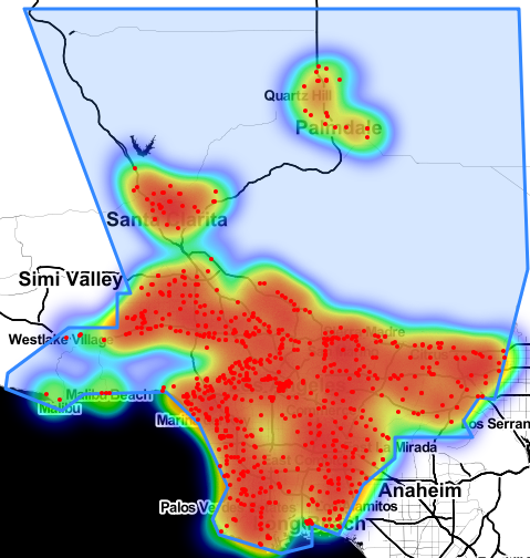
Hmm … cool but it kind of seems like everything is red. Heatmaps might be more valuable if you zoom in. Let’s zoom in a bit and see if we can identify more specific hotspots.

Nice! It’s pretty clear from the above map that we have some hotspots and some not-hotspots (notspots?) in the map. One that stands out is in Downtown Los Angeles (understandably).
And that’s about it! My only regret is that I haven’t yet found a way to embed the actual interactive versions of these maps in a Medium post so I was only able to show you screenshots. I strongly encourage you to run the small bits of code through this post to play with the interactive maps for yourself. It’s a totally different experience.
Thank you for reading!
Originally published on https://towardsdatascience.com
#python #google-maps #machine-learning #data-science