Data visualization is simply presenting data in a graphical or pictorial form which makes the information easy to understand. It helps to explain facts and determine courses of action.
In this article, I’m going to introduce you to the world of data visualization and interpretation using Python.
Table of Content
- Popular Python libraries for visualization
- Introduction to Seaborn
- Environment Setup and dataset
- Univariate plots
- Bivariate plots
- Multivariate plots
- Numerical features against categorical features
- Categorical features against numerical features
- Visualization for TimeSeries Data
- Extra visualizations
Popular Python libraries for visualization
Python has numerous visualization libraries that come packed with lots of different features. Most of these libraries are general-purpose while some are specific to a task.

Some popular Python libraries for visualization are:
- Matplotlib: The OG of visualization, most Python libraries are built on top of it.
- Seaborn: High-level visualization library built on top of Matplotlib. Offers intuitive and simple interface.
- ggplot: Based on the popular R ggplot.
- Plotly: Useful for clean interactive plots. Has online publishing options as well.
- Bokeh: Similar to Plotly, great for interactive web-ready plots.
In this article, we’ll be using the Seaborn library for visualization of different datasets, and I’ll be showing you how to interpret them.
Introduction to Seaborn
Seaborn is built on top of Python’s core visualization library Matplotlib. Seaborn comes with some very important features that make it easy to use. Some of these features are:
- Visualizing univariate and bivariate data.
- Fitting and visualizing linear regression models.
- Plotting statistical time series data.
- Seaborn works well with NumPy and Pandas data structures
- Built-in themes for styling Matplotlib graphics
Note: The knowledge of Matplotlib is recommended to tweak Seaborn’s default plots.
Environment Setup
If you have Python and Anaconda installed on your computer, you can use any of the methods below to install seaborn:
pip: "pip install seaborn"
**anaconda: **" conda install seaborn"
from Github: "pip install git+https://github.com/mwaskom/seaborn.git"
Dataset
Seaborn comes pre-packaged with a couple of data sets, and we’ll be using most of them depending on the task. First, let’s import the library and dataset:
import seaborn as sb
import numpy as np
import matplotlib.pyplot as plt
import pandas as pd

#Print the list of data sets available in seaborn
tips_df = sb.load_dataset('tips')
titanic_df = sb.load_dataset('titanic')
flights_df = sb.load_dataset('flights')
Take a peek at the data sets:
tips_df.head()
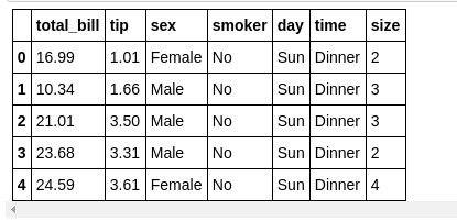
First 5 rows of the Tips dataset
Univariate plots
Univariate plots show the distribution of a feature (single feature). For univariate plots, you can make plots like Bar Graphs and Histograms. In seaborn, you can use the distplot function:
Displot:
sb.distplot(tips_df['total_bill'], color='r')
plt.title("Distribution of total bills")
plt.show()
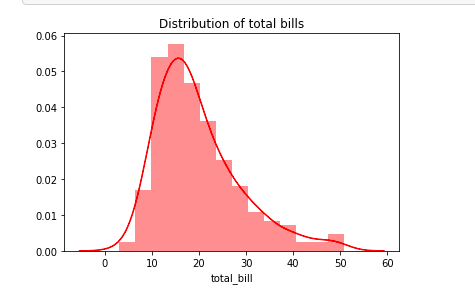
The distribution of total_bills shows that the bills are normally distributed and centred around 10–30.
sb.distplot(titanic_df['fare'], color='g')
plt.title("Distribution of fare in titanic")
plt.show()

The distribution plot of fare in titanic shows that the fare prices is right-skewed as a majority of the prices are within 0–50. This means that there were cheaper fare tickets than expensive ones.
Countplots:
sb.countplot(tips_df['time'])
plt.title("Count of Time")
plt.show()

Bivariate Plots
Bivariate Plots are used when we want to compare two variables together. Bivariate plots show the relationship between two variables.
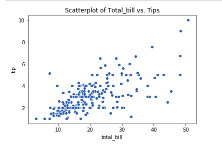
Scatter Plot:
sb.scatterplot(x='total_bill', y='tip', data=tips_df) plt.title("Scatterplot of Total_bill vs. Tips")
plt.show()
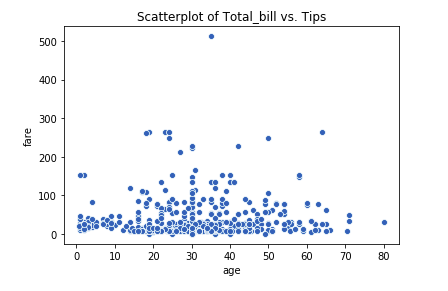
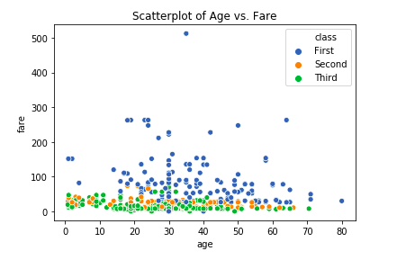
sb.scatterplot(x='age', y='fare', data=titanic_df)
plt.title("Scatterplot of Age vs. Fare")
plt.show()
sb.jointplot(x='total_bill', y='tip', data=tips_df)
plt.show()
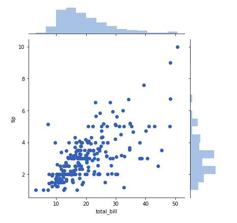
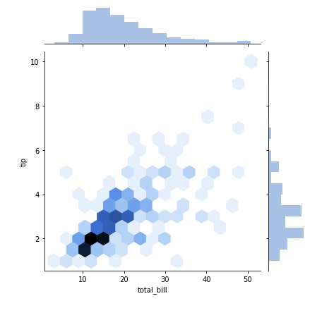
When you have sparse data, the hex or kde plot is better than scatterplot.
sb.jointplot(x='total_bill', y='tip', data=tips_df, kind='hex')
plt.show()
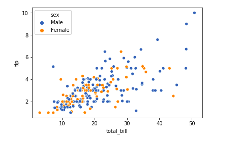
Multivariate plots
Multivariate plots can show the relationship between three or more features. In seaborn, the popular hue parameter can be used to separate features in multiple dimensions.
sb.scatterplot(x='total_bill', y='tip', data=tips_df, hue='sex')
plt.show()
Now let’s use another dataset
titanic_df.head()

sb.scatterplot(x=‘age’, y=‘fare’, data=titanic_df, hue=‘class’) plt.title(“Scatterplot of Age vs. Fare”)
plt.show()
sb.barplot(x=‘sex’, y=‘fare’, data=titanic_df, hue=‘class’)
plt.show()

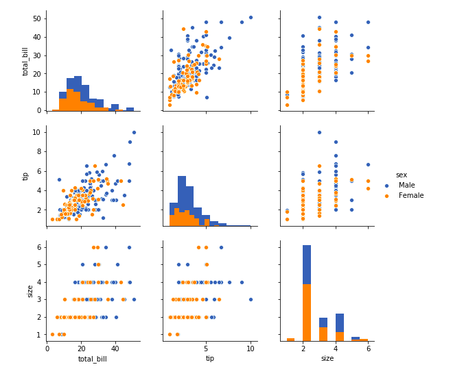
## PairWise Plots
Pairwise plots show the distributions of multiple features in a dataset. In seaborn, you can use the pair plot() function. This shows the relationship between features in a DataFrame as a matrix of plots and the diagonal plots are the univariate plots.
sb.pairplot(tips_df, hue=‘sex’, diag_kind=‘hist’)
plt.show()
# Numerical features against categorical features
Numerical features are features with continuous data points. We can use two popular plot to observe the distribution and variability of these features.#data-science #data-analysis #data-visualization #seaborn #data analysis