Executive Summary
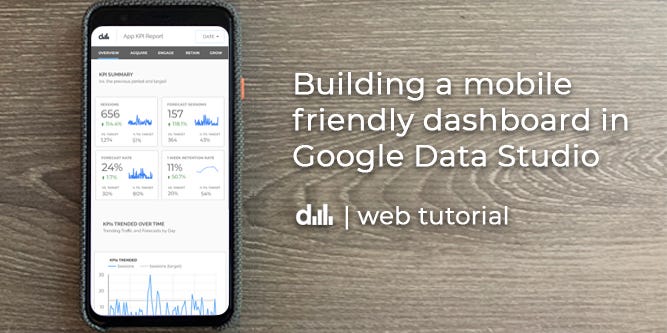
In this article, we’ll be building this mobile product dashboard for the open source web app ‘forecastr’ using Google Data Studio and in the process we’ll learn how to:
- Organize data into categories such as Acquisition, Engagement, Retention and Growth
- Build a simple mobile navigation bar to jump to different sections of our report
- Create modern mobile UI elements such as data cards and product engagement funnels
- Integrate data from a growth backlog to tell the story about how we are going to improve our app and drive KPIs
- Join data together using Google’s data blending feature
- Create a simple web page for an iframe generated by Data Studio so that we can easily view our report on the mobile web.
At the end of this tutorial, you should be able to apply these learnings with your KPIs to build your own product or sales focused mobile dashboard in Google Data Studio.
Now let’s get started and have some fun!
Building mobile dashboards brings me a surprising amount of joy.
Maybe it’s the fact that we use our mobile devices to consume so much information in the world today, it just feels natural to check my phone for a quick business update. Oftentimes, it can feel like work to fire up the laptop and review some data.
But on my phone, something feels different.
What if our business data was easily accessible on a mobile device across the growing number of the platforms we use today? Wouldn’t that be amazing?
Sure, we’d still need our laptops to do the more intensive analysis and build presentations, but at a high level, our mobile devices seem like the ideal medium for us to consume quick business updates. Just enough information to spark an insight or question, to know what is going on, before we flip open our laptops and do that exploratory analysis.
This article is a first in a series designed to help people build better dashboards and organize the business data we use everyday from around the web.
So today, we are going to have some fun and create a mobile product dashboard in Google Data Studio and then embed it into a web page!
Why Data Studio you ask?
Aside from python, it’s my favourite place to explore and visualize data. It’s the canvas I use to not only tell the story of my business performance, but also what I’m doing to actively improve my business and drive my company objectives in order to reach my goals. And it only gets better if you know how to leverage python with BigQuery (but that’s another blog post)
Now, while this dashboard isn’t going to be responsive, it’s “good enough” to start thinking about how we lay out our data so that as we scroll through our dashboard, we’ll be able to fully understand what is happening with our product and identify opportunities to grow its usage. Along the way, we’ll have a few tips and tricks to work with the layout.
So, let’s imagine that we’re working on an open source web app that guides people through the process of creating a baseline forecasts and we want to make it better.
What would a summary KPI report for this app look like on a mobile device?
First up, let’s get our data sources in order
I’m going to assume that you’ve added data sources to Data Studio before, but if you haven’t here is a link.
To keep it simple and relatively brief, this tutorial will be primarily focused on building out the first page in this report. For this, we’ll be using a few data sources in this report sourced from:
- Google Analytics — forecastr (production data)
- Google Sheets — retention data, targets, and growth backlog data
Customizing the Canvas Size
Now that we have our data in order, we need to pick a ‘mobile friendly’ screen width for our canvas.
For this dashboard, I chose 393px wide as I’m currently sporting a Pixel 4, but I’d recommend choosing anything around 400px wide in Data Studio. Or you could use a service like statscounter to find the most popular screen widths and start from there. In any event, when we embed this Data Studio report into a webpage and set the width of the iframe to 100%, the Data Studio report should scale within that space.
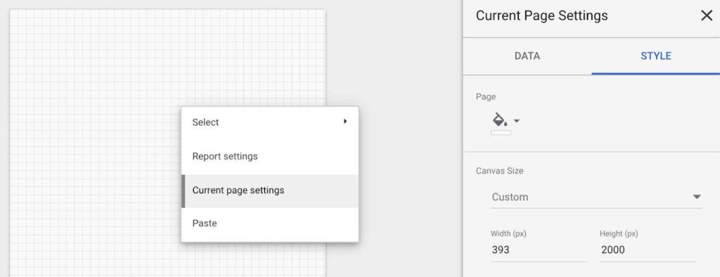
So, to set the size of your dashboard, right click anywhere in the blank canvas and select:
Current Page Settings
Then open the STYLE tab in the right menu and update the width and height of your canvas. As you can see in the screenshot below, i’ve selected a canvas size of 393 x 2000 px.
#data-science #google-analytics #google-data-studio #dashboard-design #analytics