Income and expense tracking is crucial to any business, no matter if it’s a start-up or a well-established company. For entrepreneurs, income and expenses will be the first things they need to track to assess how well their business runs. Charts play an important role in visualizing these numbers. But you should carefully choose the appropriate chart type for your data story to convey information clearly. In this blog, I will walk you through the seven best chart types for visualizing your income and expense details.
I have used the Syncfusion Flutter Charts widget to illustrate the chart types, but they are not limited to Flutter and you will find these chart types in other platforms as well.
#1 Column chart
The column chart, also known as the vertical bar chart, uses vertical bars to display different values for one or more items. It is the most common chart type used to compare values across categories.
In our case, you can visualize various scenarios like comparing your income and expense details across various years, comparing a single year’s data divided into various categories, comparing your details with a competitor’s, etc.
In the following example, I show the income and expense details of several years using two column series.
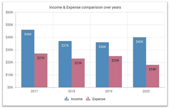 This column chart shows the past years’ income and expense details.
#flutter