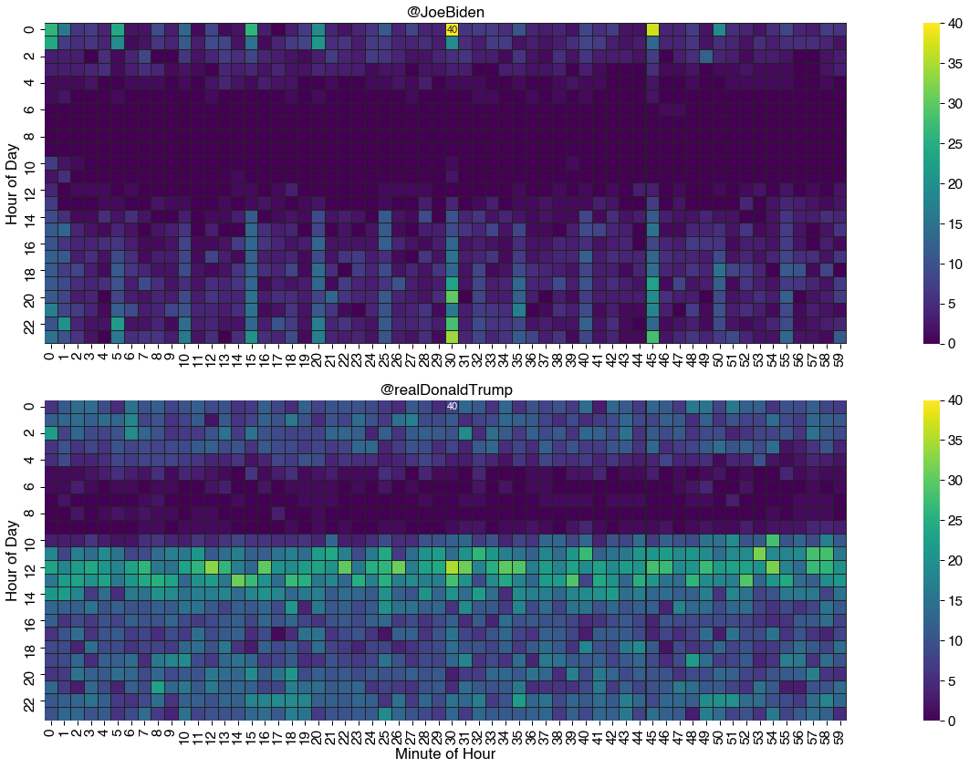
A heatmap is a data visualization technique that uses color to show how a value of interest changes depending on the values of two other variables.
For example, you could use a heatmap to understand how air pollution varies according to the time of day across a set of cities.
Another, perhaps more rare case of using heatmaps is to observe human behavior - you can create visualizations of how people use social media, how their answers on surveys changed through time, etc. These techniques can be very powerful for examining patterns in behavior, especially for psychological institutions who commonly send self-assessment surveys to patients.
#python #seaborn #matplotlib #data science
2.85 GEEK