Data visualization is the graphical representation of information and data. By using visual elements like charts, graphs, and maps, data visualization tools provide an accessible way to see and understand trends, outliers, and patterns in data.
Python Matplotlib. matplotlib.pyplot is a plotting library used for 2D graphics in python programming language. It can be used in python scripts, shell, web application servers and other graphical user interface toolkits.
When you get huge size of data, it is difficult to see the data or Dataframe using Pandas Library. Hence, we need graph to represent the data, even if you are representing your model to management. This is the best deal to go for. A Graph
a) Line Graph
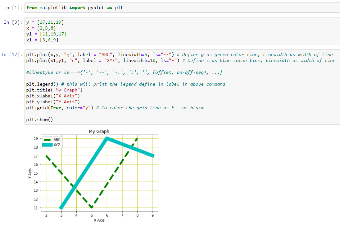
A line chart is, as one can imagine, a line or multiple lines showing how single, or multiple variables develop over time. It is a great tool because we can easily highlight the magnitude of change of one or more variables over a period.
Let’s print the basic graph using Matplotlib Library in Python.
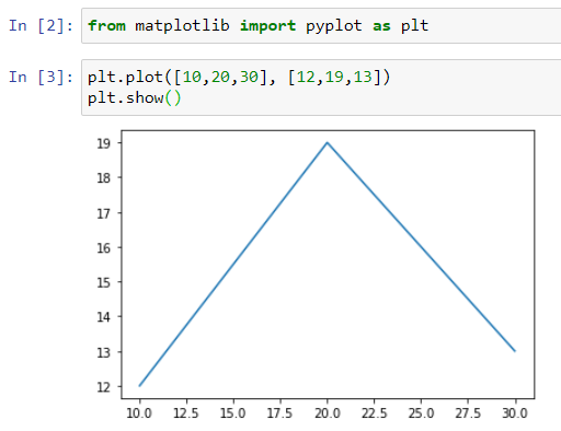
Graph
Let’s add few more parameter to the graph to make more understandable graph.
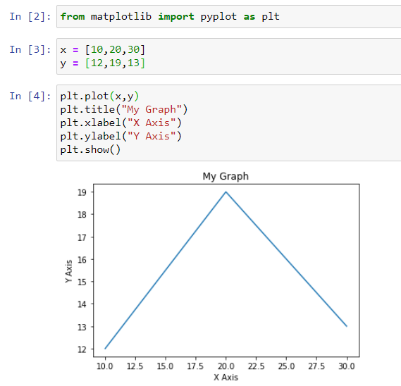
Graph with Axis
Let’s add more details to the graph for better understanding.
Graph with Axis and Legends
b) Bar Graph
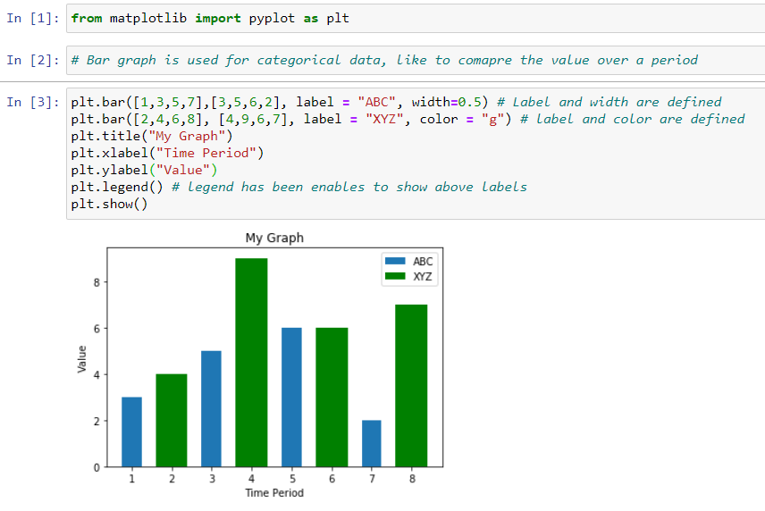
Bar charts are among the most frequently used chart types. As the name suggests a bar chart is composed of a series of bars illustrating a variable’s development. Given that bar charts are such a common chart type, people are generally familiar with them and can understand them easily. A bar graph uses bars to compare data among different categories data. It is very useful graph, when you want to measure the data changes over a period for one or two variables. You can represent the bar graph horizontally or vertically. You can estimate the value by size of the bar for that value. Example — No of students for subjects.
#data-visualization #matplot #matplotlib #graph #python-matplotlib #visual studio code
