Trigonometric Functions in CSS
Learn about Trigonometric Functions in CSS. Learn how to use CSS trigonometry functions to make precise measurements and create shapes, layouts, animations, and creative designs.
Several trigonometry functions have been added to CSS and they are now supported in all major browsers. Having the mathematical power of trig available in CSS opens up some interesting possibilities!
If you get flooded with panic or a sense of inadequacy when you hear the word “math” (or “maths” if you are not from North America), don’t worry! If you find math abstract and challenging to comprehend, try thinking of it in terms of everyday activities. Numbers underpin structures and patterns all around us. Web design is no different in this respect.
This article will provide you with a gentle crash course in trigonometry followed by some examples. Instead of getting bogged down in long-winded explanations and difficult equations, I will try to give you just enough information to apply some math to web design.
Let’s get started!
Table of contents:
- What is trigonometry?
- Making precise measurements
- Using triangulation
- Positioning points on a circle
- Modeling wave functions
- Understanding trig functions
- The trigonometry functions in CSS
- Applications of trigonometry on the web
- Placing elements on a circle
- Creating shapes
- Creating triangles
- Creating parallelograms
- Creating complex shapes
- Creating layouts
- Creating animations
- Building creative designs
What is trigonometry?
Trigonometry is concerned with triangles. This mathematical function helps us find the dimensions of a triangle’s sides and angles. Often, we know some of a triangle’s dimensions but need to find the others:
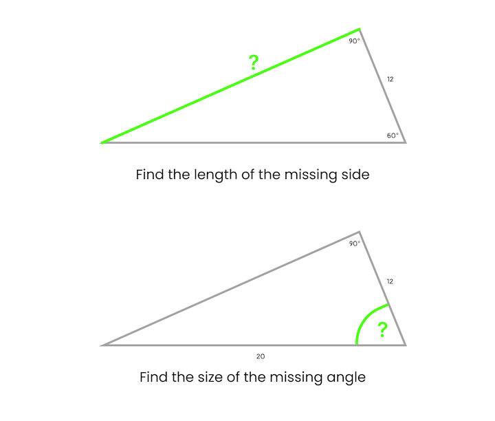
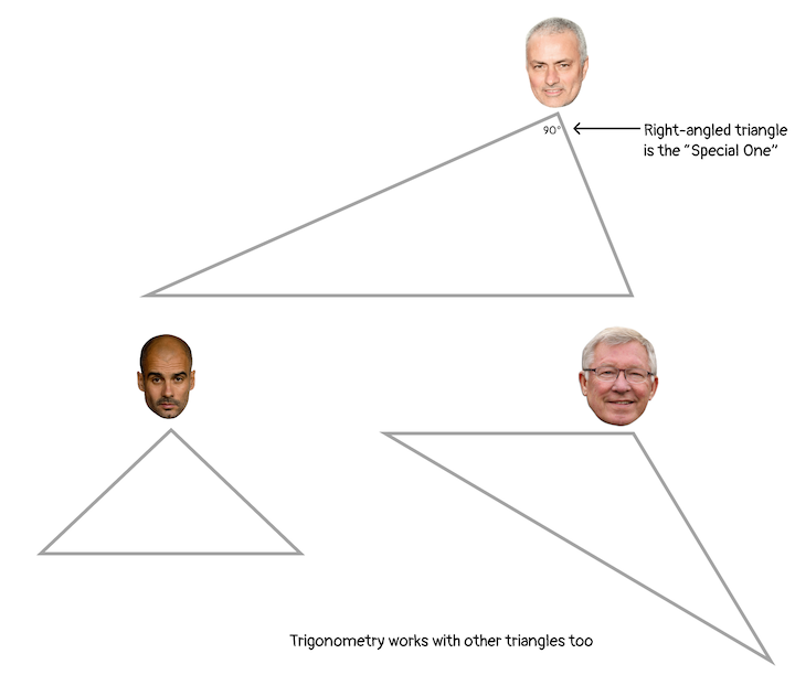
It’s fairly straightforward to use trig to calculate the dimensions of right-angled triangles. However, we can use trigonometry on other types of triangles too:
Trigonometry is not an abstract subject that lives in school books; it’s used frequently in the real world in many different disciplines. Let’s look at a few common use cases.
Making precise measurements
Trigonometry is used in cases where precise measurements are needed. For example, surveyors historically used a device called an inclinometer to get the angle of a slope and then applied trigonometry to precisely measure the horizontal distance:
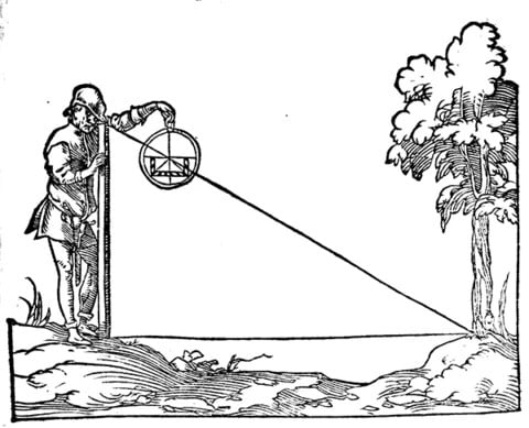
Shadow-square-stoffler courtesy of Wikipedia Commons.
More modern surveying equipment is equipped with digital sensors and lasers, but the underlying theory has remained unchanged for centuries. In fact, it was the Greeks who are credited with the formalization of trigonometry as a branch of mathematics. The name is derived from the ancient Greek words trígōnon (meaning “triangle”) and métron (meaning “measure”).
Greek letters, such as θ (theta), are often used to represent variables in trigonometric equations. But, we can actually use any letters. I think the Greek letter conversion may contribute to the intimidation factor around trigonometry.
Using triangulation
A technique known as triangulation is used to determine the location of a particular point by forming triangles to the point from other known points. In the example below, we can use triangulation to ascertain the position of the ship entering the bay using the angles observed from points A and B and the baseline, b, between them:
Positioning points on a circle
Trigonometry can be used with circles too. We can use trigonometry to position a point on a circle using triangles. I will discuss how to do this in CSS later in this article: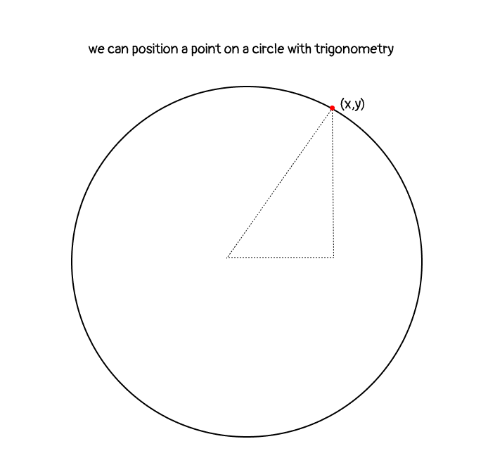
Modeling wave functions
Trigonometry is also associated with curved graphs. This mathematical function can be used to model a variety of curved or wave functions, such as planet orbits, sound waves, or vibrations.
If we rotate a triangle around a circle using trigonometry functions, we generate a series of values. For example, here’s how the cosine function relates to a circle:
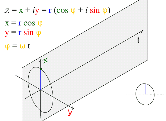
Courtesy of Wikipedia
If we plot these values on a graph, it looks like a smooth wave:
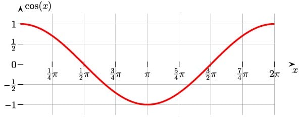
Courtesy of Wikimedia Commons
These waves create repeating patterns. While it seems abstract, we could apply this facet of trigonometry to elements on our webpages.
If this seems a bit intimidating, just keep reading; seeing some examples will help! First, let’s take a brief look at the trigonometric functions.
Understanding trig functions
Let’s start by looking at a right-angled triangle and discussing the terminology associated with triangles:
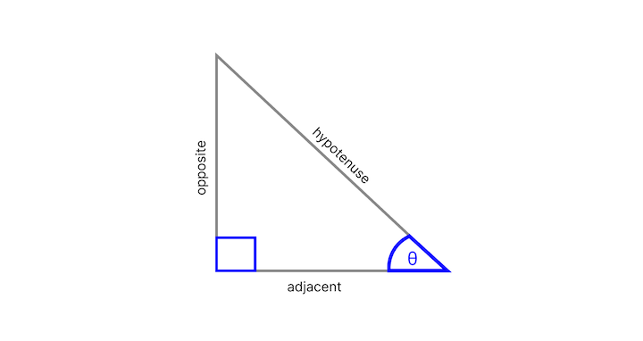
- right angle: 90-degree angle; indicated by the blue box in the corner
- other angle: located adjacent to the right angle, we usually know the value of this angle; it’s is represented by the theta symbol, θ
- opposite: side opposite the θ angle
- hypotenuse: side opposite the right angle; this is the longest side
- adjacent: side next to the θ angle that is not the hypotenuse
The main functions in trigonometry are sine, cosine, and tangent. They are the ratio of one side of a right triangle to another side:
- sin (θ) = opposite / hypotenuse
- cos (θ) = adjacent / hypotenuse
- tan (θ) = opposite/ adjacent
To learn more about trigonometry, I recommend reading the Math is Fun “Introduction to Trigonometry.” For even more in-depth information on this topic, Michell Barker wrote a three-part series called “Trigonometry in CSS and JavaScript.” Michelle provides some alternative examples that may be useful.
Sometimes hearing something described in a different way can make a concept click. Keep in mind that the series was written in 2021, so the trigonometry is done using Sass. With the addition of the trigonometric functions to CSS, we should now be able to do all of what Michelle covers using just plain ‘ol CSS!
Understanding trigonometry functions in CSS
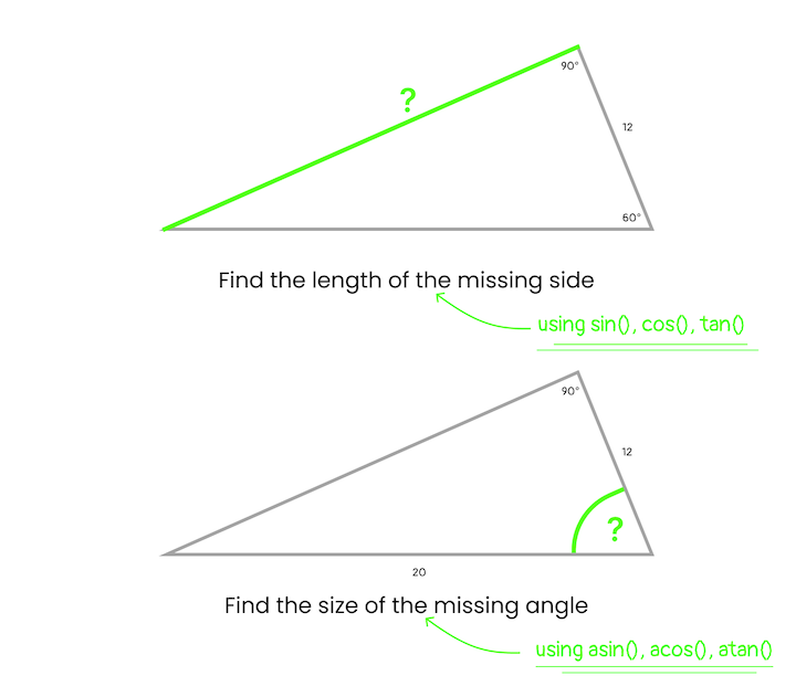
The trigonometric functions — sine, cosine, and tangent — are expressed like so in CSS: sin(), cos(), and tan().
We supply a single parameter to these functions, and it can be anything that resolves to a <number> or an <angle>. For example, sin(45deg), sin(0.125turn), and sin(3.14159 / 4) are all equivalent. The return values for sin() and cos() will always be between −1 and 1, while tan() can return any number between −∞ and +∞.
There are also the “arc” or “inverse” trigonometric functions — asin(), acos(), and atan() — which are used to obtain an angle from any of the triangle’s trigonometric ratios. “Inverse” means that they take the opposite set of values. For example, asin() accepts a value between 1 and -1, and returns an angle.
These functions are useful for a couple of cases. We can use them when we have the length of two sides of a triangle and need to get the related angle. Since those two sides are associated with the cosine formula, we can use acos() adjacent / hypotenuse ) to calculate the value of the angle. We can also use the inverse functions to calculate the value of the third side:
Make more sense now? No? Well, I tried! 
To read about this in more detail, check out: “CSS Values and Units Module Level 4 specification.”
Applications of trigonometry on the web
Here are some applications for trigonometry functions:
- Unique layouts based on shape: use trigonometric functions to place elements on a shape, and aid in the creation of different shapes
- Data visualization and charts: use trigonometric functions to push CSS frameworks, like Charts.CSS, forward
- Animations: use trigonometric functions to coordinate actions
- Dynamic layouts: use trigonometric functions to replace simple units with calculations
- Creative designs
Let’s explore these applications with some examples.
Placing elements on a circle
We can use trigonometry to place a point on a circle. You thought trigonometry was all about triangles? Well, yes it is. But, we can decompose problems into sub-problems that involve triangles, and this is one such example.
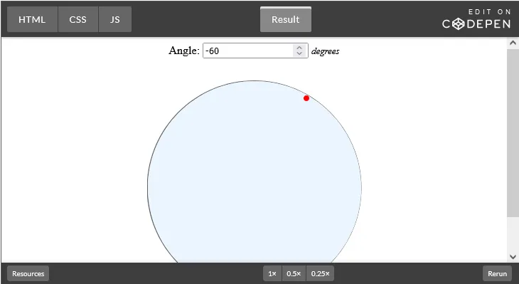
Let’s look at positioning at the one o’clock position on a circle. An important point to note is that zero degrees is at the three o’clock position:
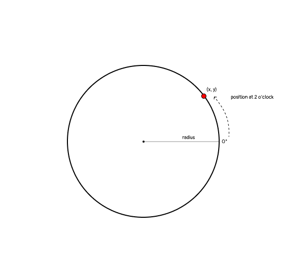
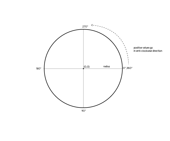
In mathematics, positive degrees go in a counterclockwise direction. Therefore, we would position this at 60 degrees:
Another thing about the above diagram is that we have divided the circle into quadrants, or four parts, by drawing four radii. If we draw a line between two radii, we create a triangle and can do some trigonometry. By creating right-angled triangles in a quadrant, we can determine the x and y position of a point:
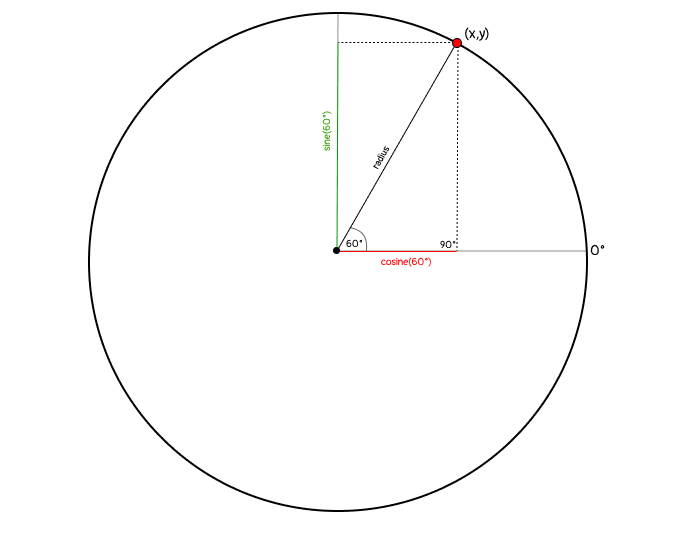
Therefore, the formulas for the x and y positions are as follows:
- x = radius * cosine(θ)
- y = radius * sine(θ)
Now, let’s create this example using CSS.
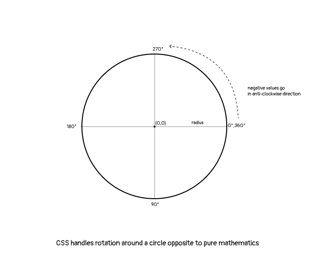
In CSS, negative degrees go in a counterclockwise direction (this is the opposite of mathematics). Therefore, we will position our point at -60 degrees:
Here’s a CodePen to see this in action:
Here’s a CodePen by Mads Stoumann demonstrating how to build a clock with CSS trigonometry functions:

Mads used the formulas that we’re discussing in this article to position the numbers inside the clock face.
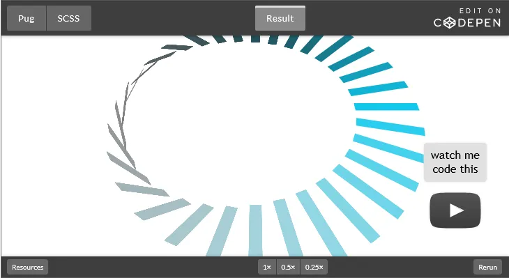
Ryan Mulligan used CSS trigonometry functions to create an interesting diamond pattern by positioning diamond shapes of increasing sizes around concentric circles:
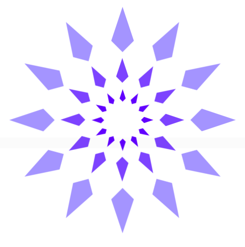
View his CodePen to see how he turned this image into a cool animation.
Creating shapes
It’s possible to create more accurate and complex shapes in CSS with mathematical functions including trigonometry functions – there have been other math functions added recently too that can help us go even further.
Remember that every element on a webpage is a box. To deviate from this can feel fresh and liberating.
Let’s start with a triangle.
Creating triangles
There are a few ways to create triangles in CSS, but not every method allows us to be precise with the length of the sides and sizes of the angles.
The CSS clip-path property offers the most control. We can create a triangle using the polygon() shape function and provide three points:
/* this is a triangle with equal sides and angles */
.triangle{
    width:100px;
    height:100px;
    background-color:red;
    clip-path: polygon(50% 0%, 0% 100%, 100% 100%);
}
However, we’d have to experiment with different values to come up with points that will allow us to create the type of triangle that we want. Firefox DevTools permits clip-path editing where the points can be dragged around. Alternatively, we can use a clip-path editing tool, like clippy, to come up with the points to use.
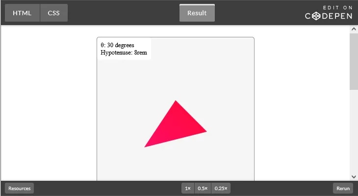
With trigonometry, we can make a triangle in a more precise manner and also make it responsive. With custom properties, we can create a series of custom properties to create a particular triangle. For example, the below CSS code allows us to change the size of the triangle using the hypotenuse custom property:
.triangle {
        --hypotenuse: 8rem;
        --angle: 30deg;

        --size: 20rem;
        --opposite: calc(sin(var(--angle)) * var(--hypotenuse));
        --adjacent: calc(var(--hypotenuse) / 2);
        --startPosX: calc(var(--size) / 2 - var(--adjacent));
        --startPosY: calc(var(--size) / 2 - var(--opposite) / 2);
        --endPosX: calc(var(--size) / 2 + var(--adjacent));
        --endPosY: calc(var(--size) / 2 + var(--opposite) / 2);

        clip-path: polygon(
          var(--startPosX) var(--endPosX),
          50% var(--startPosY),
          var(--endPosX) var(--endPosY)
        );

        width: var(--size);
        height: var(--size);
        background: linear-gradient(45deg, deeppink, red);
}

  .triangle:nth-of-type(2) {
    --hypotenuse: 100%;
  }
Here is a CodePen to show this in action:
Creating parallelograms
Now, let’s look at how to create a parallelogram:
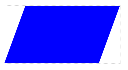
We use the skewX() transformation to pivot the shape. Then, we use tan() to the correct proportions of the width:
.parallelogram {
    --w: 400;
    --h: 200;
    --angle: 20deg;

    position: relative;
    width: calc(1px * var(--w));
    height: calc(1px * var(--h));
    border: 2px lightgray dotted;

    margin: 2rem auto;
 }

  .parallelogram::before {
    content: "";
    position: absolute;
    width: calc(100% - 100% * var(--h) / var(--w) * tan(var(--angle)));
    height: 100%;
    transform-origin: 0 100%;
    transform: skewX(calc(0deg - var(--angle)));
    background-color: blue;
  }
Here is the accompanying CodePen.
Creating complex shapes
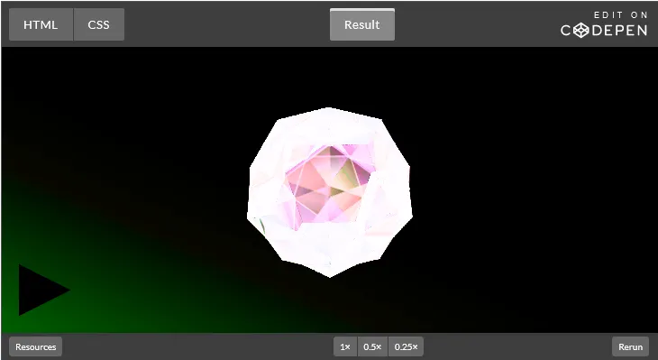
We can create more complex two-dimensional or three-dimensional shapes with the help of trigonometry. The most obvious three-dimensional shape is a pyramid, often referred to as a tetrahedron. The names of geometric shapes are also derived from Greek, usually the name describes the number of sides; hédra means ”face” in Greek.
For a complex 3D example, check out this dodecahedron made by Mack Fitz:
Daniel Wilson covers creating shapes with trigonometry functions in his article, “Improving CSS Shapes with Trigonometric Functions.”
Creating layouts
Now that we know how to create parallelograms, we can use them to create a diagonal layout:
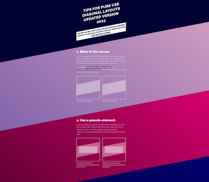
Here is the CodePen of the diagonal layout, it is courtesy of Nils Bender:
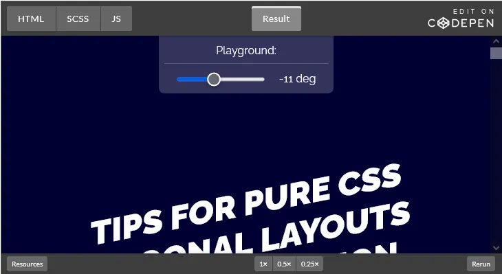
To add horizontal text to the diagonal section, we’d need to add vertical padding to the content to ensure it doesn’t overflow the outline of the section. We can use trigonometry to calculate the minimum height required.
In the following illustration, we already know the container width, a. Then, α is the same angle we use to skew our element. Since we know this forms a right-angle triangle, we can calculate x using the following formula:
x = tan(α) * a / 2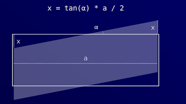
Nils provides a complete walk-through of this method in his article “Create Diagonal Layouts Like It’s 2020.” When Nils originally wrote the article, he used a custom property with --magic-number: 0.09719; — now we can use tan() to take the magic out of it!
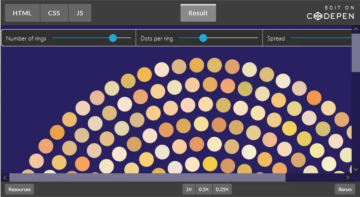
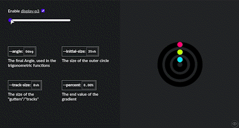
We can create concentric layouts by using multiple repeating circles and placing elements on them. We covered how to place elements on a circle earlier in this article:

Here is a dynamic version by Mads Stoumann with some parameters to vary the density and number of elements and circles (rings):
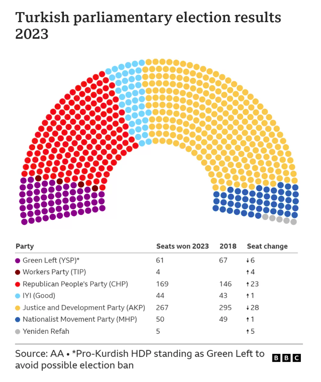
BBC recently this pattern to create a data visualization of election results in Turkey:
We could also use trigonometry and other math functions to create repeating patterns. One example, referred to as tessellations, is the covering of a surface using one or more geometric shapes with no overlaps or gaps.
Creating animations
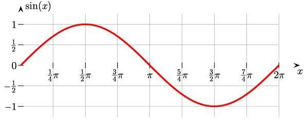
Let’s return to the concept of waves. Here is a sine wave:
An example of the sine wave in nature is the oscillation of an undamped spring around an equilibrium:
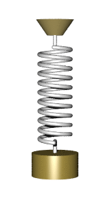
Image credit: Wikipedia
We can use trigonometry in the tweening (animated) property or in the easing function. For the easing function, we would supply values to a cubic-bezier() to emulate the wave-like curve.
I have seen people use trigonometry functions in the animation-delay; in many cases, using a magic number. However, the same outcome could also be achieved using an arbitrary number:
.dot {
  --count: 4;

  /* this is a magic number */
  animation-delay: calc(
    sin((var(--index) / var(--count) * 45deg) * -1s
  );
}
To animate an object on a sine wave path, or sinusoidal curve, we can use the cubic-bezier() to calculate the y position. Temani Afif explains in his article, “Advanced CSS Animation Using cubic-bezier()”, but it’s quite involved to grasp how this works. Here’s his example:
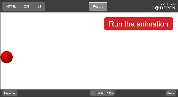
A direct application of trigonometry functions in an animation can be showcased by this rotating box animation by Ana Tudor:
The orange squares get squished into rhombi and then eventually into a line, all while rotating around a central point! The scaling factor of the orange boxes is the cosine of the skew angle. Ana Tudor explains the idea behind the animation in this Twitter thread.
Building creative designs
LukyVJ created an Apple-inspired loader using trigonometry functions and conical gradients:
Here’s the CodePen.
Ana Tudor created a captivating animation that she called Animated Mobius Strip.
She uses trigonometry functions as an input to the hsl() function to shift colors in unison with the rotation of the objects:
.comp {
--m: calc(.5*(var(--n) - 1)); /* middle index */
--ba: calc(1turn/var(--n)); /* base angle */
--ca: calc(var(--i)*var(--ba)); /* current angle */
--sgn-i: sign(var(--i) - var(--m)); /* sign w.r.t. middle */
/* other styles */
background: hsl(calc(100 + var(--sgn)*90),
calc((1 + cos(var(--ca)))*43%),
calc((1 + .5*var(--sgn)*sin(var(--ca)))*50%));
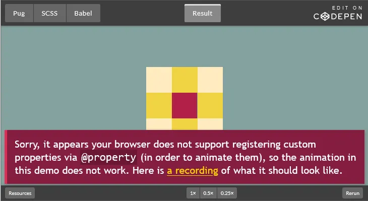
}Michelle Barker made a paper snowflake maker, where the viewer can drag control handles to clip out segments of a triangle to generate a snowflake pattern. The clip-path coordinates are calculated using trigonometric functions:

Michelle uses Sass, but now we could use CSS for the clip-path calculation!
Final word
Now that trigonometry functions are available in CSS, we can do some interesting things without reaching for JavaScript. I hope I was able to demonstrate some practical applications of the CSS trigonometry functions and take away some of the mystery around using math for things like layouts and animations.
Of course, you don’t need to use math to build webpages, but it can be helpful for creating some beautiful and unique things.
Thanks for reading!
Source: https://blog.logrocket.com
#css