The complete guide to clean data sets — Part 2
Photo by Ine Carriquiry on Unsplash
The success of a machine learning algorithm highly depends on the quality of the data fed into the model. Real-world data is often dirty containing outliers, missing values, wrong data types, irrelevant features, or non-standardized data. The presence of any of these will prevent the machine learning model to properly learn. For this reason, transforming raw data into a useful format is an essential stage in the machine learning process.
**Outliers **are objects in the data set that exhibit some abnormality and deviate significantly from the normal data. In some cases, outliers can provide useful information (e.g. in fraud detection). However, in other cases, they do not provide any helpful knowledge and highly affect the performance of the learning algorithm.
In this article, we will learn how to identify outliers from a data set using multiple techniques such as boxplots, scatterplots, and residuals.
Now, let’s get started 💚
Data Set
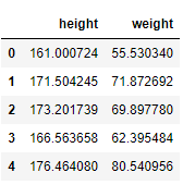
The data set used for this article contains the weight (kg) and height (cm) of 100 women. As the first step, we load the CSV file into a Pandas data frame using the pandas.read_csv function. Then, we visualize the first 5 rows using the pandas.DataFrame.headmethod.
import pandas as pd
	import numpy as np
	import seaborn as sns
	import matplotlib.pyplot as plt
	plt.style.use('seaborn')

	# read csv file
	df_weight = pd.read_csv('weight.csv')

	# visualize the first 5 rows
	df_weight.head()
As you may notice, the data set used for this article is really simple (100 observations and 2 features). In real-world problems, you will deal with much more complex data sets. However, the procedures to identify outliers remain the same 💜.
Identify outliers
There are many visual and statistical methods to detect outliers. In this post, we will explain in detail 5 tools for identifying outliers in your data set: (1) histograms, (2) box plots, (3) scatter plots, (4) residual values, and (5) Cook’s distance.
Histograms
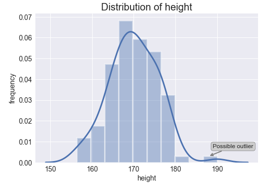
A** histogram** is a common plot to visualize the distribution of a numerical variable. In a histogram, the data is split into intervals also called bins. Each bar’s height represents the frequency of data points within each bin.
The** histograms** for both variables are shown below. The bars are displayed in the shape of a bell-shape curve which indicates that both features (weight and height) are normally distributed. Additionally, the Gaussian kernel density estimation function is depicted as well. This function is an approximation of the probability density function and represents the probability of a continuous variable to fall within a particular range of values.
# histogram and kernel density estimation function of the variable heightax = sns.distplot(df_weight.height, hist=True, hist_kws={"edgecolor": 'w', "linewidth": 3}, kde_kws={"linewidth": 3}) # notation indicating a possible outlierax.annotate('Possible outlier', xy=(188,0.0030), xytext=(189,0.0070), fontsize=12, arrowprops=dict(arrowstyle='->', ec='grey', lw=2), bbox = dict(boxstyle="round", fc="0.8")) # ticks plt.xticks(fontsize=14)plt.yticks(fontsize=14) # labels and titleplt.xlabel('height', fontsize=14)plt.ylabel('frequency', fontsize=14)plt.title('Distribution of height', fontsize=20);
# histogram and kernel density estimation function of the variable weightax = sns.distplot(df_weight.weight, hist=True, hist_kws={"edgecolor": 'w', "linewidth": 3}, kde_kws={"linewidth": 3}) # notation indicating a possible outlierax.annotate('Possible outlier', xy=(102, 0.0020), xytext=(103, 0.0050), fontsize=12, arrowprops=dict(arrowstyle='->', ec='grey', lw=2), bbox=dict(boxstyle="round", fc="0.8")) # ticks plt.xticks(fontsize=14)plt.yticks(fontsize=14) # labels and titleplt.xlabel('weight', fontsize=14)plt.ylabel('frequency', fontsize=14)plt.title('Distribution of weights', fontsize=20);
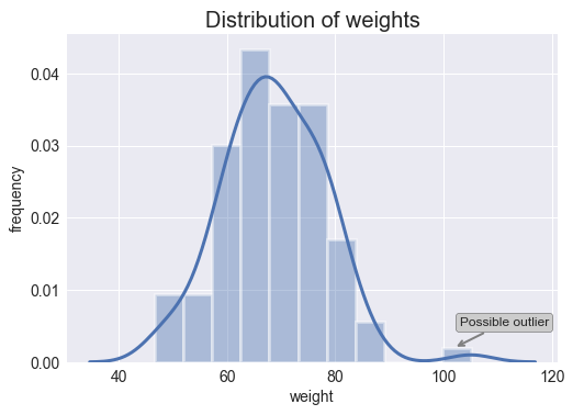
As you can see above, it seems that both variables present an outlier (isolated bar). It is important to bear in mind that histograms do not identify outliers statistically as box plots do. On the contrary, the identification of outliers with histograms is entirely visual and depends on our personal view.
#pandas #statistics #python #programming #data-science